
 MONA OS 2.0
 Partner with MONA


 Tự động hoá doanh nghiệp
 Cẩm nang SEO
 Digital Marketing
 Kinh nghiệm thiết kế website
 Hạ Tầng Server
 Giáo dục


 VI
 EN











Message us on
Zalo Official


 ProductsNew

 ProductsProducts
 Mới ra mắtKHA AI 2027App tự edit video, tự đăng mọi mạng xã hội, 2 phút mỗi ngày







 Website designLooks good and wins customers over.
SEO servicesBrings in customers searching for exactly what you sell.
 Tư vấn digital marketingKéo khách từ nhiều kênh, đo bằng số thật.
Corporate video productionVideos introducing your company, factory and team.
 NewAI video productionCompany story films made with AI.
 Custom software developmentCRM, ERP and HRM built for your business.
 Viết AI Agent theo yêu cầuĐặt riêng một trợ lý AI cho đúng việc của mình.
 Tư vấn chuyển đổi AIĐưa AI vào vận hành của cả công ty.
NewMONA LMSManagement for centers and schools.
MONA SkillHubInternal training for company staff.
 NHTQ systemEnd-to-end China–Vietnam shipping operations.
MONA JMSManagement for gold, diamond and pawn shops.
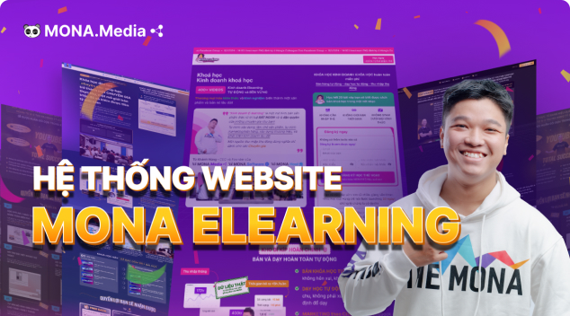 MONA E-LearningA website with every feature you need to sell courses.
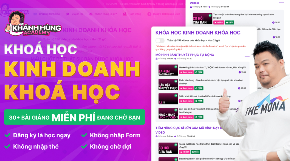 How to sell online courses (course)More than 30 free lessons on selling courses on autopilot.
 MONA Cloudmonacloud.vnServers to get your apps and websites running.
 MONA Basemonabase.vnPostgres database, sign-in and file storage.
 MONA Mailmonamail.vnSend OTP, order and invoice emails from your software.
 MONA Paymonapay.vnAccept bank transfers via VietQR and notify your software when the money arrives.
 MONA eInvoiceComing soonIssue e-invoices that meet tax standards.
Gấu CườiTrả lời khách 24/7 trên web, Fanpage, Zalo và thu lead cho sale.
 Gấu TeleSalesGọi điện tư vấn, chăm khách như tổng đài viên thật.
Dê CườiTư vấn và chốt đơn cho shop ngay trong khung chat.
Gấu WebmasterNhắn nhóm Zalo là website được sửa xong.
 Gấu Pháp ChếSoạn hợp đồng, rà điều khoản trong vài phút.
 Gấu Báo GiáLên báo giá đúng mẫu và gửi khách ngay.
 AI chăm sóc khách hàngTheo dõi và giữ chân khách hàng cũ.
 Gấu Tuyển DụngLọc hồ sơ, hẹn lịch, phỏng vấn ứng viên.
 Mới ra mắt
KHA AI 2027
Xây kênh chuyên gia 2 phút mỗi ngày
Quay bằng điện thoại, AI tự edit video, tự đăng lên 16 nền tảng và tự trả lời bình luận, tin nhắn.
892.555lượt xem trên kênh CEO MONA sau 37 ngày
 Anh Khánh HùngCEO MONA đang dùng mỗi ngày
Xem app làm được gì
 AI
Gấu Cười MONA ĐANG TỰ XÀITrả lời khách 24/7 trên website, Zalo OA, Messenger và thu lead về cho sale.
Dê CườiChốt đơn bán lẻ và sàn: Shopee, TikTok Shop, web. Chăm cả khách sỉ, đại lý.
Gấu WebmasterCập nhật nội dung, tối ưu SEO website mỗi ngày.
Gấu TeleSalesGọi điện tư vấn, chăm khách như tổng đài viên thật.
Gấu Tuyển DụngLọc hồ sơ, hẹn lịch, phỏng vấn ứng viên tự động.
AI chăm sóc khách hàngGiữ khách cũ, cứu lead đã rớt cho phòng kinh doanh.
Gấu Pháp ChếSoạn hợp đồng, rà điều khoản trong vài phút.
Gấu Báo GiáLên báo giá đúng mẫu, gửi khách ngay khi có yêu cầu.
 Chuyển đổi AI toàn phầnGiải pháp tổng cho doanh nghiệp, 3 lớp triển khai.
 Viết AI Agent theo yêu cầuĐặt riêng một con AI gánh đúng nghiệp vụ của bạn.
 Custom softwareCRM, ERP and HRM with built-in AI automation.
 SEO & AEO thời đại AIĐược Google lẫn AI trích dẫn, không chỉ xếp hạng.
 Kiến thức AI cho doanh nghiệpBài phân tích, hướng dẫn ứng dụng AI vào vận hành.
 Free AI courses
 AI tools at work
App mới · KHA AI 2027
Xây kênh 2 phút mỗi ngày
AI tự edit video, tự đăng mọi mạng xã hội
Free consultation, 8am–10pm every day

18 March, 2023

Web navigation is the system of links that helps users and search engines move easily between the pages of a website. A clear navigation structure not only improves user experience but also supports SEO. Yet not everyone understands what web navigation is and how to optimize it. In this article, MONA Media shares what will help you understand web navigation better and how to optimize your website’s navigation system. Read on!
Web navigation is the navigation system of a website, made up of links, menus, breadcrumbs and a search bar, helping users move around and find information easily. It organizes the site structure clearly, gives a convenient user experience and helps search engines understand the website structure better.
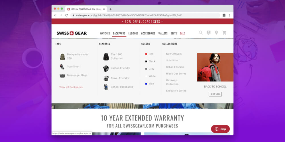
Components of website navigation:
Web navigation not only improves user experience but also supports SEO strategy, helping raise search rankings effectively.
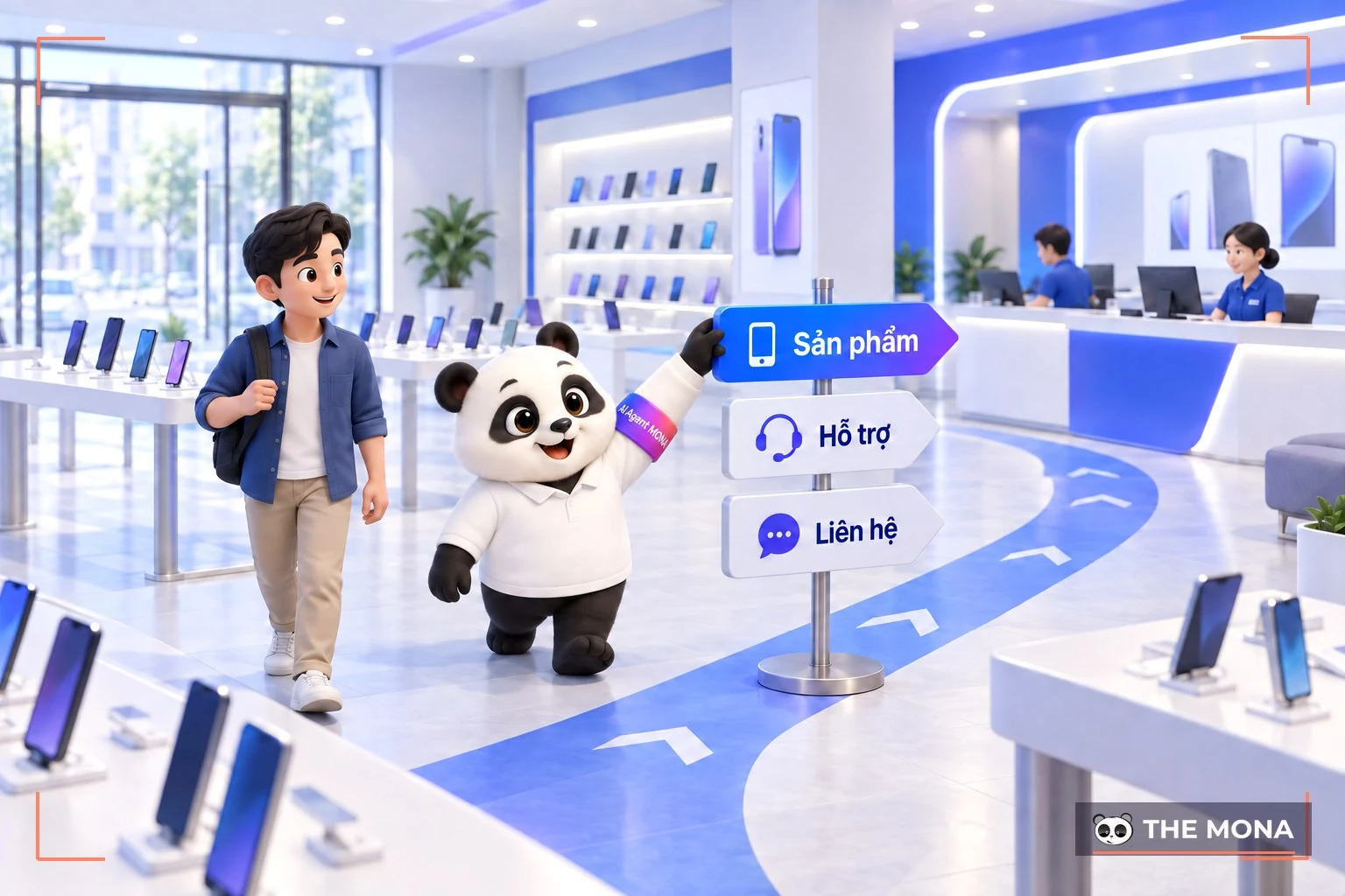
A website’s navigation system not only helps users find information easily but also affects SEO performance and user experience. Here are the reasons navigation is so important:
So an effective navigation system is the deciding factor that lets a website not only run smoothly but also help raise search rankings and grow revenue.
When you choose website design service, a website’s navigation menu system helps users find information and browse categories easily. How it works, however, depends on each website’s navigation design. Today, web navigation falls into 3 main types:
Each type of web navigation has its own benefits, helping optimize user experience and improve how easily information can be found on the website.
Global navigation is the menu bar and set of links that appear identically on every page of the website, giving users easy access to key sections such as “Home,” “Products,” “Services” and “Contact.” This menu bar is usually fixed and follows users as they scroll or move between pages, creating consistency and convenience.
For example, when you visit a phone store website, whether you are viewing a product in detail or reading the warranty policy, the menu bar always stays at the top of the page with links such as “Home,” “Products,” “Promotions” and “Contact.”
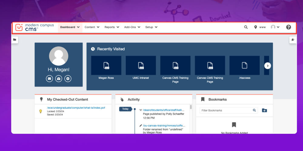
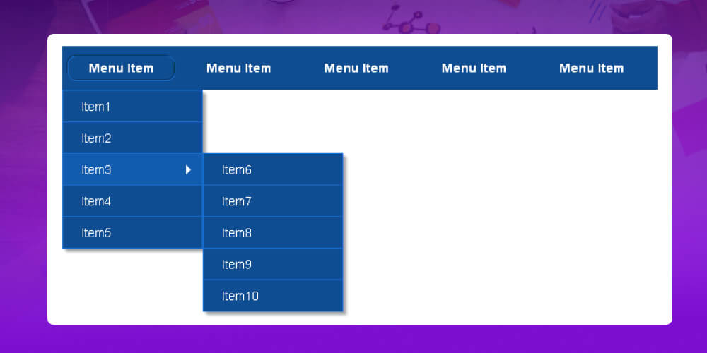
Hierarchical navigation is a navigation system whose menu structure changes with the user’s location and needs. As users move between pages, the links are organized in a hierarchy, so they can easily get from the main sections to detailed information.
For example, on a phone store website, when you choose “Products,” you see categories such as “Smartphones,” “Tablets” and “Accessories.” When you click “Smartphones,” the menu shows options such as “iPhone,” “Samsung” and “Xiaomi,” so you can find the product you want without getting lost.
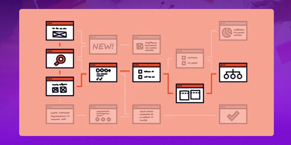
Local navigation is a navigation system made of internal links or small menus placed within a specific page, helping users explore related content in the same area. This lets users reach detailed information without leaving the page they are viewing.
For example, on a phone store website, when you view a product in detail, local navigation might include links such as “Similar products,” “Product reviews” or “Specifications,” so you can find extra information without leaving that page.
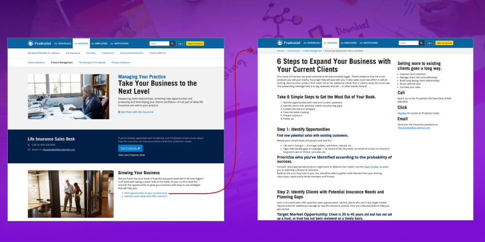
To build an effective website navigation system, you need to follow some basic principles that optimize user experience and support full-scope SEO. Below are the key principles for building website navigation:
Before create a website, planning the page structure and navigation system in detail is a very important step. It helps define the number of main sections, subpages and how the parts link to each other.
A website with a clear structure not only helps users find information easily but also supports a structured full-scope, helping search engines understand and index the website easily.
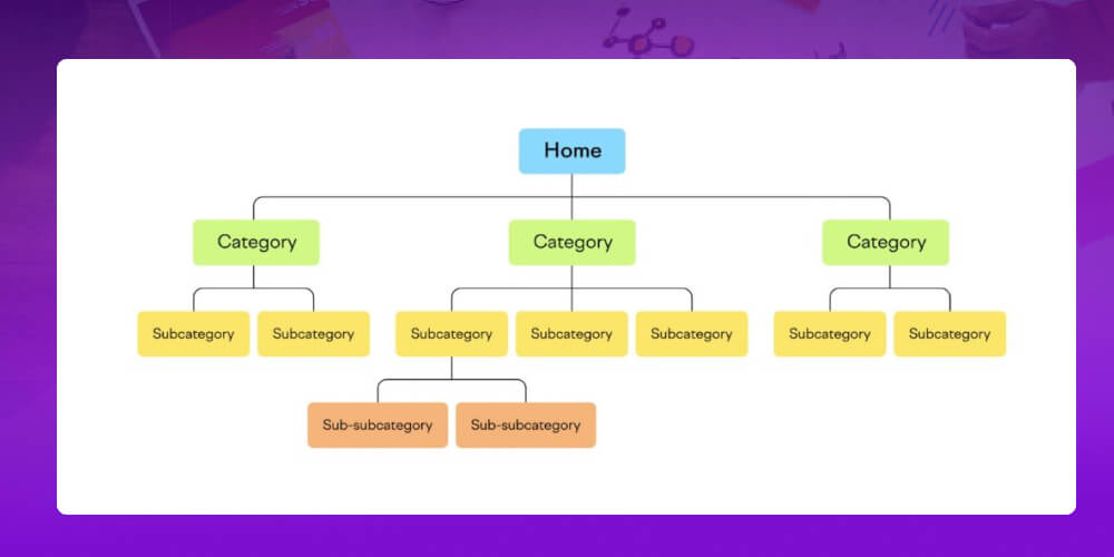
When designing a navigation system, following standards is one of the important steps to make the website easy to use.
For example, place the menu in a fixed position at the top of the page, or use the three-line icon for the hamburger menu on mobile. Applying these conventions lets users act quickly without time spent getting used to the site, which improves the user experience.
When designing website navigation, it is important to use clear, easy-to-understand item names. Avoid jargon, difficult words or uncommon abbreviations, as these can confuse users, especially new visitors.
Easy-to-understand names help users quickly recognize the website’s functions and content, making for a more convenient experience. This also supports SEO, since clear item names help search engines understand the page content correctly and improve visibility in search results.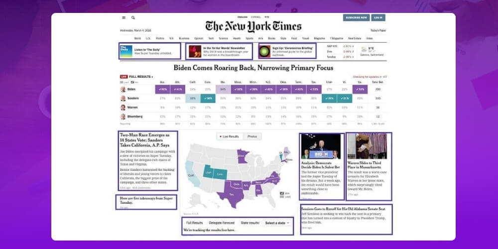
The footer menu sits at the bottom of the page, where you can place extra links such as FAQs, the privacy policy and contact information without cluttering the main layout.
This lets customers reach information without scrolling back to the top. The footer menu also supports SEO by improving internal linking, helping search engines understand and index important pages.
A responsive menu automatically adjusts to the screen size, avoiding font or menu bar errors when users visit from a phone. This is very important because more than 60% of users now access websites from mobile devices.
A responsive menu makes the user experience smooth and convenient, letting people navigate the website easily on any device.
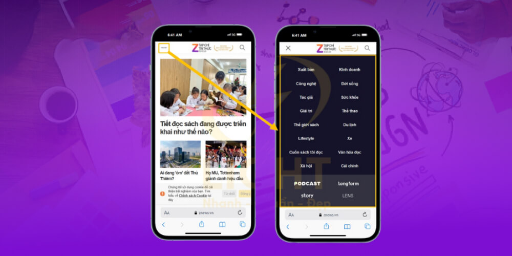
Dropdown menus should only be used on websites with many categories or subcategories. Overusing dropdowns can make the menu complicated, confuse users and cause them to miss important items.
If you do use them, add recognizable icons such as an arrow or three horizontal lines so users can navigate easily, which improves the experience and avoids visual clutter.
When designing a navigation bar, keep it simple and focused on the important items, especially the main links at the top or bottom of the page. Avoid putting too many links on the homepage, as this dilutes the information and makes things harder for users.
A clear navigation bar helps users explore the website, remember the main categories and find deeper pages efficiently, which improves the user experience.
Design consistency is very important for a smooth user experience. Elements such as fonts, colors and sizes should stay fixed and uniform across the whole website.
This helps readers focus on important information without being distracted by excessive changes in appearance. A website with a consistent design not only looks better but also makes browsing easier and more efficient.
Web navigation plays a very important role in improving user experience and optimizing SEO. A clear, easy-to-use navigation system not only helps customers find information easily but also helps search engines understand the website structure, which raises search rankings. Sensible website navigation lets users move smoothly between pages, keeps them on the site longer and increases the chance of conversion. Investing in website navigation is therefore an essential part of building an effective, successful website.

CEO & Founder · The MONA
The founder of The MONA built a service company of 60+ staff with 14,000+ projects delivered. Khánh Hùng shares his thinking on building self-running systems, automating a business, and the real lessons behind MONA's projects.
 1,5K



Professional website
design services
Own a website with a beautiful, 100% exclusive design and a lifetime warranty, with the ability
to expand features flexibly as your business grows, starting today!






 MONA will never sell your information or send you spam


 MONA will never sell your information or send you spam
