
 MONA OS 2.0
 Partner with MONA


 Tự động hoá doanh nghiệp
 Cẩm nang SEO
 Digital Marketing
 Kinh nghiệm thiết kế website
 Hạ Tầng Server
 Giáo dục


 VI
 EN











Message us on
Zalo Official


 ProductsNew

 ProductsProducts
 Mới ra mắtKHA AI 2027App tự edit video, tự đăng mọi mạng xã hội, 2 phút mỗi ngày









 Website designLooks good and wins customers over.
SEO servicesBrings in customers searching for exactly what you sell.
 Tư vấn digital marketingKéo khách từ nhiều kênh, đo bằng số thật.
Corporate video productionVideos introducing your company, factory and team.
 NewAI video productionCompany story films made with AI.
 Custom software developmentCRM, ERP and HRM built for your business.
 Viết AI Agent theo yêu cầuĐặt riêng một trợ lý AI cho đúng việc của mình.
 Tư vấn chuyển đổi AIĐưa AI vào vận hành của cả công ty.
NewMONA LMSManagement for centers and schools.
MONA SkillHubInternal training for company staff.
 NHTQ systemEnd-to-end China–Vietnam shipping operations.
MONA JMSManagement for gold, diamond and pawn shops.
 MONA E-LearningA website with every feature you need to sell courses.
 How to sell online courses (course)More than 30 free lessons on selling courses on autopilot.
 MONA Cloudmonacloud.vnServers to get your apps and websites running.
 MONA Basemonabase.vnPostgres database, sign-in and file storage.
 MONA Mailmonamail.vnSend OTP, order and invoice emails from your software.
 MONA Paymonapay.vnAccept bank transfers via VietQR and notify your software when the money arrives.
 MONA eInvoiceComing soonIssue e-invoices that meet tax standards.
Gấu CườiTrả lời khách 24/7 trên web, Fanpage, Zalo và thu lead cho sale.
 Gấu TeleSalesGọi điện tư vấn, chăm khách như tổng đài viên thật.
Dê CườiTư vấn và chốt đơn cho shop ngay trong khung chat.
Gấu WebmasterNhắn nhóm Zalo là website được sửa xong.
 Gấu Pháp ChếSoạn hợp đồng, rà điều khoản trong vài phút.
 Gấu Báo GiáLên báo giá đúng mẫu và gửi khách ngay.
 AI chăm sóc khách hàngTheo dõi và giữ chân khách hàng cũ.
 Gấu Tuyển DụngLọc hồ sơ, hẹn lịch, phỏng vấn ứng viên.
 Mới ra mắt
KHA AI 2027
Xây kênh chuyên gia 2 phút mỗi ngày
Quay bằng điện thoại, AI tự edit video, tự đăng lên 16 nền tảng và tự trả lời bình luận, tin nhắn.
883.362lượt xem trên kênh CEO MONA sau 36 ngày
 Anh Khánh HùngCEO MONA đang dùng mỗi ngày
Xem app làm được gì
 AI
Gấu Cười MONA ĐANG TỰ XÀITrả lời khách 24/7 trên website, Zalo OA, Messenger và thu lead về cho sale.
Dê CườiChốt đơn bán lẻ và sàn: Shopee, TikTok Shop, web. Chăm cả khách sỉ, đại lý.
Gấu WebmasterCập nhật nội dung, tối ưu SEO website mỗi ngày.
Gấu TeleSalesGọi điện tư vấn, chăm khách như tổng đài viên thật.
Gấu Tuyển DụngLọc hồ sơ, hẹn lịch, phỏng vấn ứng viên tự động.
AI chăm sóc khách hàngGiữ khách cũ, cứu lead đã rớt cho phòng kinh doanh.
Gấu Pháp ChếSoạn hợp đồng, rà điều khoản trong vài phút.
Gấu Báo GiáLên báo giá đúng mẫu, gửi khách ngay khi có yêu cầu.
 Chuyển đổi AI toàn phầnGiải pháp tổng cho doanh nghiệp, 3 lớp triển khai.
 Viết AI Agent theo yêu cầuĐặt riêng một con AI gánh đúng nghiệp vụ của bạn.
 Custom softwareCRM, ERP and HRM with built-in AI automation.
 SEO & AEO thời đại AIĐược Google lẫn AI trích dẫn, không chỉ xếp hạng.
 Kiến thức AI cho doanh nghiệpBài phân tích, hướng dẫn ứng dụng AI vào vận hành.
 Free AI courses
 AI tools at work
App mới · KHA AI 2027
Xây kênh 2 phút mỗi ngày
AI tự edit video, tự đăng mọi mạng xã hội
Free consultation, 8am–10pm every day

25 July, 2026

The third course in MONA's free AI course series, and the most hands-on so far: you'll learn to build apps with Claude Code in the true sense: make a mobile app yourself that runs for real on a real device, with login, data stored in the cloud, AI features inside, and then take the full road of submitting to the App Store and Play Store. You don't need to have written a single line of code or know any mobile programming concept beforehand; the only requirement is having taken the basic Claude Code course (or knowing how to open Claude Code and give commands in plain language). As usual for the series: written for people in business, every step is a real action, and the end of the course has a view specific to Vietnamese businesses: when a business should have an app, and how to build it so money isn't wasted.
Course contents
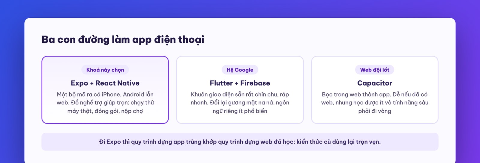
Before getting hands-on, let's sketch a quick map so you know which road you're on. App makers today have three main roads, and luckily for beginners: you only need to grasp the gist of each, because the machine does the walking.
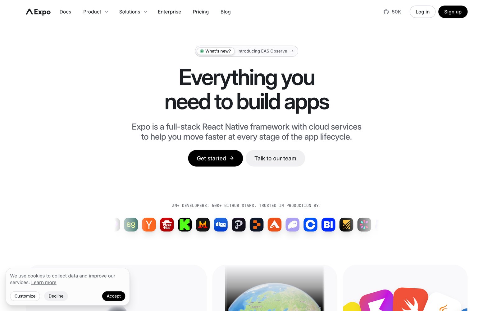
Road 1: Expo + React Native (this course's road). Write the app in a single codebase, then output to all three places: an iPhone app, an Android app, and a web version running in the browser. It comes with an ecosystem of services called Expo that handles the stages that have always been hard: live testing on a real phone while you build, packaging the official release, and submitting to the app stores. One codebase, three outputs, a full set of helper tools: exactly the taste of people who want to ship fast.
Road 2: Flutter + Firebase (the Google road). It uses a language developed by Google, with a “very Google” set of interface components: buttons and dialogs all follow polished ready-made templates. The upside is fast assembly because everything has a template; the downside is that your app easily ends up looking like every other app, and a distinct look takes effort. It suits teams already used to Google's stack, and isn't the easiest choice for a beginner working with AI.
Road 3: Capacitor (the “web in an app costume” road). Build a web page, then wrap it in a shell to submit to the app stores. It's easiest if you already have a website, but if you want to learn app making this road teaches the least, and features that reach deep into the phone (vibration, push notifications, camera) must go through an intermediary layer.
This course takes road 1, and there's a reason deeper than convenience: with Expo, the process of building an app almost matches the process of building a website that you learned in the basic course. It's still giving a brief in words, the machine builds, you look and give feedback; the only difference is that the final destination is a phone screen. What you learned before carries over in full.
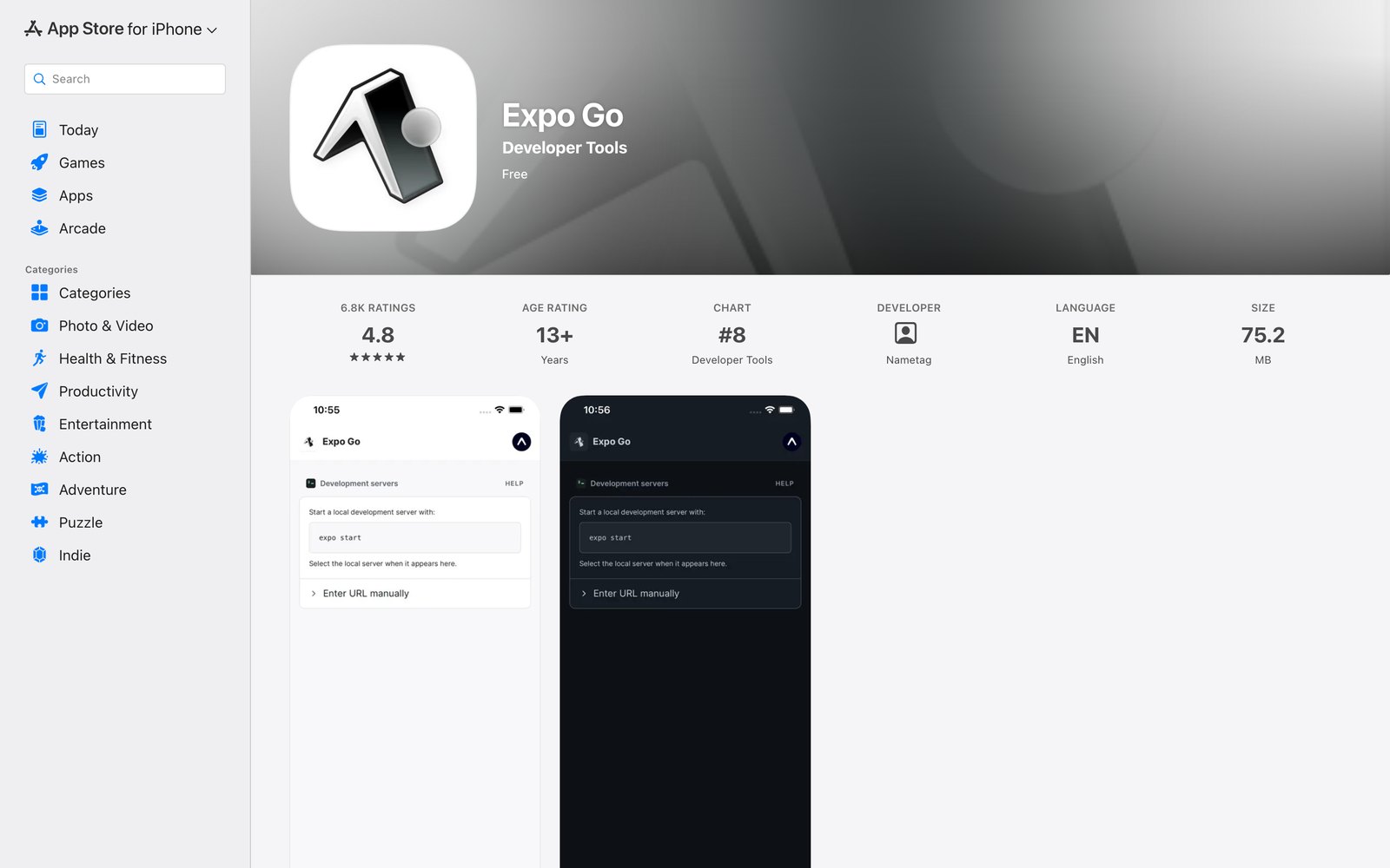
If you've taken the earlier courses, half of the environment is already there: Claude Code (Pro plan or higher) running in a terminal or an IDE (Antigravity, or VS Code with the official, verified Claude Code extension). Only two things remain to add:
Then try it right away to warm up: “create a simple habit-tracking demo app, then start the Expo server in a new terminal window to show the QR code.” The detail “new terminal window” is a hard-won tip: if the machine runs it inside the chat pane, the QR code doesn't display properly. A few minutes later the terminal shows a huge QR code; open your phone camera, scan it, tap to open in Expo Go, and the app you just described out loud is running on your own phone. Honestly, the feeling the first time is no different from the first time you saw a machine build a website in course one: you can't believe it's this easy.
A common question at this step, answered now for peace of mind: “is my app held hostage by Expo?” No. Expo Go is only a preview frame while you build; the app's source code sits intact in your own project folder (and on your own GitHub from part 3 onward). By release time, the official build is a standalone app installed directly on users' devices, with nothing to do with Expo Go anymore. Expo is scaffolding, not the foundation.
Two notes before moving on to design. One, while building, the machine will sometimes hand you instructions telling you to type commands yourself; remember the earlier lesson: say “just do it for me” and it does it itself, so don't dutifully type by hand. Two, test runs sometimes show a red error at the bottom of the screen (like a library that doesn't match the version); don't panic, copy the error verbatim and paste it into Claude Code, and it diagnoses it and swaps in a suitable library version itself. Handling errors by pasting the error: a crude-sounding skill that carries half the craft of building apps with AI.
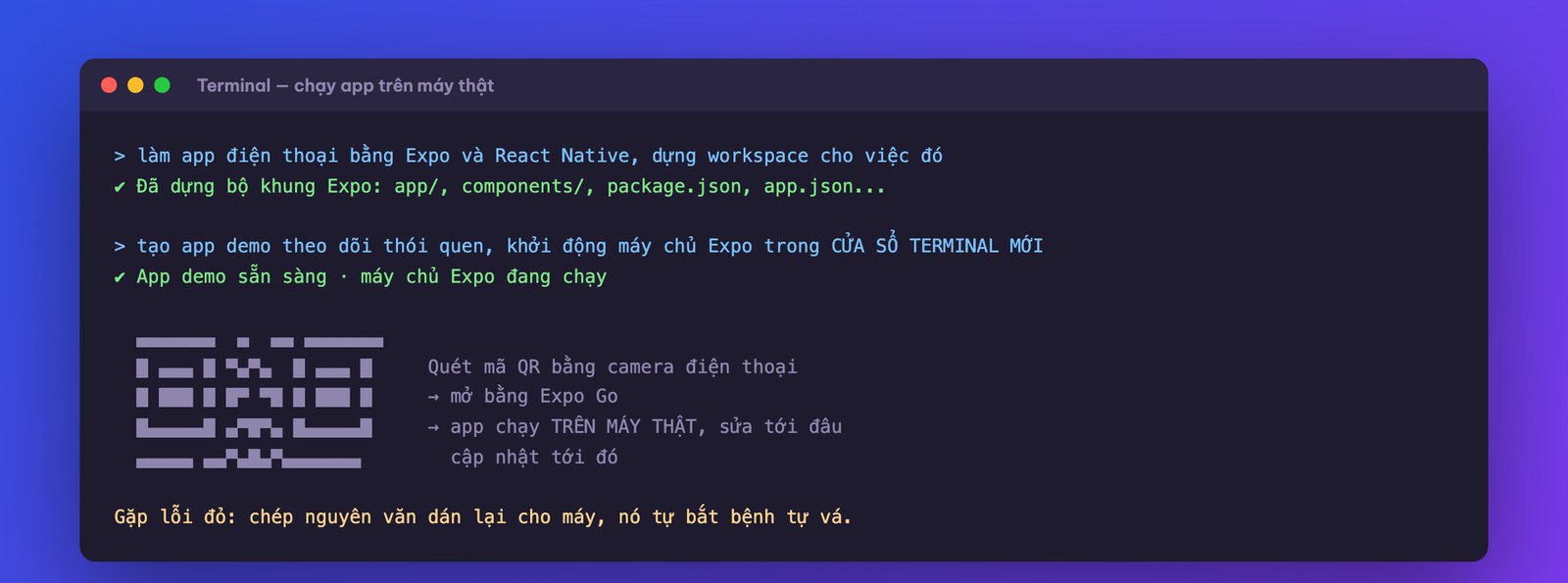
Hands-on: set up an Expo workspace, create any demo app, and get it running on your own phone through Expo Go. It doesn't need to look good yet; what you need is the feeling of “it really runs on my device.”
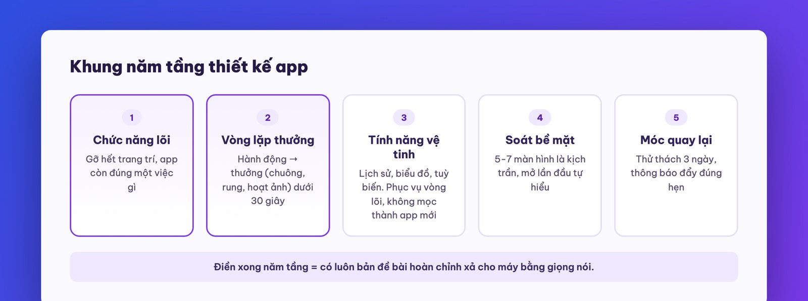
The machine can build anything you describe. So the problem of this era is no longer “can it be built?” but “what should be built?”. This is the part that's worth the money for business people: the five-layer design framework that serious app makers go through before writing a single line. Grasp it, and you'll look at every app in the world (including competitors' apps) with different eyes.
Before filling in the framework, screen your idea with three questions to avoid wasting effort on ideas that die young. One: how many times a week will users run into this task? A task met daily (notes, tracking, reminders) keeps an app alive; a task met once a year is better served by a web page. Two: what does the app offer that a web version or Zalo can't? A worthwhile answer usually lies in three things only an app has: push notifications, the camera, and running smoothly without a network. If you use none of the three, reconsider building an app. Three: can you reach your first group of users? An app for your chain's regular customers is reachable right away; an app for “everyone on a diet in the world” is a very different battle. When all three answers come out well, fill in the five-layer framework.
Layer 1: core function. The question: strip away all decoration, and what single job does this app still do? A habit-tracking app: create a habit and tap to log it. A calorie-counting app: photograph a dish and get a number. If you can't answer this tightly, you're not ready to build an app.
Layer 2: core loop. A user action must be tied to a reward, and the whole loop must fit in under 30 seconds: tap to log a habit → a pleasant chime + a light vibration + an expanding animation + confetti falls when a streak completes. Humans are creatures that love instant feedback; an app without a reward loop gets opened once and forgotten. The successful apps play a higher tier: a gem that grows more splendid with each day of your streak, a tree that grows with each minute of focus. Visual rewards are the common language of every app that retains users.
Layer 3: accessory features. Things that wrap around the core loop and thicken it, not replace it: history and streak charts, several kinds of habits (do-once and count-the-times, like drinking eight glasses of water), maybe a feature to invite friends to track together. The principle: satellites serve the planet and don't grow into new planets.
Layer 4: surface area check. The chronic disease of beginners: getting so excited they stuff in ten core functions and a hundred screens. Users open a confusing app and delete it. A simple rule: five to seven screens is the ceiling, and users must understand how to use it on the very first open, with no one explaining.
Layer 5: retention hook. The reason for users to open the app again: a 3-day streak challenge right after install (to finish the challenge they have to come back three times), a push notification checking in at the time they set. An app without a retention hook gets installed today and deleted next week; every healthy app on the store is deliberately designed to pull people back, and we learn that properly: remind people of exactly what they themselves want to do.
Let's try filling in this framework for an app close to home for Vietnamese businesses so you can see how easily it applies: a loyalty app for a spa chain. Layer 1, core function: book an appointment in three taps. Layer 2, core loop: after booking, you immediately see a nice confirmation with reward points added, with a “ting” sound and an animation; the whole loop under 15 seconds. Layer 3, accessories: treatment history with skin photos from each session (exactly what spa customers love most, like the story of the 22-branch chain owner we shared earlier in the series), membership tiers by points, a voucher wallet. Layer 4, surface check: five screens is the ceiling: booking home, history, offers, profile, and the confirmation screen. Layer 5, retention hook: rebooking reminders on the right treatment cycle, birthday vouchers, and a notification like “your skin has passed 5 sessions, see the comparison photos.” Fifteen minutes filling in the framework, and you have a description that many product teams can't finalize in three meetings.
The best thing about this framework: once the five layers are filled in, you automatically have a complete brief to hand to Claude Code. The way to hand it over is also learned from the earlier course: unload it in one burst by voice. State each layer clearly: “the core function of this app is X; the core loop is that every time the user does Y they're rewarded with sound, vibration and animation; the accessory features are A, B, C; keep at most six screens; the retention hook is a 3-day challenge with one push notification a day.” That one burst is worth more than a hundred scattered commands, because the machine sees the whole intent instead of guessing piece by piece.
Hands-on: pick an app idea (tip: take a task from your own company), and fill in the five-layer framework on paper. Don't build yet; part 3 will build it.
Now to put everything together: take the five-layer framework for the habit-tracking app, unload it into Claude Code, and walk the full road from rough draft to polished version. This part is long because it is the craft itself: the machine does the building, but shaping it into a usable product is the skill of the person holding it.
Beat 0: clear the desk before the session. It sounds redundant but saves the whole session: before each app-building session, type /clear to wipe memory (the lesson from course one: new task, new session), and open three windows ready: Claude Code, a browser for the test version, and a phone with Expo Go. These three screens are the standard workbench of this trade; missing any one makes that part of the session stutter.
Beat 1: set the foundation before building. Go into the project folder and run /init so the machine writes CLAUDE.md itself (an old lesson from course one: a compressed context that lets every later session start light and smart). Only then unload the five-layer brief. The machine will present a phased plan like “I'll do phase 1 first”; if you want it all in one go, say so directly: “do everything from phase 1 to 4, then open it in Chrome for me to test.” The machine tends to conserve effort and tokens, so be explicit about the portion you want.
Beat 2: test on the computer first, where it's easier to inspect. The first version that opens will be both beautiful and buggy: text the same color as the background turns invisible, stats are miscalculated (done for 1 day yet it shows 3%), long text overflows, and the button to set a reminder time can't be tapped. That's completely normal. The craft lies in how you give feedback: go screen by screen, describe each error in plain words, gather them into one long burst, and send it all at once. A real feedback burst in the course looked like this: “management screen: habit name text matches the background color, fix it globally because this error repeats in many places; the stats calculate over 30 days but the label says 7 days, recheck the formula; the reminder section must let each habit have its own time, not one shared time; and add one last screen in the welcome section explaining how the app works.” Every burst ends with: “that's the 80/20 of this round, after fixing open a new tab to keep testing.” Three to four rounds like this and the app settles into shape; each round takes the machine a few minutes to fix.
One more thing to prepare for early so you don't get discouraged: a red error screen is a colleague, not a death sentence. Building apps, there will be moments when you open it and see a whole red screen with incomprehensible white text. The standard handling has three steps: stay calm, copy it verbatim (or take a screenshot), and paste it to the machine with “the app is showing this error, please handle it.” Nine times out of ten the machine diagnoses and patches it in one round; otherwise it will ask one or two more questions. This is where beginners differ from veterans: a beginner sees a red screen and shuts the machine down, while a veteran sees a red screen, pastes it to the machine, and goes to pour some water.
Beat 3: ask for a mode for the builder. A little-known tip that saves tons of time: have the machine make a developer area inside the app: a button to simulate “pretend the 3-day challenge is done,” a button to wipe all data and start over, a button to trigger the confetti screen. Without this area, to see the real 3-day streak celebration screen you'd have to… wait 3 days. The command: “add a developer area in settings: simulate challenge completion, clear data, and trigger the reward animations for testing.”
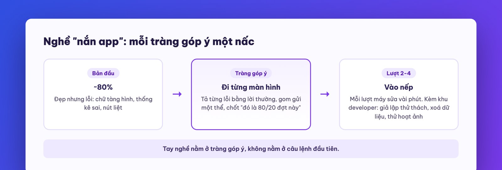
Beat 3b: borrow taste to get good-looking fast. The machine's first version of an app is usually “clean but bland.” The fastest way to level up is learned from the web-building lesson in course one: find an app with taste that you love (on your own phone, or on app design showcase sites), take a few screenshots, and give them to the machine with: “borrow this taste: spacing, corner radius, font size, use of color; keep my own content; when done, screenshot it yourself against the reference and adjust until it's the same caliber.” A few rounds of this self-mirror loop and the app puts on a new outfit. A reminder of the old boundary: borrow the aesthetic framework, don't copy their content or identity.
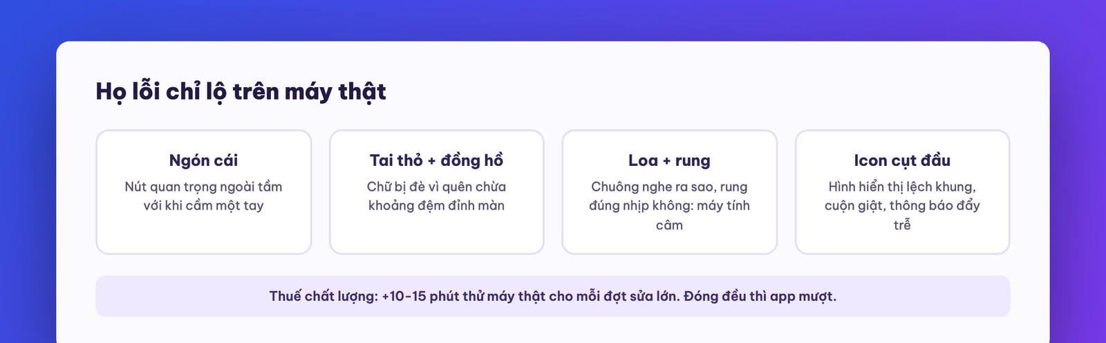
Beat 4: onto a real phone, where what the computer hides shows up. Once the computer version is done, start Expo, scan the QR, and inspect with your thumb on the phone. This step can't be skipped, because there's a whole family of bugs that only show up on a real device: an icon cut off in the top half; the system clock overlapping text because no padding was left for the iPhone notch; an important button out of thumb reach when holding with one hand; choppy scrolling; and things a computer doesn't have: how the chime sounds through a real speaker, whether the vibration has the right rhythm, whether the push notification shows up at the right time. Note each one (unload by voice to be quick), then go back and send the machine one burst to fix. The distilled experience: always add 10-15 minutes of real-device testing for each major round of fixes, think of it as a quality tax, and paid regularly, the app stays smooth.
Beat 5: lock the version, put it in storage. When the app reaches a version you like, do two things learned from earlier courses, now reflexes: update CLAUDE.md (the app is no longer a demo, so the description has to catch up) and push the code to GitHub: “create a GitHub repo for this project with a README and push it.” From now on every change has a saved copy, and if the machine ever breaks something, you can go back to the previous version with one command. Building an app without this net, a single “slip” from the machine can wipe out a whole working session.
Hands-on: build the app following the five-layer framework you filled in during part 2, going through all five beats: set the foundation, test on the computer with 2-3 feedback bursts, ask for the developer area, test on a real device, push to GitHub.
Your app is running well, but it has one critical limit: all the data sits on the very device running the app. Give the app to someone else to install and they start from zero; switch phones and the data stays behind on the old one. To turn the app into a real product for many users, you have to connect it to a “back brain” in the cloud: database, along with the gate of log in so that brain knows which data belongs to whom.
Before connecting, some contrarian advice, so listen closely: don't rush to connect a database if you don't need it yet. An app that runs locally (data on the user's device) has its own perks: not a cent spent on servers, no worry about the security of centralized data, no login screen to bother users. Personal-tool apps, idea-testing apps, demo apps for customers to see: just run them locally. Connect the back brain only when the answer is “yes” to at least one of three: it needs to be used on multiple devices, it needs multiple users to see each other's data, or it needs data to survive when a user changes phones. Connecting early means taking on costs and responsibilities before you need them.
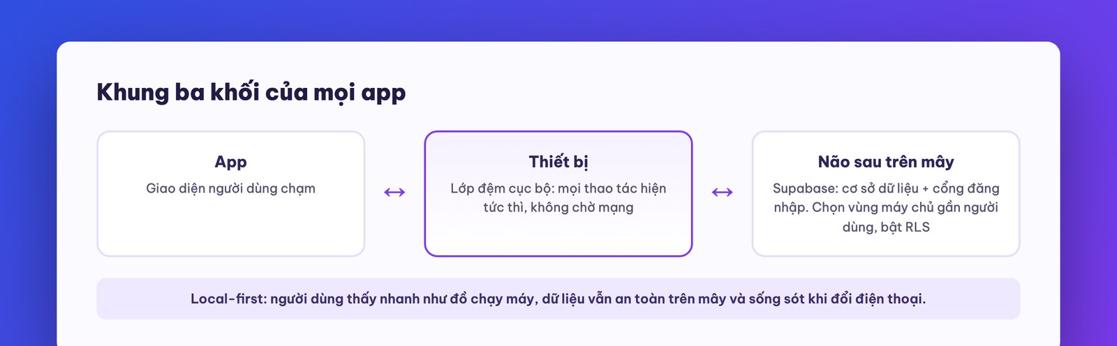
The standard architecture, drawn out, has only three blocks, and you should memorize it because every app in the world shares this frame: app ↔ device ↔ database. The app talks to on-device storage first (so every action appears instantly, with no waiting for the network), then the device syncs with the cloud database on a background rhythm. People in the trade call this “local-first caching”: the user sees an app as fast as a native one, and the data is still safe in the cloud. When briefing the machine, you only need to say that idea in plain words: “add a database to the app, use Supabase, keep a local cache layer for a smooth experience, and add login with email and password.”
The service used in the course is Supabase, a familiar face from earlier courses: it has a free plan, handles both the database and the login system, and the whole vibe-coding community uses it, so the machine knows the way well. To be fair, as the original teacher of the source course admits too: this is the “familiar” choice rather than the one true answer; teams that already have another stack should use it, and the three-block frame doesn't change.
The connection process, in the exact order that has run for real:
After these three steps, open the app: now there's a proper account sign-up screen wrapped around it, and this is a stretch worth a minute of self-reward: open the Supabase admin page, go to the data tables, and watch the data run live: create a habit in the app and a new row appears in the table; delete in the app and the row disappears; edit a figure directly in the table, go back to the app and see it change. That admin page is also your control panel later: creating accounts for stuck customers, seeing how many users the app has, how the data grows. You just came to own something a software team ten years ago would have spent a whole month building.
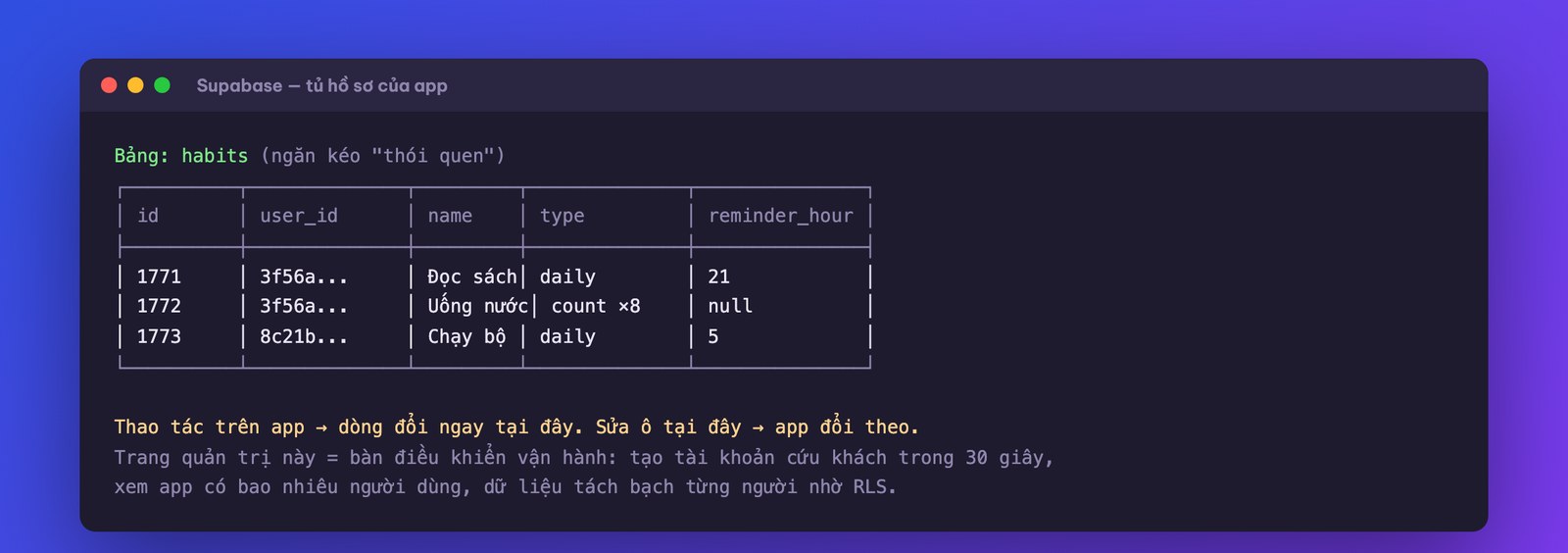
Understand the schema through an everyday image so you don't feel overwhelmed: a database is the company's filing cabinet, each table is a labeled drawer, and each row is a slip. The “users” drawer holds a slip for each customer; the “habits” drawer holds a slip for each habit, with a customer ID on the slip so you know whose it is; the “completions” drawer records each time a customer taps the button, with date and time. The machine is good at working out how many drawers are needed, what labels, and which fields go on each slip, from your own business description. Your job is to skim the list of drawers and ask yourself: is any drawer missing (a sales app without an “orders” drawer is an alarm), and is any field superfluous and sensitive (there's no reason for the profile drawer to store date of birth if the app doesn't use it; remember the principle “don't keep what you don't need” from the security lesson).
The Supabase admin page is also worth practicing one “firefighting” move that every customer care team will need: a customer messages “hi, I can't create an account.” Go to the users section, click to create an account manually, enter the customer's email, set a temporary password, tick auto-confirm, and send it to the customer with a note to change the password. Thirty seconds, the customer is rescued, and no technical person needed. Access to this admin page, of course, you guard like a safe: it sees all of the app's data.
Remember to recheck the testing triangle: computer, Expo, real device, because adding a network layer adds new places for errors (a library that doesn't match the version is the classic case; paste the error verbatim for the machine to handle, as you've learned).
Hands-on: connect your app to Supabase in all three steps, create two test accounts, open the admin page to see the two accounts' data kept separate, and try editing a cell from the table side to see whether the app changes accordingly.
Now the rung that separates ordinary apps from modern apps: letting AI live inside the app. For the habit app, the course builds two features whose value you'll see right away: a smart coach (periodically reads the user's streak data and pushes a personalized notification: “14 days sleeping on time, impressive. But the water habit is flagging, try putting a bottle right on your desk”) and a weekly summary (AI writes a personal report for each person: which habit is most durable, which one dropped mid-week, what to adjust next week).
The architecture of every in-app AI feature shares one flow, and once you grasp it you can sketch features for your own app:
App (on the phone) → a function that runs briefly in the cloud → reads the database → packages the data and sends it to an AI model with a brief → receives the result → writes it back to the database → pushes a notification to the phone.
Two new concepts, explained in plain words:
How to brief it in practice: draw (or screenshot) the flow diagram above, paste it along with a description burst: “build these two features, backend uses Claude through a Supabase edge function, use a mid-priced model, update the database to match.” The machine reads the edge function docs, builds the new tables, and writes the model's sub-brief by itself. Your job is to approve the voice of the messages (this is where your brand's taste speaks: a spa app's messages should differ from a gym app's) and settle the rhythm (once a day is enough; messages that are too frequent make users turn off notifications and lose your retention hook with them).
To show how concrete the “sub-brief for the model” gets, here's a ready-to-use sample for the coach feature, with the voice adjustable to your brand: “Input: the most recent 14 days of one user's data, including the list of habits, streaks, and completion rate per habit. Write ONE short message under 40 words, in a warm, specific voice like a coach who knows them: praise exactly one bright spot with a number, point out exactly one flagging spot, and suggest one small tip doable today. No generic lines like keep it up, no lists, no more than one exclamation.” The weekly summary brief has the same mold but longer: allow 5-7 sentences, require three figures, and end with an open question for next week. Notice that writing a brief for a model is just like writing a job description for a customer care employee, and anyone who writes good job descriptions writes good briefs. That's an advantage business people have that purely technical people don't.
The CalTracker exercise deserves a few more lines because it's the mold for the whole “snap-a-photo-get-a-result” family of apps: the user photographs a dish, the app compresses the photo and sends it through the flash function, the function passes the image to the model with the brief “identify the dish in the photo, estimate the portion, return dish name, calories, protein, fat, carbs in structured form,” the result is written into the “meals” drawer of the filing cabinet, and the app displays it nicely with the day's total. With the same skeleton, change the brief and you get another app: photograph a business card into a customer contact list, a receipt into an expense ledger, a shelf into an inventory check slip. Reading this far, you've probably seen it yourself: for Vietnamese businesses this family of apps is a whole gold mine.
A money perspective worth pausing on, from real building experience: an AI feature like this uses a few tens of thousands of tokens during building and a few cents per run. That means you're trading tokens for a feature that used to be the privilege of million-dollar apps. A calorie-counting app that photographs food, a model once acquired for fifty to a hundred million dollars, is now a mid-course exercise: the same flow as above, just swap “read habit data” for “send the food photo” and change the brief to “identify the dish and estimate calories and main nutrients.” The door is open to everyone; what remains different is who picks the right problem and keeps users engaged.
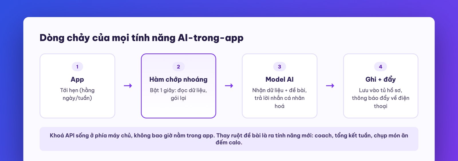
Hands-on: build the smart coach feature for your app following the flow above; write the model's sub-brief yourself in your brand voice; test on a real device to see whether push notifications arrive at the right rhythm.
The source course doesn't stop at one app, and the reason is well worth learning: the first app is tuition; from the second app on you see the profit. Two more apps are built in the course: CalTracker (photograph food, AI counts calories, exactly the million-dollar app model mentioned above) and a forest-tree Pomodoro app (a 25-minute focus timer, and each finished session grows a tree in your own forest, all kinds of trees from pine to cherry blossom to crystal trees, the tree wilts if you neglect it, touch a tree and it vibrates lightly and sways as if real).
Three lessons from this repetition, each worth the money:
One, next time is much faster than last time, if you accumulate. App one takes the full groping process; app two goes one and a half times faster because CLAUDE.md has thickened with your tastes and the stumbling points have become rules; app three nearly glides. The peak of accumulation is the last step the source course takes: writing a template CLAUDE.md for building apps: the machine proactively asks back a series of questions (what the app does, for whom, how the five design layers are filled in, what aesthetic style), and once it has all the answers it runs the full process on its own: build, test itself in Chrome, build the database in the standard way, run a security audit, and only then invite you to test on a real device. Sounds familiar, right? It's the “package the process into a skill” thinking from course one, applied to the app-making trade itself.
The question set in our template CLAUDE.md, for you to copy and edit: (1) what pain does this app solve, and for whom; (2) what is the core function in one sentence; (3) what rewards the user in the core loop, and in how many seconds; (4) list at most five accessory features, ranked by importance; (5) how many screens, and name each one; (6) what is the retention hook, and what rhythm of push notifications; (7) what app or website is the aesthetic anchor, with screenshots; (8) does it need login and cloud data, or does the first version run locally; (9) is there any AI feature, describe the flow; (10) who tests the first version, and how many people. The machine asks in turn, you answer by voice, and once question 10 is answered it runs the full process. A whole app design session shrinks into a 15-minute interview where the interviewer never forgets to ask a question.
Two, aesthetics have their own tricks for apps. To get a beautiful app without hiring a designer: screenshot an app with taste (the source course borrowed Apple's design taste) and give it to the machine as the aesthetic anchor, just like the “give a reference image” lesson when building the web in course one: borrow the corner radius, spacing and font size, while the content is your own. For in-app graphics (the set of trees, icons, badges): generate them with an AI image tool, but remember the stumble already paid for on your behalf: generate one at a time, with a transparent background, don't ask it to generate a whole grid of characters in one image and then cut them, because cutting always lops off heads and limbs.
A side lesson, but worth the money, from the forest-tree app: an image-heavy app needs a compression step. An AI-generated tree set looks gorgeous, but each image weighs megabytes; stuff them all into the app and it bloats, weak devices stutter, and users on slow networks wait forever. Before locking the build, add a command as a habit: “review all images in the app, compress them to their exact display size, and report the size before and after.” The app gets several times lighter from a single sentence. The general principle for any image-heavy app: store each image at the size it displays, and don't make people's phones carry a 4K image to show a 200-pixel frame.
Three, the further along you go, the more the human's work shifts to testing and approving. Looking back at the build log of the three apps, you'll see the time ratio change completely: the first time the person is busy the whole session; by the third, the machine does most of the work while the person mostly holds the phone to inspect, unloads feedback bursts, and approves the security. That's exactly the trajectory of “the human role sliding up to briefing and being accountable” that the advanced course described; your new trade is product director, not typist.
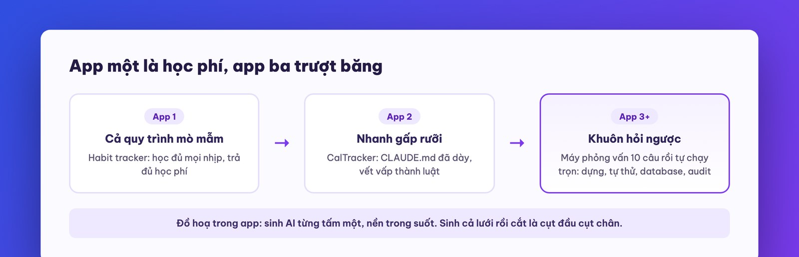
Hands-on: build a second app that's very different from the first (easy suggestion: forest-tree Pomodoro, or an app that scores meals), and measure how much faster it goes than the first; then ask the machine to distill the whole process into an ask-back template CLAUDE.md so the third time you only answer questions.
The app is about to have strangers really using it, which means it's time for the most serious lesson of this course series to come back: security checks with a clean session. You learned the principle in the advanced course; this part is the version applied to mobile apps, with a few notable differences.
The standard process, run at the rhythm you've learned: open a brand-new Claude Code session, with no context from the build (type /clear to be sure), paste the security audit prompt (the framework given in the advanced course, part 8), have the machine scan the whole project and return a findings table ranked by severity. Read the table, have it patch from the top down, then run a second round with another clean session. The second round isn't for show: real building experience shows that the patches from round one occasionally create new bugs (a real case in the source course: after fixing how login credentials are fetched, something elsewhere that was green turned red). Security is a loop, not a checkbox.
Four places where a mobile app needs closer inspection than the web:
A perspective to ease the frustration of the paperwork in the next part: the App Store review process is itself a free layer of security checking. Apple and Google inspect your app with both machines and people: excessive system permissions get questioned, overstated descriptions get sent back, and apps that crash during testing are rejected. Annoying, yes, but that very layer of inspection is why users dare to install unfamiliar apps from the store. If you do the audit loop carefully at home first, their inspection becomes a confirmation station, not a hurdle.
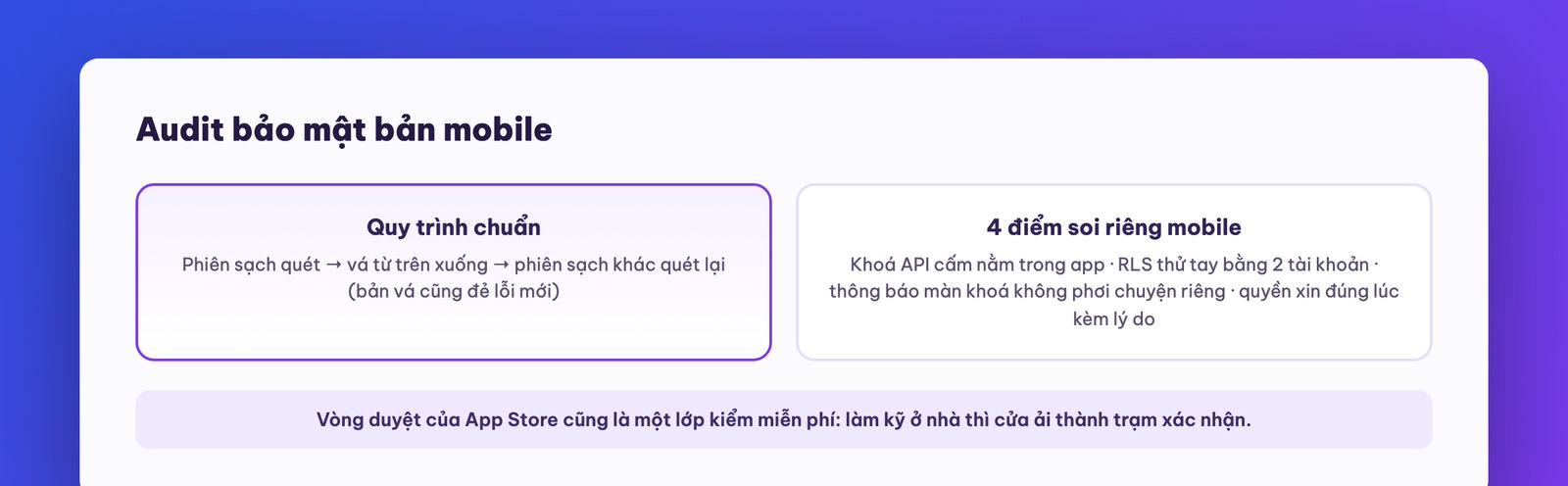
Hands-on: run both audit rounds on your app in full; do the two-account test yourself; and review the content of every push notification with the eyes of “what can the person sitting next to me read.”
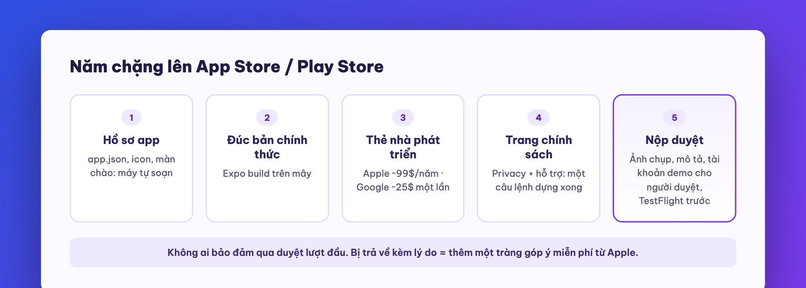
The final stretch, and to be honest from the start: this is the least fun stretch of app making, not because it's hard but because it's heavy on procedure. The good news: the machine can do most of that procedure for you; you only need to understand the map so you don't get lost. The map has five stops:
Stop 1: prepare the app's “paperwork.” An app going to the store needs a set of birth documents: an info file (app name, identifier, version number), icons at the standard sizes, and a splash screen. All of this: “prepare app.json and eas.json for the official release, review system permissions and declare them in full” is something the machine writes itself and patches where gaps remain (including hard-to-foresee things like “if the app uses the camera, you must also declare the reason for using the microphone”). The icon and splash screen can also be generated by the machine.
Stop 2: package the official build. The version you've been running through Expo Go is the “in the making” version; to go to the store it must be cast into a solid block: an optimized build that runs fast and can't be hot-edited. Expo handles the whole casting step on their servers (the free plan casts slower than paid plans, but a short wait is fine). The machine hands you the commands; the only caution: run the command in the right project folder, and if unsure, tell the machine to “include the cd command to be safe.”
Stop 3: two developer cards. Apple Developer (annual fee, around $99 a year) and Google Play Console (one-time fee, around $25). Registration requires identity verification, and here's a real time-saving tip: register with a company domain email (like name@yourcompany.vn), and Google's verification goes noticeably faster than with a regular personal email. Play Store also requires you to have a real Android device to test the app: their rule, so plan ahead and avoid being caught off guard.
Stop 4: the required policy pages. Both stores require the app to have a privacy policy page and a support page accessible on the web. It sounds grand; in practice it's a coffee break: “read Apple's policy requirements, write the privacy policy page and support page for app X, and build them on the company website.” For anyone who has followed this series from the start, building a static web page is already a one-command job. The ideal page address shares the domain with the registration email, to keep the records consistent.
Stop 5: fill in the submission page and press the button. Go into App Store Connect (or Play Console) and work from the top down: a set of screenshots at the right sizes for both iPhone and iPad (the machine opens the app and takes the full set for you), the description and keywords (the machine drafts, you approve the voice), choose the age rating, declare the price (free or paid), and one easily forgotten item: a test account for the reviewer: a real person at Apple will log in to your app to check, so you must leave a demo account with a password for them. When everything is done, press submit, and wait.
Before pressing submit, run through a ten-item checklist to be sure, each a yes-or-no question: (1) has the app passed two clean-session security audit rounds; (2) has the full sign-up flow and main usage flow been tested on a real device; (3) do the icon and splash screen display correctly on both light and dark backgrounds; (4) can every screen be exited, with no dead ends; (5) are the privacy and support pages accessible; (6) does the reviewer's demo account log in and come with sample data to explore; (7) are the screenshots the right size for each device type; (8) does the app description avoid promising more than the app does (the review team looks closely at this); (9) do the age rating and system permissions declared match reality; (10) is there a channel to receive user feedback (a support email that's actually read, not a ghost mailbox). Press the button only when all ten are green.
A bit more on closed testing because it's worth it: TestFlight (Apple's) lets you invite up to thousands of testers through a single link, the app updates itself whenever you push a new build, and testers can send feedback right inside the app. The standard scenario for an app for regular customers: in week one, invite company staff to install (a dozen people, exposing operational bugs); in week two, invite a group of your closest customers (a few dozen people, exposing experience bugs); gather the two rounds of feedback into two big feedback bursts for the machine to fix, and only then submit for official review. One more feature of the Expo ecosystem worth knowing: over-the-air updates let you push small fixes to users' devices without going through review again, which saves you from waiting on a review for the sake of fixing one line of text.
Two reminders to keep expectations right. First, no one can guarantee an app passes review on the first try, even veterans; being sent back with a reason is common, so fix it per the reviewer's guidance and resubmit, and treat it as one more free feedback burst from Apple. Second, don't submit a build that no one but you has ever used: both stores have a closed testing channel (TestFlight on Apple's side) where you send a link for a small group of acquaintances to install first; a week of closed testing with a dozen real people will reveal things you're blind to, and the review team will have less reason to send your submission back.
Hands-on: run stages 1 and 2 for your app (you can do both without a developer account); sign up for the account if you're serious; build the policy page with a single command; and make a list of 10 people you know for a closed beta.
We close the course with the part we think is worth the most to you: once you've learned to build apps, where your business can use that skill to make money, and where to stop.
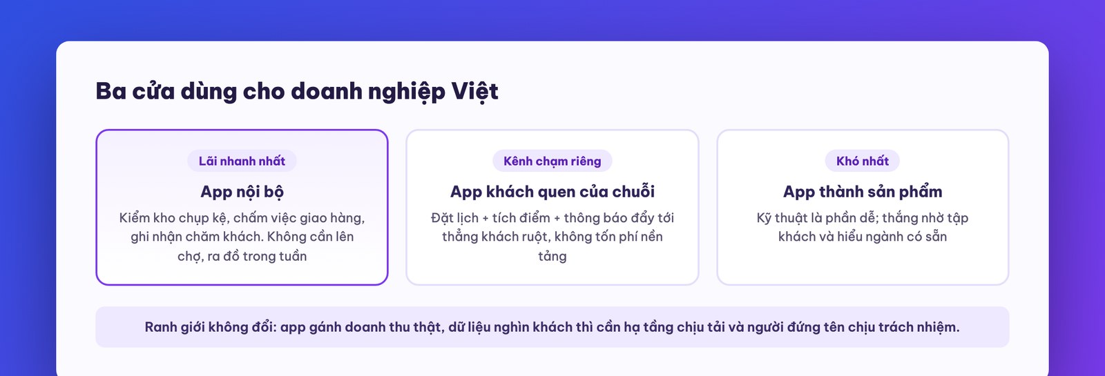
Three routes you can use right away, ranked by how safe a bet they are:
Let's describe one sample internal app in detail so you can see how close this route is: an end-of-day stock-check app for a store chain. Core function: staff photograph the shelves, the app uses the same CalTracker skeleton from Part 5 to recognize and count items, compares against the stock in the system, and flags any mismatch. Core loop: after the photo, you see the reconciliation result right away, and green means it's safe to close the shift. Hook to come back: a 9 p.m. notification reminding the evening shift they haven't checked yet. All of it is within what this course teaches, built over a few evenings, and anyone running a chain can work out the value themselves: every percent of shrinkage caught early is cash in hand. This is exactly the kind of job we recommend starting with: the problem you know best in your own house, where mistakes get fixed in-house and the value is measurable right away.
Here's a hypothetical calculation for route two so you can see the money side: a spa chain with 20 branches, each with 150 active regulars, 3,000 customers in total. A booking + loyalty app built yourself following this course: the running cost of the app (database, push notifications, domain) at that scale falls somewhere between a few hundred thousand and a little over a million VND a month, less than the chain's ad budget for a single day. In return, every push notification reaches your 3,000 loyal customers with no platform fee, automatic rebooking reminders bring customers back more steadily, and the behavior data (which customers haven't visited in a while, which treatment plans were abandoned) sits in your hands instead of in an intermediary booking platform's. The break-even point of a regular-customer app like this usually isn't about “selling the app” but about one extra percent of customers coming back each month. That's the right way to calculate when you weigh route two.
And the boundary, repeated one last time to close the course: a self-built app works well for the three routes above at the trial stage and at a small scale. When the app starts to carry real revenue, hold data for thousands of customers, and run peak-season promotions that can't afford to go down, the problem changes weight class: you need infrastructure that handles load, a backup process, someone on call and someone whose name is on the responsibility. You bring a trial version that customers have already approved, plus your own industry knowledge; MONA's engineers handle turning it into a system that lives long. That's exactly the division of roles that 14,000 projects since 2016 have taught us. Call 1900 636 648 or send your idea to info@themona.global, and in the first 30-minute session we'll tell you straight: how far you can go on your own, which part is worth hiring out, and the real numbers for each path.
There's one post-launch job that anyone running a business must not skip: measuring. At minimum three numbers, checked weekly: the number of active users (not downloads, since downloads are the most vanity number in the app world), the 7-day return rate (whether your hook to come back is sharp enough), and the drop-off point (which screen users leave most, which is your next fix). All three can be read from the app store's admin page plus a few simple queries on your Supabase database, and you already know whom to ask to run the queries. An app that isn't measured is an app run on feelings, and feelings tend to flatter the owner.
Can someone who can't code really build an app with Claude Code? Yes, and this course is designed for exactly that person: every action is a command in plain language, and every error is handled by pasting it verbatim to the machine. Where you need to be good is designing the five layers and the feedback rounds, two things that depend on understanding users, not on code.
How much does it cost to build an app with Claude Code? A version that runs for you and a small team: a Claude Pro plan (a few hundred thousand VND a month) plus free-tier services (Expo, Supabase) is enough. To go on the app stores, add developer accounts (Apple about 99 USD a year, Google about 25 USD one time). AI features inside the app cost extra in API fees per call; at small scale it's pocket change.
How long until the first app? At the course's pace: one session for a demo app running on a real device, one to two days for a complete app with a database and login, plus a few days of waiting if you submit to the app store. The second app is much faster thanks to the system you've built up.
Should I build for iPhone or Android first? With Expo this question almost disappears: one codebase ships to both. The order of store submission depends on your customers; the Vietnamese market leans Android in numbers and iOS in spending power.
Does an internal app need to go on the App Store? No. An internal distribution channel, or a web app installed as a home-screen shortcut, is enough for your team, and you skip the whole paperwork stage. Only go to the store when the app is for the general public.
Building apps with Claude Code is a skill that compounds with use; your second app will be about one and a half times faster than the first. The next course in the series: NotebookLM for work, the tool taking off in Vietnam that turns your company's documents into a Q&A assistant and a listenable news digest. See you there.

CEO & Founder · The MONA
The founder of The MONA built a service company of 60+ staff with 14,000+ projects delivered. Khánh Hùng shares his thinking on building self-running systems, automating a business, and the real lessons behind MONA's projects.
 664




Professional website
design services
Own a website with a beautiful, 100% exclusive design and a lifetime warranty, with the ability
to expand features flexibly as your business grows, starting today!






 MONA will never sell your information or send you spam


 MONA will never sell your information or send you spam
