
 MONA OS 2.0


 Tự động hoá doanh nghiệp
 Cẩm nang SEO
 Digital Marketing
 Kinh nghiệm thiết kế website
 Hạ Tầng Server
 Giáo dục



 VI
 EN





Message us on
Zalo Official


 ProductsNew

 ProductsProducts
 Mới ra mắtKHA AI 2027App tự edit video, tự đăng mọi mạng xã hội, 2 phút mỗi ngày









 Website designLooks good and wins customers over.
SEO servicesBrings in customers searching for exactly what you sell.
 Tư vấn digital marketingKéo khách từ nhiều kênh, đo bằng số thật.
Corporate video productionVideos introducing your company, factory and team.
 NewAI video productionCompany story films made with AI.
 Custom software developmentCRM, ERP and HRM built for your business.
 Viết AI Agent theo yêu cầuĐặt riêng một trợ lý AI cho đúng việc của mình.
 Tư vấn chuyển đổi AIĐưa AI vào vận hành của cả công ty.
NewMONA LMSManagement for centers and schools.
MONA SkillHubInternal training for company staff.
 NHTQ systemEnd-to-end China–Vietnam shipping operations.
MONA JMSManagement for gold, diamond and pawn shops.
 MONA E-LearningA website with every feature you need to sell courses.
 How to sell online courses (course)More than 30 free lessons on selling courses on autopilot.
 MONA Cloudmonacloud.vnServers to get your apps and websites running.
 MONA Basemonabase.vnPostgres database, sign-in and file storage.
 MONA Mailmonamail.vnSend OTP, order and invoice emails from your software.
 MONA Paymonapay.vnAccept bank transfers via VietQR and notify your software when the money arrives.
 MONA eInvoiceComing soonIssue e-invoices that meet tax standards.
Gấu CườiTrả lời khách 24/7 trên web, Fanpage, Zalo và thu lead cho sale.
 Gấu TeleSalesGọi điện tư vấn, chăm khách như tổng đài viên thật.
Dê CườiTư vấn và chốt đơn cho shop ngay trong khung chat.
Gấu WebmasterNhắn nhóm Zalo là website được sửa xong.
 Gấu Pháp ChếSoạn hợp đồng, rà điều khoản trong vài phút.
 Gấu Báo GiáLên báo giá đúng mẫu và gửi khách ngay.
 AI chăm sóc khách hàngTheo dõi và giữ chân khách hàng cũ.
 Gấu Tuyển DụngLọc hồ sơ, hẹn lịch, phỏng vấn ứng viên.
 Mới ra mắt
KHA AI 2027
Xây kênh chuyên gia 2 phút mỗi ngày
Quay bằng điện thoại, AI tự edit video, tự đăng lên 16 nền tảng và tự trả lời bình luận, tin nhắn.
311.630lượt xem trên kênh CEO MONA sau 17 ngày
 Anh Khánh HùngCEO MONA đang dùng mỗi ngày
Xem app làm được gì
 AI
Gấu Cười MONA ĐANG TỰ XÀITrả lời khách 24/7 trên website, Zalo OA, Messenger và thu lead về cho sale.
Dê CườiChốt đơn bán lẻ và sàn: Shopee, TikTok Shop, web. Chăm cả khách sỉ, đại lý.
Gấu WebmasterCập nhật nội dung, tối ưu SEO website mỗi ngày.
Gấu TeleSalesGọi điện tư vấn, chăm khách như tổng đài viên thật.
Gấu Tuyển DụngLọc hồ sơ, hẹn lịch, phỏng vấn ứng viên tự động.
AI chăm sóc khách hàngGiữ khách cũ, cứu lead đã rớt cho phòng kinh doanh.
Gấu Pháp ChếSoạn hợp đồng, rà điều khoản trong vài phút.
Gấu Báo GiáLên báo giá đúng mẫu, gửi khách ngay khi có yêu cầu.
 Chuyển đổi AI toàn phầnGiải pháp tổng cho doanh nghiệp, 3 lớp triển khai.
 Viết AI Agent theo yêu cầuĐặt riêng một con AI gánh đúng nghiệp vụ của bạn.
 Custom softwareCRM, ERP and HRM with built-in AI automation.
 SEO & AEO thời đại AIĐược Google lẫn AI trích dẫn, không chỉ xếp hạng.
 Kiến thức AI cho doanh nghiệpBài phân tích, hướng dẫn ứng dụng AI vào vận hành.
 Free AI courses
 AI tools at work
App mới · KHA AI 2027
Xây kênh 2 phút mỗi ngày
AI tự edit video, tự đăng mọi mạng xã hội
Free consultation, 8am–10pm every day

18 March, 2023
Website fonts are often overlooked when a business builds its site, and that is a mistake. Everything that appears on a website should be planned, and the right font says a lot about your brand and shapes how people experience your pages. So which fonts work well on a website? Read on as MONA Media walks you through the details below.
The right font makes a website look more professional. It also ties the site to your brand identity, so your brand looks more polished and earns more trust from visitors.
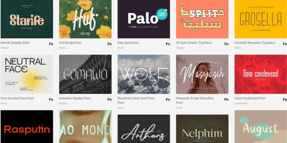
Imagine visiting a company website to learn about it, only to find the text set in a dull or dated font. That hurts the experience a lot, and most people won’t bother reading further. Headings set in an overly fancy font, with no restraint, are just as off-putting.
That’s why choosing a font deserves the same care as choosing images and colours. It keeps your brand looking consistent and professional, and it makes the site easier to use.
On a website, text does more than carry content. It directly affects how people use the page. Headings, body copy and call-to-action buttons each play their own part in guiding readers and keeping them on the page. Once you understand the different types, it gets much easier to write content that is clear, readable and effective. This also matters when you run full-scope website SEO services, so your site works well for people and ranks well on Google.
In design you often hear two terms: font and typeface. Put simply, a font is a specific set of characters. There are many fonts, and each one belongs to a typeface. For example, in Microsoft Word one of the fonts we all know best is Arial Regular.
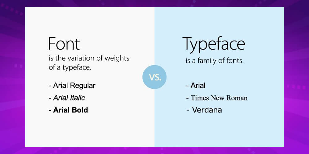
In design, when you want to capture the exact mood of an image and tie it closely to a brand or message, font matters a great deal. Vintage or nostalgic imagery, for example, often uses a calligraphy font. Today, websites and graphic design tend to favour minimal, sans-serif fonts with thin strokes.
Typeface is the font family: a group of fonts that share the same design. It is a broader idea and is not limited to one shape or size. The Arial typeface, for example, includes Arial Black, Arial Bold and so on. These are all basically Arial, but each differs from the original in some way, so they are grouped into one “family” (font family), which is called a typeface.
Grouping website fonts this way does three things:
You don’t need lots of special fonts to make a website stand out. Using the right ones in the right places is enough. Here are some common, good-looking website font styles to consider:
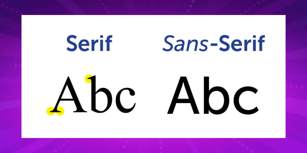
Default fonts usually have a simple, clean design that is easy to read. You can also add a font of your own. On most websites, though, body text is set in serif or sans-serif fonts.
Font Serif is a web font style with fine strokes and small strokes (serifs) at the ends of letters. It is common in printed documents, official records and scientific papers. It suits news sites and other sites built mainly to share information, and it gives content a more formal, refined feel.
Sans serif is close to Arial: a font without serifs. Its strokes are even and slightly thicker than a serif’s. It is also used mainly for body text.
There is no rule saying a website must use sans serif or serif. But marketers have found that news-style sites with long articles usually stick to these two, because they are easier on the eyes. These two default styles also make a site look more formal and professional. Creative sites, on the other hand, should play with them more, for example by changing colours or adding effects, to match the character of the site.
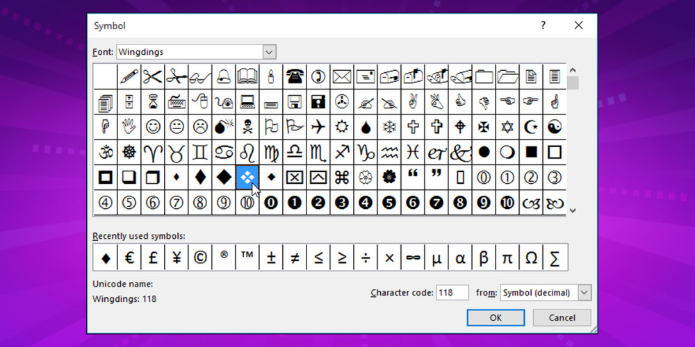
Symbol fonts are often used to mark out special content. Symbol fonts are mostly decorative. You may know them by names like Webdings and Wingdings. They are hard to use on the web because they contain only special symbols. Some sites that offer sample documents or forms may use them.
Our advice is to use symbol fonts sparingly. Even though they are meant to decorate, the symbols are plain and haven’t evolved much, so they rarely add much visual appeal. Used carelessly, they can distract readers from the content and make the page feel cluttered.
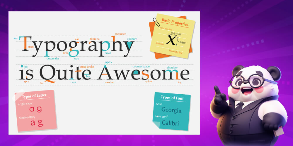
When building a website, a business can also create its own custom font . These fonts are designed specifically for the brand and are more distinctive than default fonts. They decorate, carry content and get the company’s message across at the same time. A custom font carries a strong brand signature, which helps people connect with and recognise the brand. These fonts are rarely used for body text and work better for headings. They also show up in website graphics, billboards and the like, which is why they are often heavily stylised.
Another stylised font type is handwriting fonts. These are designed to look like handwriting. They are more restrained than custom display fonts but still largely decorative. Handwriting fonts give a soft, relaxed feel. Sites focused on messages, humanitarian work or charities can consider them, and fashion sites can use them for an elegant, delicate look.
There are many fonts to choose from, and every business will approach website designin its own way. Still, there are a few common requirements you can use as a guide. They give you a solid basis for making a better choice:
First, the font must be clear and easy to read. A typical size is 12 to 14 so readers can see the text comfortably without leaning in to the screen. Use a regular font for article body text. Avoid decorative fonts across a whole article, as they tire the eyes. Also avoid using too many symbols, which pull readers away from the main content. Colour and formatting need the same care.
Second, decorative fonts should only be used or created to fit the website’s concept. Be careful with decorative fonts. A special font that clashes with the concept of the whole site does nothing for your brand identity.
Finally, everything needs to fit together. Brand imagery, colours, layout, site concept and fonts should all fit together from the start. Use fonts from the same typeface for your site content. That gives you variety while keeping everything consistent.
Below is a list of Vietnamese-friendly fonts that are widely used on websites, put together by MONA. You can use them as a starting point for your own website content:
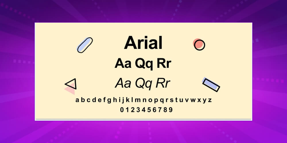
Arial is a font almost everyone knows. It belongs to the sans-serif group and displays content clearly and legibly. If you simply want content that is easy to read and user-friendly, Arial is the best choice.
Courier New was the go-to font for newspapers and old film scripts. Like Times New Roman it is a serif font, but it doesn’t feel as dull or dated. You can use it for certain headings or special content. Courier New can give an artistic, slightly vintage feel.
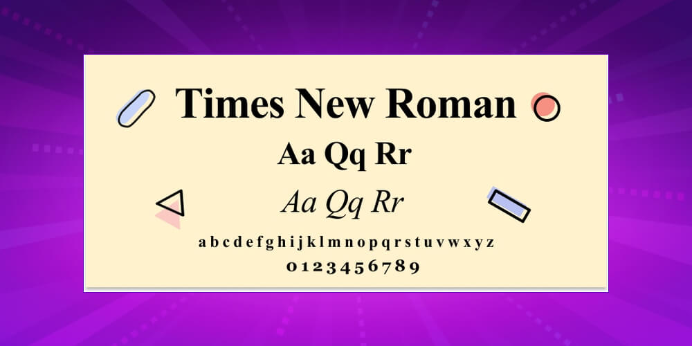
Another familiar font is Times New Roman. It belongs to the serif group. Its simple design makes your content easy to follow. Some people now feel it looks dated, especially on modern business websites, so you may want to consider a fresher font for your site.
Another sans-serif font like Arial is Verdana. It is easy on the eyes, with thin strokes, but slightly wider than Helvetica or Arial. It is often used for articles on online news sites.
Tahoma is another sans-serif font, simple and formal, which is why it is used on most mainstream websites. What sets Tahoma apart from Arial and Helvetica is its tighter letter spacing, so text looks more compact and less stretched out.
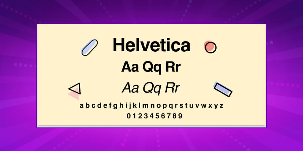
A sans-serif font similar to Arial, but Helvetica with thinner strokes, and highly rated by Vietkey. Many recent minimal, modern designs also use it. Helvetica looks good and, above all, elegant. It is still easy to read and never so thin that it strains the eyes. If Arial feels a bit “heavy” to you, try Helvetica instead.
Also a sans-serif font. Calibri feels lighter and younger, and it works especially well for academic content.
If you read English books or textbooks such as those from Oxford, you will often come across the font Garamond . It is widely used in education, so you can draw on that familiarity for an education website. Use it in moderation, though, for headings or to highlight a passage.
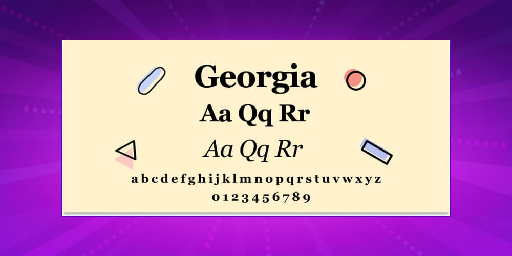
If you read English-language newspapers such as The New York Times or The Jakarta Post, you will often see their websites use Georgia for body text. It is fairly close to Times New Roman but a little more formal. It is used less often because its characters vary in size. One tip: don’t pair it with Times New Roman, as the contrast is too strong and looks off.
Font Bookman originally had a stylised design and was later simplified to make it easier to use. It is also widely used.
Those are the details on the website fonts most widely used today. We hope this helps you pick the right font for your site. In addition, MONA Media is a provider of website design service with a strong track record, so you can trust MONA with the fonts and design of your website. We will build a modern website that gives users a great experience and reflects your company’s identity. Contact MONA via hotline 1900 636 648 or email info@themona.global for advice and answers to your questions.

CEO & Founder · The MONA
Founder of The MONA, who built a services company of 200+ staff with 14,000+ projects delivered. Khánh Hùng shares how he thinks about building systems that run themselves, automating a business, and the real lessons from delivering projects at MONA.
 2,5K


Professional website
design services
Own a website with a beautiful, 100% exclusive design and a lifetime warranty, with the ability
to expand features flexibly as your business grows, starting today!











 MONA will never sell your information or send you spam


 MONA will never sell your information or send you spam
