
 MONA OS 2.0
 Partner with MONA


 Tự động hoá doanh nghiệp
 Cẩm nang SEO
 Digital Marketing
 Kinh nghiệm thiết kế website
 Hạ Tầng Server
 Giáo dục


 VI
 EN



Message us on
Zalo Official


 ProductsNew

 ProductsProducts
 Mới ra mắtKHA AI 2027App tự edit video, tự đăng mọi mạng xã hội, 2 phút mỗi ngày


 Website designLooks good and wins customers over.
SEO servicesBrings in customers searching for exactly what you sell.
 Tư vấn digital marketingKéo khách từ nhiều kênh, đo bằng số thật.
Corporate video productionVideos introducing your company, factory and team.
 NewAI video productionCompany story films made with AI.
 Custom software developmentCRM, ERP and HRM built for your business.
 Viết AI Agent theo yêu cầuĐặt riêng một trợ lý AI cho đúng việc của mình.
 Tư vấn chuyển đổi AIĐưa AI vào vận hành của cả công ty.
NewMONA LMSManagement for centers and schools.
MONA SkillHubInternal training for company staff.
 NHTQ systemEnd-to-end China–Vietnam shipping operations.
MONA JMSManagement for gold, diamond and pawn shops.
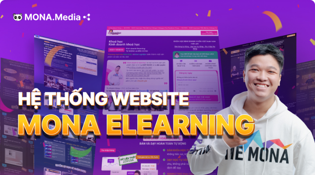 MONA E-LearningA website with every feature you need to sell courses.
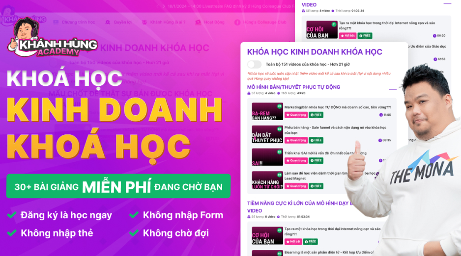 How to sell online courses (course)More than 30 free lessons on selling courses on autopilot.
 MONA Cloudmonacloud.vnServers to get your apps and websites running.
 MONA Basemonabase.vnPostgres database, sign-in and file storage.
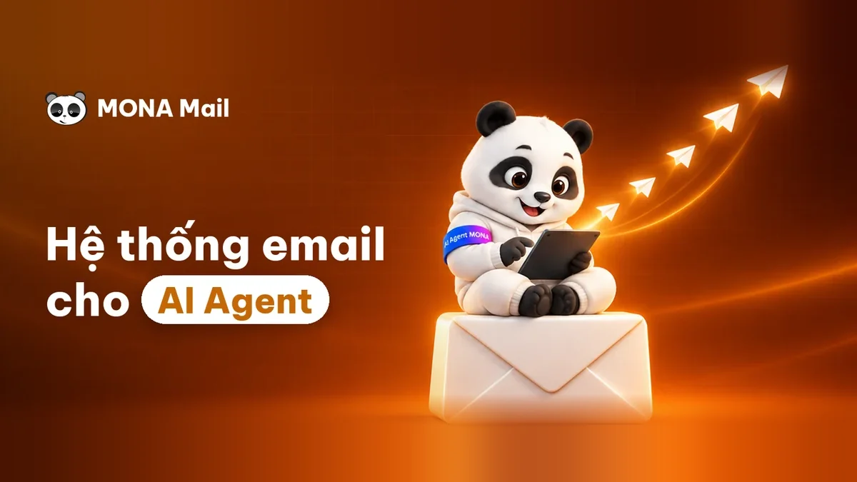 MONA Mailmonamail.vnSend OTP, order and invoice emails from your software.
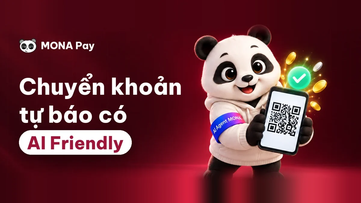 MONA Paymonapay.vnAccept bank transfers via VietQR and notify your software when the money arrives.
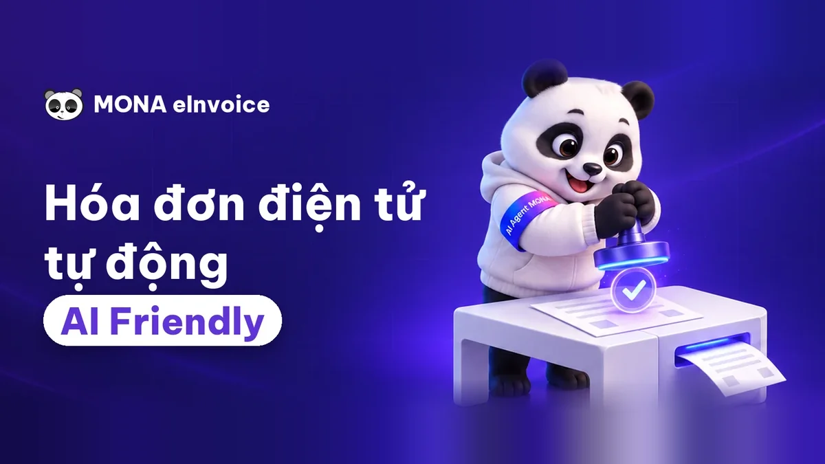 MONA eInvoiceComing soonIssue e-invoices that meet tax standards.
Gấu CườiTrả lời khách 24/7 trên web, Fanpage, Zalo và thu lead cho sale.
 Gấu TeleSalesGọi điện tư vấn, chăm khách như tổng đài viên thật.
Dê CườiTư vấn và chốt đơn cho shop ngay trong khung chat.
Gấu WebmasterNhắn nhóm Zalo là website được sửa xong.
 Gấu Pháp ChếSoạn hợp đồng, rà điều khoản trong vài phút.
 Gấu Báo GiáLên báo giá đúng mẫu và gửi khách ngay.
 AI chăm sóc khách hàngTheo dõi và giữ chân khách hàng cũ.
 Gấu Tuyển DụngLọc hồ sơ, hẹn lịch, phỏng vấn ứng viên.
 Mới ra mắt
KHA AI 2027
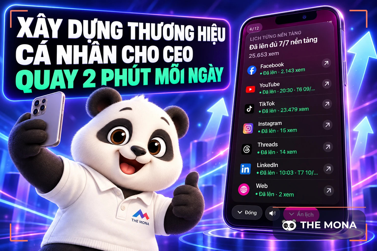
Xây kênh chuyên gia 2 phút mỗi ngày
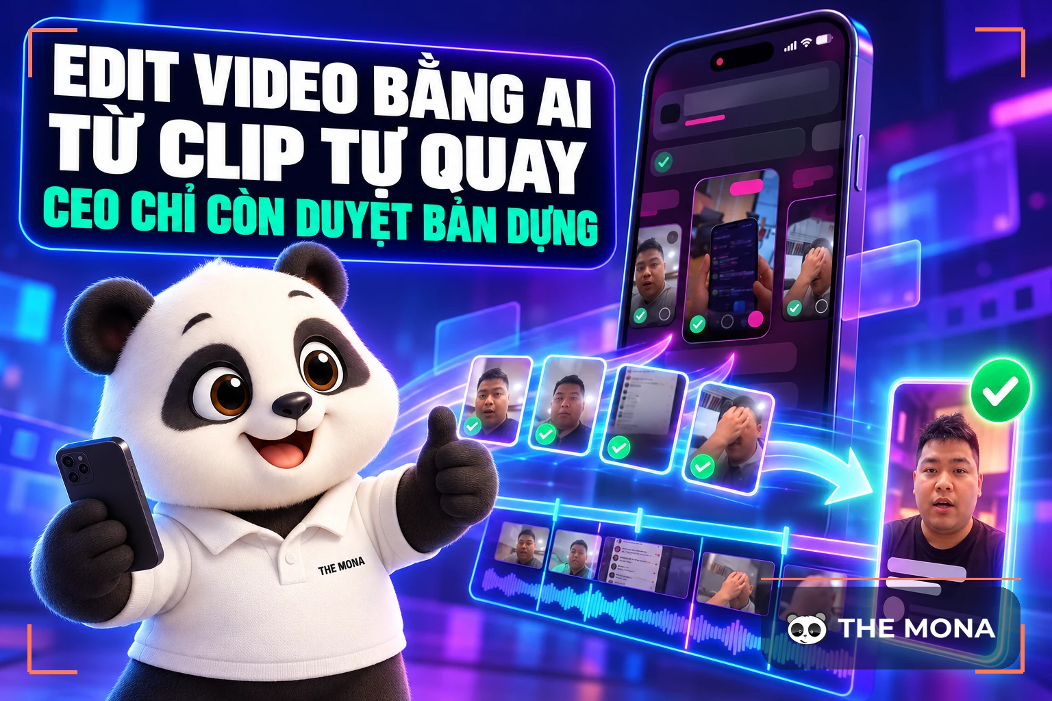
Quay bằng điện thoại, AI tự edit video, tự đăng lên 16 nền tảng và tự trả lời bình luận, tin nhắn.
890.855lượt xem trên kênh CEO MONA sau 36 ngày
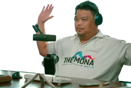 Anh Khánh HùngCEO MONA đang dùng mỗi ngày
Xem app làm được gì
 AI
Gấu Cười MONA ĐANG TỰ XÀITrả lời khách 24/7 trên website, Zalo OA, Messenger và thu lead về cho sale.
Dê CườiChốt đơn bán lẻ và sàn: Shopee, TikTok Shop, web. Chăm cả khách sỉ, đại lý.
Gấu WebmasterCập nhật nội dung, tối ưu SEO website mỗi ngày.
Gấu TeleSalesGọi điện tư vấn, chăm khách như tổng đài viên thật.
Gấu Tuyển DụngLọc hồ sơ, hẹn lịch, phỏng vấn ứng viên tự động.
AI chăm sóc khách hàngGiữ khách cũ, cứu lead đã rớt cho phòng kinh doanh.
Gấu Pháp ChếSoạn hợp đồng, rà điều khoản trong vài phút.
Gấu Báo GiáLên báo giá đúng mẫu, gửi khách ngay khi có yêu cầu.
 Chuyển đổi AI toàn phầnGiải pháp tổng cho doanh nghiệp, 3 lớp triển khai.
 Viết AI Agent theo yêu cầuĐặt riêng một con AI gánh đúng nghiệp vụ của bạn.
 Custom softwareCRM, ERP and HRM with built-in AI automation.
 SEO & AEO thời đại AIĐược Google lẫn AI trích dẫn, không chỉ xếp hạng.
 Kiến thức AI cho doanh nghiệpBài phân tích, hướng dẫn ứng dụng AI vào vận hành.
 Free AI courses
 AI tools at work
App mới · KHA AI 2027
Xây kênh 2 phút mỗi ngày
AI tự edit video, tự đăng mọi mạng xã hội
Free consultation, 8am–10pm every day

18 March, 2023
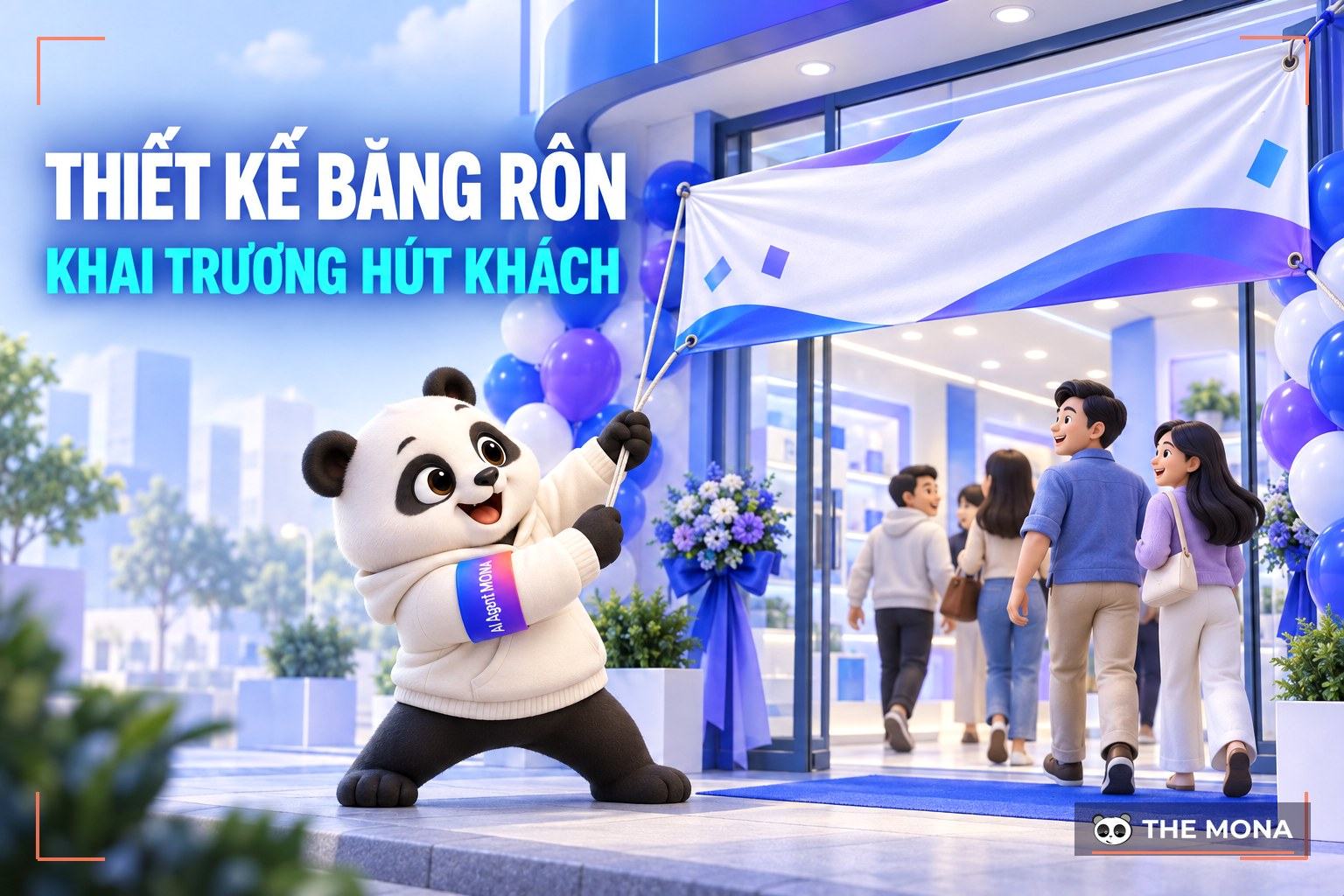
Grand opening banner design how do you promote an event effectively and eye-catchingly? This is a question many shop owners and newcomers to design care about. Whether a grand opening banner attracts viewers and gets them to act depends on many factors such as images, content, layout and colors. In today's article, MONA Media will share with you 7 tips for designing a grand opening banner that are the most attractive and easiest to apply.
Put simply, a grand opening banner is a large printed board or image designed to decorate or hang at the opening events of shops and restaurants. On the grand opening banner design you can show the full message about the promotions and featured products the business wants customers to know. It is also one of the most cost-effective options in a business's offline communication. Nothing fancy or showy: even a simple banner can deliver the full message and drive action.
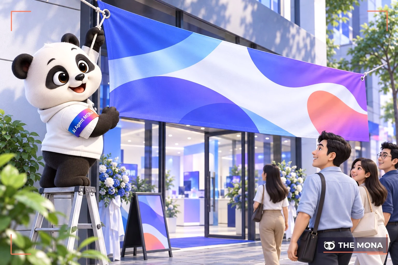
The most important purpose of printed materials like this grand opening banner design is to promote the event. A hanging banner should show customers that the store is opening and has specific offers for the event.
A banner carries all the details: event name, start and end time, target audience, promotions and more. At some opening events, shops combine banners with sound and lighting, music, guests and so on to draw more customers.
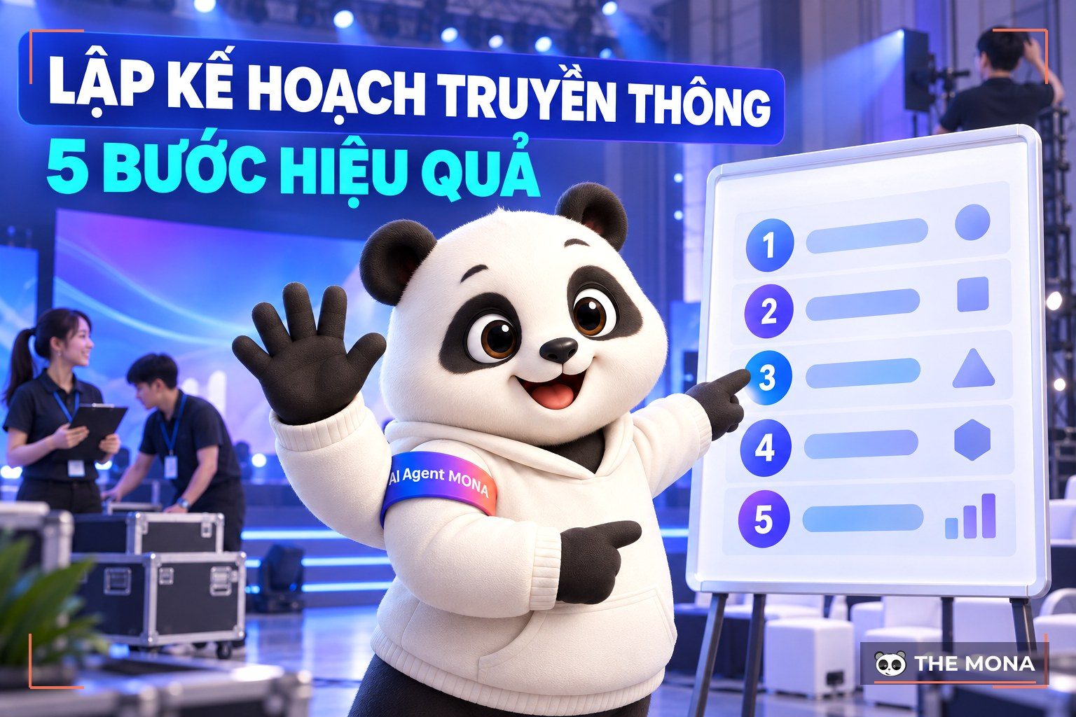
See also: 5 steps to plan an effective communication event
If you look closely, at many large opening events the organizers hang lots of banners along both sides of the road. This is not only for promotion but also guides interested customers to the event. That way, the business saves time, money and staff it would otherwise spend on receptionists to welcome and direct guests.
Besides the basic details, a banner also shows the shop's attractive offers, such as free gifts, percentage discounts, Buy 1 Get 1 and more. This pushes customers to act faster.
See also: 10 steps to build a promotion that blows up your sales
Some banners draw a big crowd the moment they go up, while others are hard to see or simply ignored. Why? A major reason is how the banner is designed.
To create a banner that looks good, catches the eye and works well, pay attention to the following factors.
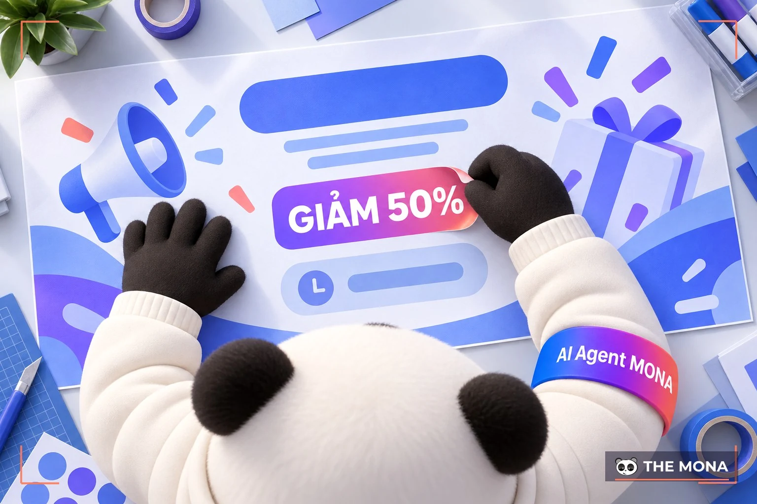
The banner content must include the shop name, products or services, logo, slogan, promotion, time and so on. However, when grand opening banner design you need to keep it short, memorable, easy to understand and with a clear highlight so viewers grasp the information well. Brand identity elements should also be shown with care to make the banner more memorable.
Images are what attract and impress viewers most. So when grand opening banner design, choose representative, sharp images that clearly show the purpose of the message.
Images of staff, work, and products or services must be neat, attractive and authentic to build customer trust. Also keep the content, images, layout and colors in harmony.
How you use and combine colors in a banner is extremely important for harmony and for making the message stand out. Banners usually use bold colors such as red, blue, white, and yellow with black. Depending on the colors of the logo, images and fonts, and on what the shop owner wants, the designer adjusts and matches colors to suit the situation and the brand.
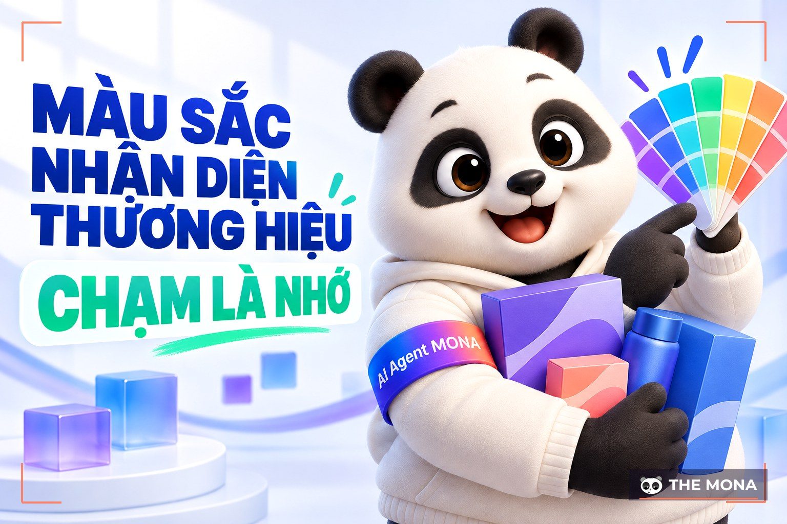
See also: How do colors affect brand recognition?
Fonts are also a key factor in whether a grand opening banner attracts people and delivers the brand message well. When designing a banner, use simple, easy-to-read fonts. The font style should suit the brand, and the more recognizable it is as the brand's, the better.
Whether a message lands depends on the layout. How colors are combined, where large and small color blocks go, where the text sits, and where images and content look best all come down to layout.
Make sure the elements are arranged logically, in harmony and easy on the eye. In particular, the key things customers must see right away should stand out and come first.
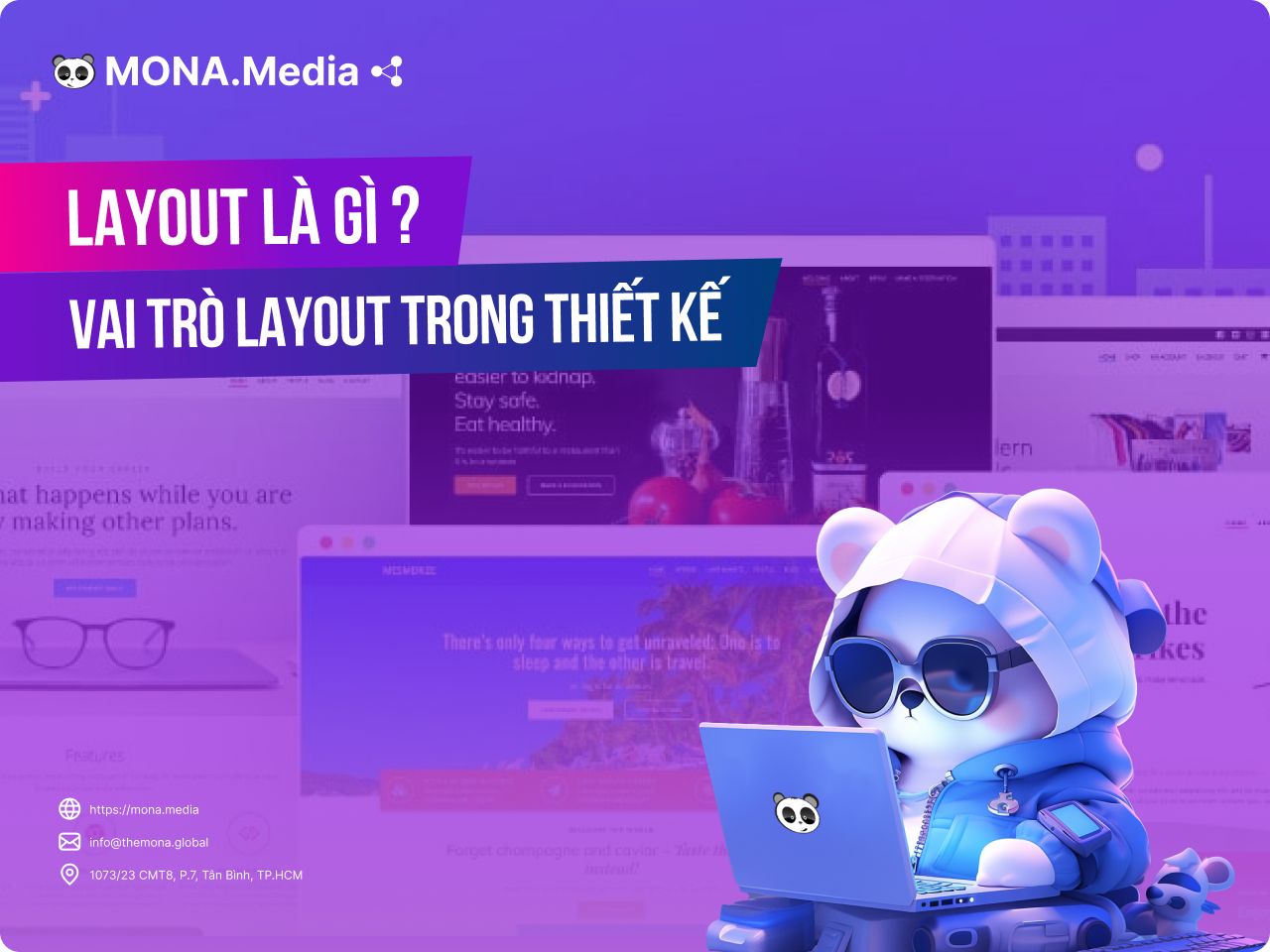
See also: Layout rules in design you should not skip
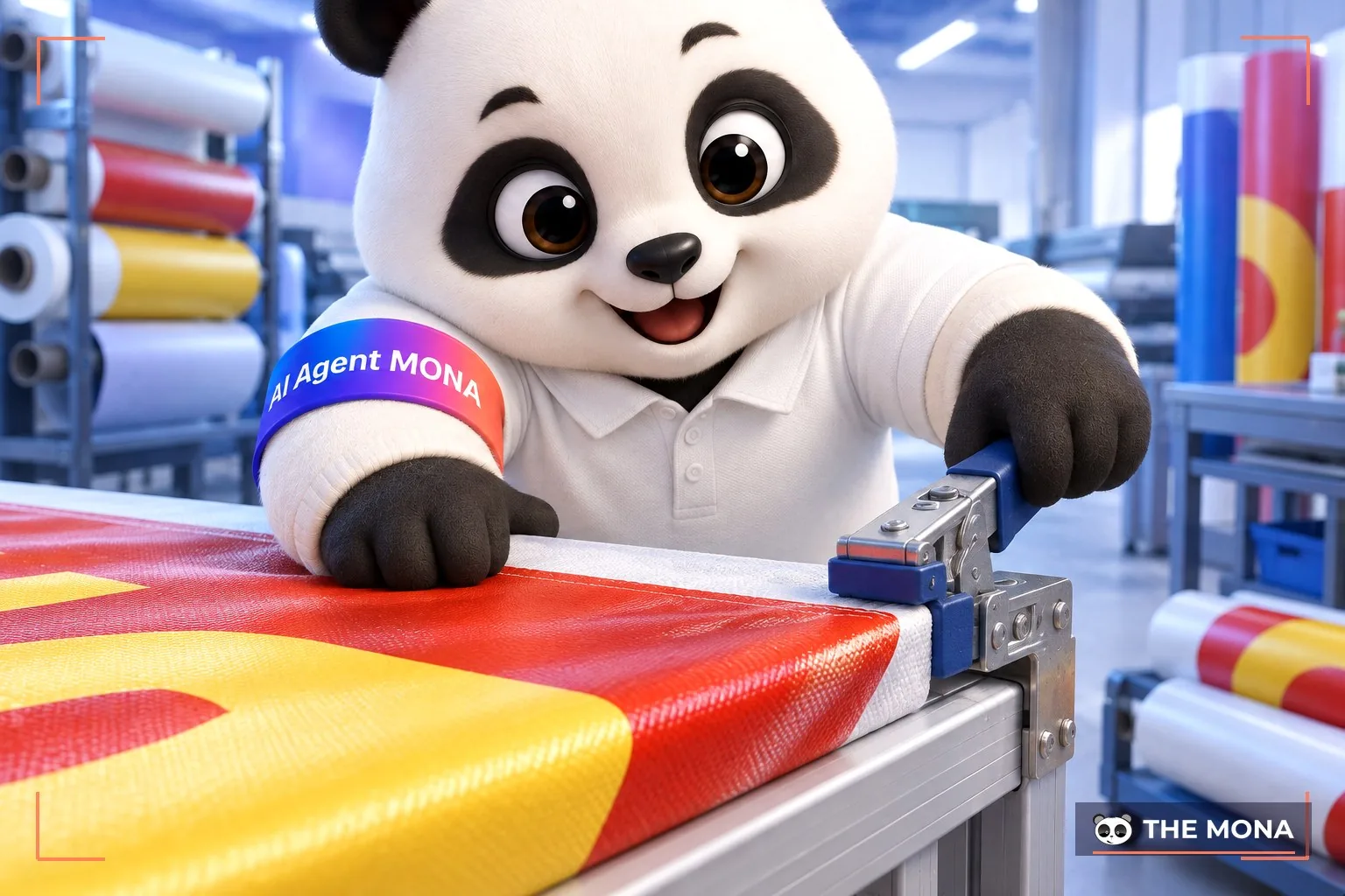
A perfect banner depends not only on content, images, layout and colors but also on the printing material. A design may look flawless, but on different materials the visual effect can be very different. Weather such as rain and sun can also smear, damage or fade a banner and reduce its marketing effect.
So the last important thing to watch when designing a banner is choosing the right material. Effective banner materials include Hiflex and PP.
Besides the key factors above, also pay attention to empty space (white space), effects, icons and so on when designing a banner.
Using banners at a store opening helps attract customers and increase sales. But you need to know how to design a grand opening banner properly: in harmony, eye-catching and with a complete message. We hope the banner design tips above that Mona Media shared will help you a lot!
CEO & Founder · The MONA
The founder of The MONA built a service company of 60+ staff with 14,000+ projects delivered. Khánh Hùng shares his thinking on building self-running systems, automating a business, and the real lessons behind MONA's projects.
 1,5K

Professional website
design services
Own a website with a beautiful, 100% exclusive design and a lifetime warranty, with the ability
to expand features flexibly as your business grows, starting today!





 MONA will never sell your information or send you spam


 MONA will never sell your information or send you spam
