
 MONA OS 2.0


 Tự động hoá doanh nghiệp
 Cẩm nang SEO
 Digital Marketing
 Kinh nghiệm thiết kế website
 Hạ Tầng Server
 Giáo dục



 VI
 EN






Message us on
Zalo Official


 ProductsNew

 ProductsProducts
 Mới ra mắtKHA AI 2027App tự edit video, tự đăng mọi mạng xã hội, 2 phút mỗi ngày







 Website designLooks good and wins customers over.
SEO servicesBrings in customers searching for exactly what you sell.
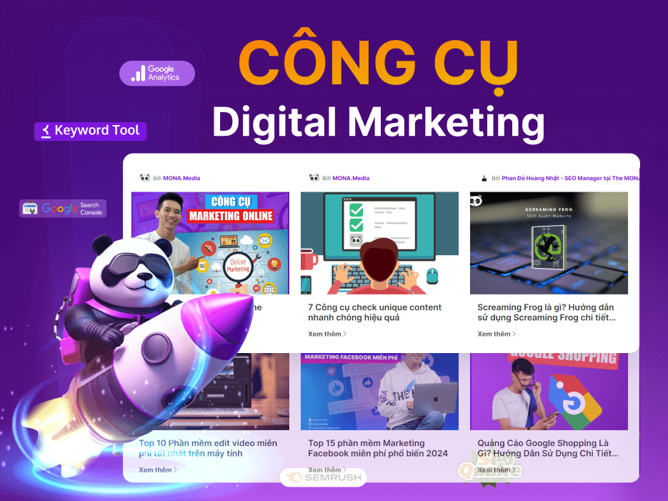 Tư vấn digital marketingKéo khách từ nhiều kênh, đo bằng số thật.
Corporate video productionVideos introducing your company, factory and team.
 NewAI video productionCompany story films made with AI.
 Custom software developmentCRM, ERP and HRM built for your business.
 Viết AI Agent theo yêu cầuĐặt riêng một trợ lý AI cho đúng việc của mình.
 Tư vấn chuyển đổi AIĐưa AI vào vận hành của cả công ty.
NewMONA LMSManagement for centers and schools.
MONA SkillHubInternal training for company staff.
 NHTQ systemEnd-to-end China–Vietnam shipping operations.
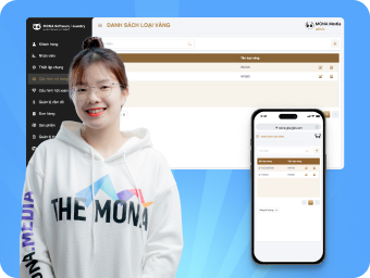
MONA JMSManagement for gold, diamond and pawn shops.
 MONA E-LearningA website with every feature you need to sell courses.
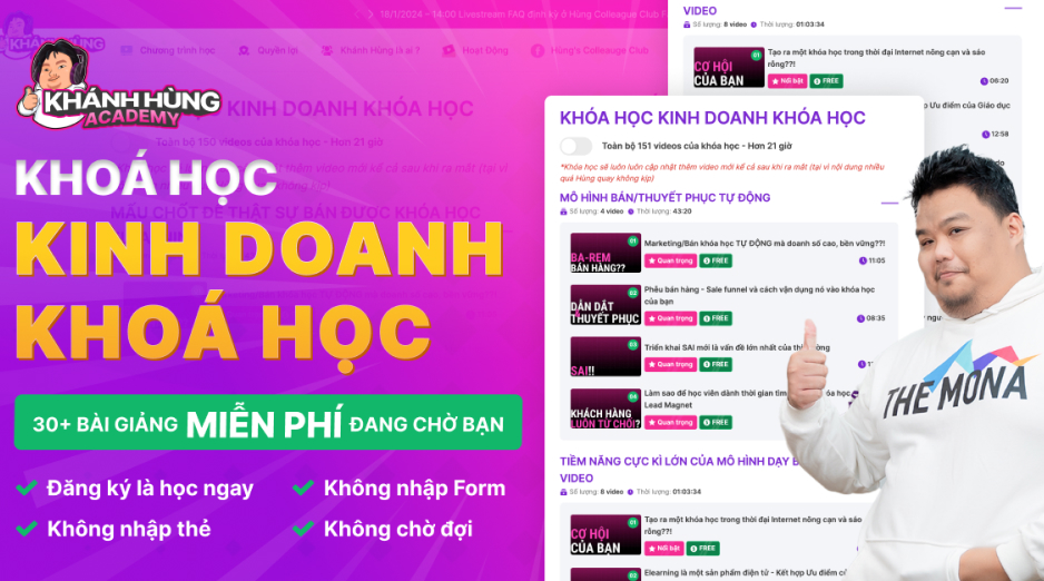 How to sell online courses (course)More than 30 free lessons on selling courses on autopilot.
 MONA Cloudmonacloud.vnServers to get your apps and websites running.
 MONA Basemonabase.vnPostgres database, sign-in and file storage.
 MONA Mailmonamail.vnSend OTP, order and invoice emails from your software.
 MONA Paymonapay.vnAccept bank transfers via VietQR and notify your software when the money arrives.
 MONA eInvoiceComing soonIssue e-invoices that meet tax standards.
Gấu CườiTrả lời khách 24/7 trên web, Fanpage, Zalo và thu lead cho sale.
 Gấu TeleSalesGọi điện tư vấn, chăm khách như tổng đài viên thật.
Dê CườiTư vấn và chốt đơn cho shop ngay trong khung chat.
Gấu WebmasterNhắn nhóm Zalo là website được sửa xong.
 Gấu Pháp ChếSoạn hợp đồng, rà điều khoản trong vài phút.
 Gấu Báo GiáLên báo giá đúng mẫu và gửi khách ngay.
 AI chăm sóc khách hàngTheo dõi và giữ chân khách hàng cũ.
 Gấu Tuyển DụngLọc hồ sơ, hẹn lịch, phỏng vấn ứng viên.
 Mới ra mắt
KHA AI 2027
Xây kênh chuyên gia 2 phút mỗi ngày
Quay bằng điện thoại, AI tự edit video, tự đăng lên 16 nền tảng và tự trả lời bình luận, tin nhắn.
325.883lượt xem trên kênh CEO MONA sau 18 ngày
 Anh Khánh HùngCEO MONA đang dùng mỗi ngày
Xem app làm được gì
 AI
Gấu Cười MONA ĐANG TỰ XÀITrả lời khách 24/7 trên website, Zalo OA, Messenger và thu lead về cho sale.
Dê CườiChốt đơn bán lẻ và sàn: Shopee, TikTok Shop, web. Chăm cả khách sỉ, đại lý.
Gấu WebmasterCập nhật nội dung, tối ưu SEO website mỗi ngày.
Gấu TeleSalesGọi điện tư vấn, chăm khách như tổng đài viên thật.
Gấu Tuyển DụngLọc hồ sơ, hẹn lịch, phỏng vấn ứng viên tự động.
AI chăm sóc khách hàngGiữ khách cũ, cứu lead đã rớt cho phòng kinh doanh.
Gấu Pháp ChếSoạn hợp đồng, rà điều khoản trong vài phút.
Gấu Báo GiáLên báo giá đúng mẫu, gửi khách ngay khi có yêu cầu.
 Chuyển đổi AI toàn phầnGiải pháp tổng cho doanh nghiệp, 3 lớp triển khai.
 Viết AI Agent theo yêu cầuĐặt riêng một con AI gánh đúng nghiệp vụ của bạn.
 Custom softwareCRM, ERP and HRM with built-in AI automation.
 SEO & AEO thời đại AIĐược Google lẫn AI trích dẫn, không chỉ xếp hạng.
 Kiến thức AI cho doanh nghiệpBài phân tích, hướng dẫn ứng dụng AI vào vận hành.
 Free AI courses
 AI tools at work
App mới · KHA AI 2027
Xây kênh 2 phút mỗi ngày
AI tự edit video, tự đăng mọi mạng xã hội
Free consultation, 8am–10pm every day

18 March, 2023
One firm rule for designers and businesses building a brand identity is color. Each color carries its own meaning and expresses a brand's message and character. In this article, MONA Media will walk you through the meaning of brand identity color and how to combine them well.
Color has a strong effect on emotions. When colors are combined well, they help brands raise recognition by up to 85% when they are combined well.
Color does more than attract attention and make an impression. It brand identity color also carries the meaning and message a business wants to convey. That is why, when brand identity design, businesses and the designers involved need to understand what each color means and combine them appropriately.

MONA Media's brand color is purple
This also helps customers remember your brand, associate it with something and trust it more. That puts you 80% of the way to closing a sale. So what does each brand color mean? Let's look at each one in detail.
Brand colors are applied across a business's whole identity system, including:
Choosing which colors to use and how to apply them is a hard problem, especially for non-specialists. And MONA Media is a specialist in company website design and provides marketing solutions. We have advised on communications and built complete brand identities for more than 6,000+ businesses of all kinds. People who build personal brand face this problem too: a familiar color palette helps viewers remember you faster.
100% of our website projects achieve strong brand recognition thanks to the way brand colors work together with the other elements of the identity, such as logo, imagery and content.

The color palette is extremely rich, but a few brand color sets are especially popular with businesses: red, orange, green, yellow, blue, purple, brown, black, white and more. Below is the meaning of the most common brand colors worth knowing.
Red is considered the color with the strongest visual impact. It is commonly known as a symbol of vitality, passion and enthusiasm.
You will see red in famous global brands such as CNN, Redbull, Puma, Coca Cola and H&M. Large East Asian groups also use red in their brand identity to signify luck, royalty, nobility and victory, such as JVC, LG and SCG.
Coca Cola's brand color, with red as the main shade
Besides that, red is also a symbol of blood, fire, speed and danger. This also explains why many science and engineering brands use red in brand logo design.
If 19 out of 100 global brands have used red in their brand identity, blue has been chosen by nearly 30. But unlike passionate, energetic red, blue makes viewers feel comfortable, calm and at ease.
Many large brands and groups also choose blue as a brand color to convey solidity and stability, and to reassure customers. Customers only choose a business's product or service when they truly trust it.

Examples of blue as the main color of well-known brands
In addition, blue symbolizes a business's ambition to aim high and reach the top. Large brands using blue that you may know include Pepsi, Samsung, IBM, Panasonic, Facebook, GAP and Intel.
But distinctive main colors and designs alone may not be enough to attract customers. For customers to buy, they need to know and trust your business. And Branding marketing services is the marketing solution that MONA Media designed for every business that wants to “upgrade” its brand image to be more trusted and more professional.

What does MONA's Branding service include?
And there are many more benefits and offers with just one Branding Marketing service at MONA. So why wait? Contact us HOTLINE 1900 636 648 for the most detailed quote and advice on how the service would work for you.
Green is a color drawn originally from the chlorophyll of nature. That is why, in brand design, green is widely used by brands that make or sell products of natural origin, such as food and tea.
Famous brands with green identity colors include Starbucks, Tropicana and Heineken.
Starbucks brand identity color
Besides freshness and purity, green also conveys wisdom and modesty. That is why many finance brands use it, such as VPBank and Groupon.
Yellow tones are the color of sunshine, expressing cheerfulness, positivity, motivation and creativity. More than 13% of the world's top brands use yellow as their main color to position the brand better.
Brand identity color with yellow as the main shade
Although yellow is a happy, positive color, it can feel “cheap” and is hard to pair with other colors. If you choose yellow, the designer must make sure the color scheme, layout and effects look refined and suitable. Yellow is currently used in the identity of many brands in food and beverage, energy, household goods and more.
Orange is a blend of passionate, fiery red and the positivity of yellow. Combining the two creates a brand identity color that means energy and creativity.
Orange as the Fanta brand color
Besides that, orange is the color of the orange fruit, expressing vitality and freshness.
A brand color set is how you attract readers the first time they click on a website, but content is what keeps customers there. Creative wording combined with images that carry a clear, valuable message is a strength for increasing traffic.
Color doesn't just make a brand look good. It is a “silent language” that fixes emotion, market segment and personality in customers' minds. So how do you blend that palette with your logo, typography, imagery and brand voice into an unmistakable brand identity? That is MONA Media's strength. With its brand identity design service, MONA has built international-standard brand identities for more than 300 businesses across many industries.
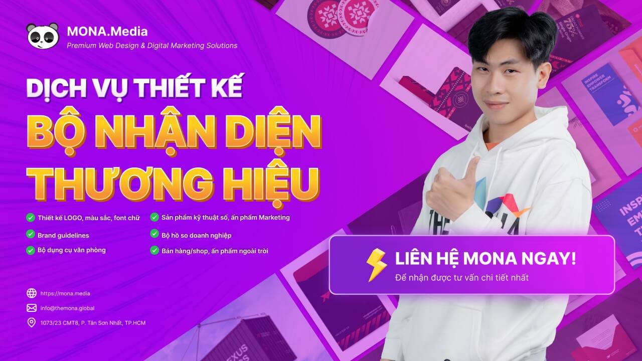
So what does MONA offer with a complete brand identity design service:
With MONA Media, you can build a brand identity that is not only beautiful but also meaningful, helping your business grow and win over customers. CONTACT US cho MONA qua HOTLINE 1900 636 648 to get advice and the most detailed quote.
Purple is a brand color that stands for premium quality, ambition and mystery. It also represents the sacred, the mysterious and the captivating, and is known as the color of truth and eternity.
Different shades give purple different meanings. Dark purple is usually linked to luxury and noble lineage. Light purple expresses courage and nostalgia.
Brands that use a purple palette
This brand color is also used by businesses in many industries and fields, such as:
Brown is a symbol of nature. That is why brands in organic natural food and beauty choose it as their brand color.
Brands that use brown as the main color
Besides the design meanings above, brown conveys durability and purity. However, use it carefully to avoid looking dirty or unclean, which makes a brand look “cheap”.
Black in brand design is the color of nobility, luxury and power. Research shows 28% of the world's top businesses choose black or gray as their brand color.
Brand identity through refined black
When using black in a brand identity, businesses often pair it with contrasting colors such as yellow or white (depending on the case) to make the brand and its message stand out.
White is an enduring symbol of perfection, wholeness, simplicity and purity. It is also the most widely used color in daily life as well as in design and branding. One well-known brand using white as its main color is Apple.
Apple's brand identity color
You will see white in industries such as fashion, apparel, technology and healthcare. White is uncommon in finance, food and beverage, and others.
To win customers, the next important job is marketing. These days, SEO is the most effective way to give your brand fast, strong coverage, thanks to Google, the channel used by 89% of people searching for information today. SEO services is the way to strengthen stronger brand recognition of your business in the most effective and lasting way.
Why are customers always drawn to beauty? They don't always admit it, but polish and professionalism in a brand's image strongly affect buying decisions. From color and layout to every detail on a website, video or document, everything customers see should be carefully crafted.
Some businesses understand this and invest heavily in their image, while others worry it is superficial, expensive and unnecessary. However, research shows that color, imagery and brand design can affect customers' perception and emotions, helping them trust and remember a brand more easily.
So does aesthetics really matter in brand identity? And how can a business use good looks as a competitive advantage? Watch the video below to find out more:
To apply brand colorscorrectly, keep the following in mind as well:
Some colors mean different things in different countries and regions. You can read more about the meaning of brand identity color and use them appropriately. Many other colors are used in brand design, but the ones in this article are the most representative. We hope this article from MONA Media will help you better understand helps you understand brand color palettes and apply them effectively in your own brand identity strategy.
→ You may be interested in: How to combine colors in website design

CEO & Founder · The MONA
Founder of The MONA, who built a services company of 200+ staff with 14,000+ projects delivered. Khánh Hùng shares how he thinks about building systems that run themselves, automating a business, and the real lessons from delivering projects at MONA.
 1,6K


Professional website
design services
Own a website with a beautiful, 100% exclusive design and a lifetime warranty, with the ability
to expand features flexibly as your business grows, starting today!












 MONA will never sell your information or send you spam


 MONA will never sell your information or send you spam
