
 MONA OS 2.0
 Partner with MONA


 Tự động hoá doanh nghiệp
 Cẩm nang SEO
 Digital Marketing
 Kinh nghiệm thiết kế website
 Hạ Tầng Server
 Giáo dục


 VI
 EN






Message us on
Zalo Official


 ProductsNew

 ProductsProducts
 Mới ra mắtKHA AI 2027App tự edit video, tự đăng mọi mạng xã hội, 2 phút mỗi ngày









 Website designLooks good and wins customers over.
SEO servicesBrings in customers searching for exactly what you sell.
 Tư vấn digital marketingKéo khách từ nhiều kênh, đo bằng số thật.
Corporate video productionVideos introducing your company, factory and team.
 NewAI video productionCompany story films made with AI.
 Custom software developmentCRM, ERP and HRM built for your business.
 Viết AI Agent theo yêu cầuĐặt riêng một trợ lý AI cho đúng việc của mình.
 Tư vấn chuyển đổi AIĐưa AI vào vận hành của cả công ty.
NewMONA LMSManagement for centers and schools.
MONA SkillHubInternal training for company staff.
 NHTQ systemEnd-to-end China–Vietnam shipping operations.
MONA JMSManagement for gold, diamond and pawn shops.
 MONA E-LearningA website with every feature you need to sell courses.
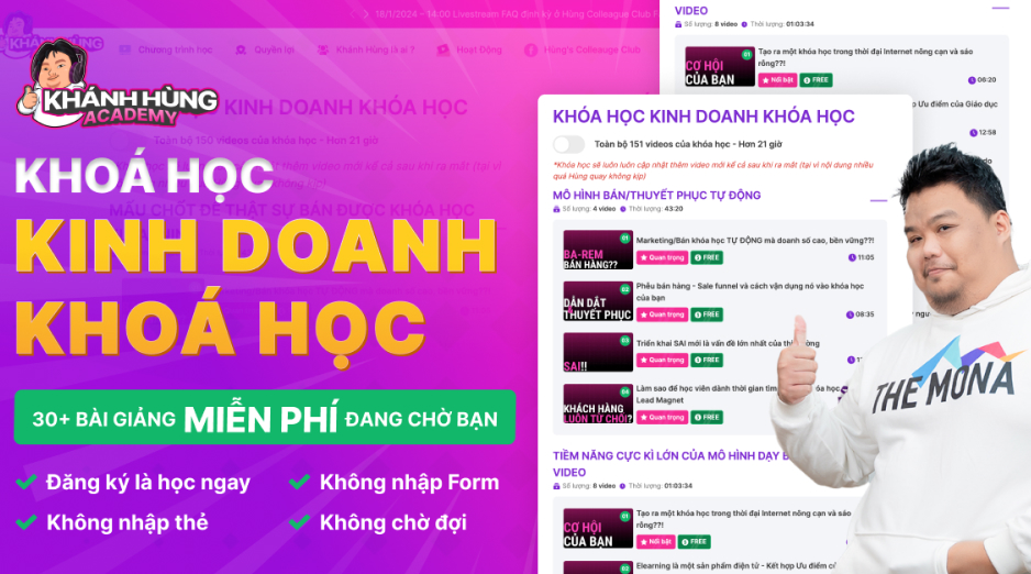 How to sell online courses (course)More than 30 free lessons on selling courses on autopilot.
 MONA Cloudmonacloud.vnServers to get your apps and websites running.
 MONA Basemonabase.vnPostgres database, sign-in and file storage.
 MONA Mailmonamail.vnSend OTP, order and invoice emails from your software.
 MONA Paymonapay.vnAccept bank transfers via VietQR and notify your software when the money arrives.
 MONA eInvoiceComing soonIssue e-invoices that meet tax standards.
Gấu CườiTrả lời khách 24/7 trên web, Fanpage, Zalo và thu lead cho sale.
 Gấu TeleSalesGọi điện tư vấn, chăm khách như tổng đài viên thật.
Dê CườiTư vấn và chốt đơn cho shop ngay trong khung chat.
Gấu WebmasterNhắn nhóm Zalo là website được sửa xong.
 Gấu Pháp ChếSoạn hợp đồng, rà điều khoản trong vài phút.
 Gấu Báo GiáLên báo giá đúng mẫu và gửi khách ngay.
 AI chăm sóc khách hàngTheo dõi và giữ chân khách hàng cũ.
 Gấu Tuyển DụngLọc hồ sơ, hẹn lịch, phỏng vấn ứng viên.
 Mới ra mắt
KHA AI 2027
Xây kênh chuyên gia 2 phút mỗi ngày
Quay bằng điện thoại, AI tự edit video, tự đăng lên 16 nền tảng và tự trả lời bình luận, tin nhắn.
897.818lượt xem trên kênh CEO MONA sau 37 ngày
 Anh Khánh HùngCEO MONA đang dùng mỗi ngày
Xem app làm được gì
 AI
Gấu Cười MONA ĐANG TỰ XÀITrả lời khách 24/7 trên website, Zalo OA, Messenger và thu lead về cho sale.
Dê CườiChốt đơn bán lẻ và sàn: Shopee, TikTok Shop, web. Chăm cả khách sỉ, đại lý.
Gấu WebmasterCập nhật nội dung, tối ưu SEO website mỗi ngày.
Gấu TeleSalesGọi điện tư vấn, chăm khách như tổng đài viên thật.
Gấu Tuyển DụngLọc hồ sơ, hẹn lịch, phỏng vấn ứng viên tự động.
AI chăm sóc khách hàngGiữ khách cũ, cứu lead đã rớt cho phòng kinh doanh.
Gấu Pháp ChếSoạn hợp đồng, rà điều khoản trong vài phút.
Gấu Báo GiáLên báo giá đúng mẫu, gửi khách ngay khi có yêu cầu.
 Chuyển đổi AI toàn phầnGiải pháp tổng cho doanh nghiệp, 3 lớp triển khai.
 Viết AI Agent theo yêu cầuĐặt riêng một con AI gánh đúng nghiệp vụ của bạn.
 Custom softwareCRM, ERP and HRM with built-in AI automation.
 SEO & AEO thời đại AIĐược Google lẫn AI trích dẫn, không chỉ xếp hạng.
 Kiến thức AI cho doanh nghiệpBài phân tích, hướng dẫn ứng dụng AI vào vận hành.
 Free AI courses
 AI tools at work
App mới · KHA AI 2027
Xây kênh 2 phút mỗi ngày
AI tự edit video, tự đăng mọi mạng xã hội
Free consultation, 8am–10pm every day

15 June, 2026
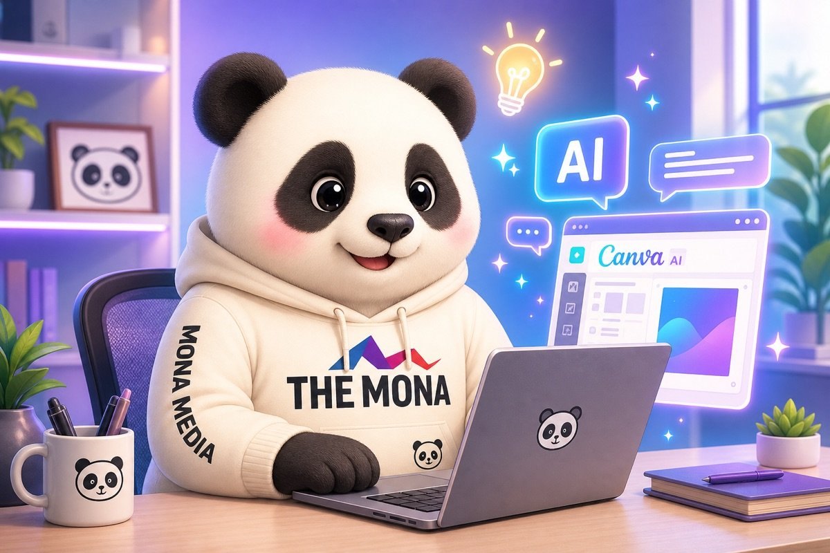
A Canva AI learning path for beginners should go straight into real tasks, not stop at a few scattered tips. In 7 days, you can learn how to create images, edit templates, write content, make short videos and build a set of marketing pieces good enough for daily work. MONA uses Canva AI internally to speed up idea generation and drafting, and to train customers to make tighter content. We wrote this article as a hands-on path, so you learn what you need first.
In the first 15 minutes, you only need one piece you can use right away. Don't start from a blank page. Don't learn all over the place.
We usually guide teams to marketing start with one very small task: pick a goal, have Canva AI generate a layout, then edit it from an existing template.
Canva AI only works well when you know what the piece is for. A vague goal leads to a messy layout, long text and images that don't fit the context.
Pick one of these goals before you tap to create a design. This keeps you from wasting time on endless edits.
MONA usually has internal teams write a one-sentence goal first. For example: "Create a Facebook post introducing a skincare package for female office workers".
Magic Design is good for creating a first draft when you have no layout idea yet. The goal at this step is to have a visible frame, not to be pretty right away.
Follow a short order. Go to Canva, choose Magic Design, enter a description, upload a product photo if you have one, then pick a template close to your industry.
Here is a description you can use right away: "Design a Facebook post introducing a Canva AI course for beginners, clean style, clear text, suitable for office workers".
Keep the first version really simple. Get the frame first.
Once you have a layout, edit 3 parts in this order: photos, text, colors. Don't change everything at once because the layout easily goes off.
For photos, use real photos of the product, classroom, store or team. If you lack photos, use Magic Media to create a temporary illustration.
We often use this rule when training customers: real photos build trust, short text speeds up reading, and familiar colors help viewers recognize the brand.
Edit less. Use it more easily.
A design is only finished when you export it in the right format. The wrong format makes images blurry, text broken or hard to put on the channel you need.
If the piece is for a website, give the file a meaningful name before uploading. For example: hoc-canva-ai-cho-nguoi-moi.png.
This supports better image management for the team working on SEO and the operations team website.
Canva AI helps you make one piece fast. When a business needs a design, approval, posting and data measurement process that runs smoothly, MONA usually recommends building custom software for better control.
Canva AI often gives off-target results when you only type a few generic words. The problem lies in the input request, not entirely in the tool.
Don't write long. You only need one 5-line prompt that covers the role, goal, reader, tone and format. That keeps it very tight.
MONA uses this structure when training internally and guiding customers to use AI tools for marketing. Since 2016, MONA has standardized many content processes, web design and SEO so the team works more evenly.
The first line says clearly what role Canva AI must play. The more specific the role, the less the layout and text drift.
Canva AI needs constraints. With a role, the tool understands how to choose text, images, colors and presentation rhythm closer to real work.
The second line says what the piece is for. Avoid writing things like "make it pretty", because pretty isn't enough to sell.
The clearer the goal, the easier it is for Canva AI to choose the headline, call-to-action button and visual focal point. Lock in the goal first.
The third line describes who will view the piece. This is the part many people skip, so the image looks good but doesn't hit the buyer.
The more accurately you describe the reader, the less generic the text in the piece becomes. This part decides the feeling of "that's exactly what I need".
The fourth line locks in the writing voice and the visual feel. Canva AI doesn't understand your brand on its own without guidance.
MONA usually separates the tone of text from the look of the visuals. This lets you control both content and aesthetics, instead of getting a random template.
The last line states the size and type of piece to export. Finish with the format.
You can combine all 5 lines into one complete prompt like this.
This formula works for posts, banners, posters, slides and ad images. Just swap the industry, goal and format, and you can practice it in the first 2 days.
Canva AI helps make one-off pieces fast. When a business needs connected data, a content approval process and performance measurement from website to SEO, MONA will put that into custom software or a more suitable marketing system.
Day 3 is when you get rid of the "you can tell it's a Canva template" feeling. A rough idea needs to be split into several visual directions, then filtered by sales goal.
Slowing down at this step makes the piece look more deliberate. Don't pick a template just because it's pretty. Pick it because it serves the right channel and the right viewer.
Before opening Canva, split the idea into 3 parts. This keeps Magic Design from pulling the design too far off.
For example, a spa wants to post about a skincare package. The rough idea shouldn't be "make a nice image about skincare".
Be clearer. The main message is "brighter skin after regular care sessions". The background is a close-up of clean facial skin in soft light. The call to action is "book a skin check".
It's easy to drift off. A glossy template may not sell. A text-heavy template may make viewers scroll past.
In Canva, go to Magic Design and enter the description you split in the previous step. Don't enter one overly general sentence.
Use this short structure.
Then pick 5 different layout directions. Don't pick 5 templates that only differ in color.
This is a trick we often use when training internally at MONA. For the same idea, the design team doesn't lock in the first template right away.
You need alternatives to compare. Only side by side can you see which template is selling and which is only decoration.
Magic Media helps you create extra visual material when your stock photos look too much like everyone else's. This step reduces the feeling of using a generic template.
You can keep the same message but change the photo style. Each style suits a different channel.
When entering a prompt for Magic Media, describe the object, lighting and emotion clearly. The more specific the prompt, the less generic the image.
Examples you can use:
Don't go overboard with effects. The more detail in the image, the harder the text is to read.
Prefer clean backgrounds. Prefer empty space.
Many pieces feel scattered because every template goes a different color. Viewers like each image, but don't recognize one brand.
Create a fixed color palette in Canva. 3 to 5 colors are enough for most sales posts.
When you create 5 image versions, only change the layout and the image. Don't change colors too much.
This keeps the whole set looking like one family. Viewers who scroll through many posts still recognize the brand.
In website and marketing projects at MONA, we keep the same principle. Beautiful design must come with a stable identity.
You can see more of how MONA handles brand identity on websites at website design service. Social media visuals should connect to the sales website.
This is a step many people skip. A beautiful template isn't necessarily worth posting.
Filter the 5 versions in 2 rounds. The first round looks through a designer's eye. The second looks through the sales goal.
If you post on Facebook, the template needs to stop a thumb mid-scroll. If it goes on a website, the template needs to be clean and support trust.
If you run ads, the template needs to state the benefit and action clearly. If you send it on Zalo, the template needs larger text because viewers read on a small screen.
After filtering, keep 1 main template and 1 backup. Still save the other 3 for later posts.
Don't delete in a hurry. The ideas still have value.
Canva AI helps you get many directions faster, but it still has a ceiling. When every staff member works on one-offs alone, colors, data and messages easily drift apart.
MONA uses AI tools internally and trains customers in a process-driven way. For businesses that need connected data, real automation and security, custom software is still the foundation to build.
Canva supports making pieces quickly. The website, SEO and sales system are where images turn into cash flow. You can see more of the approach at SEO services package from MONA?
A product photo with a dirty background, off-center framing and no focal point makes an ad lose power from the first second.
On Day 4, focus on just 3 actions in Canva AI: remove the background, expand the frame, and replace the background to fit the context. Clean up first. Download later.
At MONA, we usually guide marketing teams to process photos so they are ready to use for websites, sales posts, Zalo, Facebook and landing pages.
Photos taken in a shop often include a table, wall, a hand holding the item, a light bulb or stray objects behind it. Those details pull the eye away from the main product.
Open the photo in Canva, select the product, then use the Background Remover feature to remove the background. After that, zoom in to check hair edges, bag straps, box corners or bottle rims.
Doing this step carefully makes the image cleaner before it goes into an ad design. Don't rush to add text.
A practical tip: don't remove the background and then keep changing the design. Create a folder of background-removed product photos so the sales team uses them consistently.
Many product photos are shot too close. When you place them in a vertical frame, there is no room for the text and the call-to-action button.
Select the photo, go to Magic Expand, then choose the ratio that fits where you will post. A vertical ad image needs empty space above or beside the product.
Empty space matters a lot. It lets the text breathe.
MONA usually reminds internal teams to check any generated background before exporting the file. A beautiful background in the wrong context still makes the image less trustworthy.
A clean white background suits e-commerce marketplaces, but it isn't enough to inspire a purchase in every situation. A product needs to be placed in a real-use setting.
You can use Canva AI to swap backgrounds by context group. For example, cosmetics on a vanity table, food on a bright tabletop, tech accessories next to a laptop.
Don't make the background too lavish. The product must still be the star.
We use Canva AI as a tool for quickly putting together visual ideas. When we build a website or SEO campaign for a customer, MONA still prioritizes images of the real product and the right sales message.
A clean image isn't enough. Viewers need to understand the main benefit in the first few seconds, especially on a phone.
Add a short label next to the product, without covering important details. The label should state a benefit, not just name the product.
Keep the text short. Keep the idea clear.
Place the label where the eye looks first, usually above or beside the product. Avoid putting text right at the edge, since it can get cropped when posted on other platforms.
An image that looks fine on a computer can still be cluttered on a phone. This is a very common mistake when sales teams make their own images.
Shrink the design to roughly the size of a phone screen. Then check 3 things: is the product clear, can the text be read, and does the background clutter the eye.
Check small first. Export after.
Canva AI helps you quickly handle one-off images for posts, ads and product pages. But a scattered toolset still has a ceiling when data, the image approval process and the content library aren't connected.
For businesses that need to manage images, content, website, SEO and sales in one system, MONA usually advises custom software, a CRM, an ERP or a suitable automation chain. Canva AI is still useful, while a custom system keeps the team running steadily.
When many people make content together, color drift, wrong logos and a different style on every post happen easily. Even small drift makes a brand look unsteady.
Do this part first. You don't need to turn Canva AI into a professional design studio, you just need to lock down the parts that are easy to get wrong. MONA usually uses this approach when training internally and guiding customers to make content faster.
The Brand Kit is where a brand's core elements live. Load the logo, color codes and fonts first so staff don't choose by gut feeling.
Don't let staff guess colors. One wrong color code can make a whole set of posts look off-standard. Colors must be entered as specific codes.
Create 3 reusable background templates first. This is what keeps the next 20 designs on the same visual standard.
Keep it very simple. Each background template should only have a few main areas where staff swap text and photos. The more details, the easier it is to make mistakes.
Elements like the logo, background, main colors and layout frame should be locked. Staff should only edit the content that changes every day.
Don't skip this step. When core elements aren't locked, a new person can drag the logo off or change the background color without noticing.
Small elements like a buy-now button, a discount tag, a delivery icon and an offer frame should be saved as their own library. That way staff don't have to rebuild them from scratch.
MONA usually advises internal marketing teams to build the library before running content continuously. Canva AI helps quickly, but only a standard library keeps output consistent.
Names need rules. If everyone names files their own way, you will lose time finding old posts, old templates and approved versions.
Canva AI helps you make each piece quickly, but standalone tools still have a ceiling. When a business needs connected data, clear permissions and real automation, MONA writes custom software tied to the CRM, ERP, website, SEO and internal operations.
A beautiful design still breaks easily when you resize in a hurry. Text gets cut off, the logo shifts, and the call-to-action button falls out of the main viewing area.
At MONA, we always treat the export step as quality control, not a last click to get it done. Use one standard version, then multiply it into the right size for each channel.
Pick an original design that has the full headline, main image, logo, brand colors and call-to-action button. This version is the base for resizing.
We usually advise marketing teams to keep one standard version before exporting 6 versions. This reduces errors when many people work on content together.
In Canva, open the original design, choose Resize, then enter the size needed for each channel. With a supported account, you can copy it into multiple sizes.
Create a copy for each format. Don't stretch a single image, because the picture easily distorts and the text loses balance.
After Resize, Canva only converts the layout to the new ratio. What needs careful work is rechecking text, photos of people, the logo and white space.
MONA usually checks designs on both computer and phone screens. The same image can look great in Canva but be hard to read on a website.
Clear file names help the marketing, design and website admin teams find files faster. You also avoid uploading an old version to a sales channel by mistake.
For website and SEO projects, MONA usually names files after what is actually in the image. This keeps content management tidier as the number of images grows.
Each channel needs a different file type. Choose the right format so images are sharp, load fast and don't weigh down the website.
Take screenshots of the Resize and export steps so the internal team can follow along. For a Canva AI tutorial, the illustrations should be real screenshots from Canva.
Canva AI is very handy for making each piece quickly. When a business needs connected data, an article approval process, permissions and automatic publishing, standalone tools have a ceiling.
MONA uses AI internally and trains customers in a way that gets real work done. For larger operations, we prioritize custom software, a website, SEO and a marketing system tied to cash flow.
Canva AI is very handy for everyday pieces. You can produce banners, slides, posts and illustrations faster.
But standalone tools still have a ceiling. When marketing has to run steadily, we need connected data, approvals, permissions and measurement.
Canva AI suits jobs that need speed. Marketing teams can use it to make drafts, turn ideas into visuals and adjust layouts quickly.
This part is well worth using. It cuts the time you spend on repetitive work.
MONA also uses AI tools internally for the right kinds of work. We prefer to use AI to speed up tasks, not to replace the control process.
The problem starts when each staff member works in their own way. Files are scattered, version names are messy, and approvers don't know the full edit history.
This gets tiring fast. It isn't wrong, but it is hard to scale.
This is the point you need to see clearly. Standalone tools help you work fast, while a system helps a business operate solidly.
Once a business has a steady marketing rhythm, a piece is just one link in the chain. Behind the image there is also the website, SEO, forms, CRM and reports.
Cash flow lives in the connections. MONA usually starts there.
That is why Canva AI should sit inside the operating ecosystem. You can use Canva AI to create pieces, then connect them back to website designed by MONA.
SEO also needs to be connected properly. MONA delivers SEO services so that good-looking content also matches real search demand.
MONA started in 2016 and now has . We have served 14,000+ projects and maintain an 85% retention rate.
These numbers help us see one thing clearly. AI is only effective when it comes with a process and users who are guided properly.
Canva AI is well worth learning. You should use it to speed up personal work and daily piece production.
But growth needs a system. When a business wants connected data, security and real automation, MONA builds custom software to connect AI tools to cash flow.


CEO & Founder · The MONA
Founder of The MONA, who built a services company of 60+ staff with 14,000+ projects delivered. Khánh Hùng shares how he thinks about building systems that run themselves, automating a business, and the real lessons from delivering projects at MONA.
 186




Professional website
design services
Own a website with a beautiful, 100% exclusive design and a lifetime warranty, with the ability
to expand features flexibly as your business grows, starting today!






 MONA will never sell your information or send you spam


 MONA will never sell your information or send you spam
