
 MONA OS 2.0
 Partner with MONA


 Tự động hoá doanh nghiệp
 Cẩm nang SEO
 Digital Marketing
 Kinh nghiệm thiết kế website
 Hạ Tầng Server
 Giáo dục


 VI
 EN



Message us on
Zalo Official


 ProductsNew

 ProductsProducts
 Mới ra mắtKHA AI 2027App tự edit video, tự đăng mọi mạng xã hội, 2 phút mỗi ngày







 Website designLooks good and wins customers over.
SEO servicesBrings in customers searching for exactly what you sell.
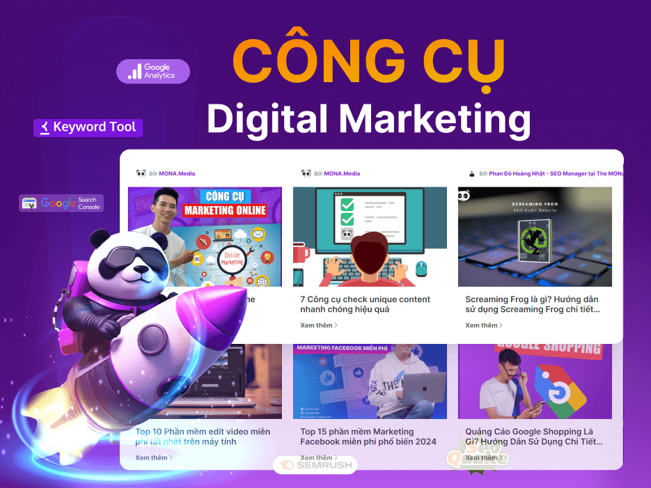 Tư vấn digital marketingKéo khách từ nhiều kênh, đo bằng số thật.
Corporate video productionVideos introducing your company, factory and team.
 NewAI video productionCompany story films made with AI.
 Custom software developmentCRM, ERP and HRM built for your business.
 Viết AI Agent theo yêu cầuĐặt riêng một trợ lý AI cho đúng việc của mình.
 Tư vấn chuyển đổi AIĐưa AI vào vận hành của cả công ty.
NewMONA LMSManagement for centers and schools.
MONA SkillHubInternal training for company staff.
 NHTQ systemEnd-to-end China–Vietnam shipping operations.
MONA JMSManagement for gold, diamond and pawn shops.
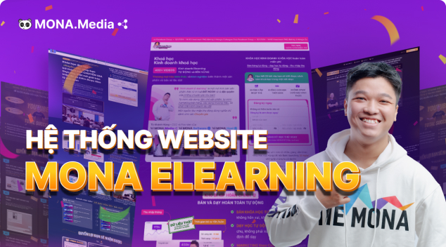 MONA E-LearningA website with every feature you need to sell courses.
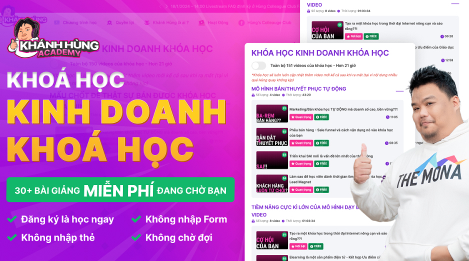 How to sell online courses (course)More than 30 free lessons on selling courses on autopilot.
 MONA Cloudmonacloud.vnServers to get your apps and websites running.
 MONA Basemonabase.vnPostgres database, sign-in and file storage.
 MONA Mailmonamail.vnSend OTP, order and invoice emails from your software.
 MONA Paymonapay.vnAccept bank transfers via VietQR and notify your software when the money arrives.
 MONA eInvoiceComing soonIssue e-invoices that meet tax standards.
Gấu CườiTrả lời khách 24/7 trên web, Fanpage, Zalo và thu lead cho sale.
 Gấu TeleSalesGọi điện tư vấn, chăm khách như tổng đài viên thật.
Dê CườiTư vấn và chốt đơn cho shop ngay trong khung chat.
Gấu WebmasterNhắn nhóm Zalo là website được sửa xong.
 Gấu Pháp ChếSoạn hợp đồng, rà điều khoản trong vài phút.
 Gấu Báo GiáLên báo giá đúng mẫu và gửi khách ngay.
 AI chăm sóc khách hàngTheo dõi và giữ chân khách hàng cũ.
 Gấu Tuyển DụngLọc hồ sơ, hẹn lịch, phỏng vấn ứng viên.
 Mới ra mắt
KHA AI 2027
Xây kênh chuyên gia 2 phút mỗi ngày
Quay bằng điện thoại, AI tự edit video, tự đăng lên 16 nền tảng và tự trả lời bình luận, tin nhắn.
840.346lượt xem trên kênh CEO MONA sau 28 ngày
 Anh Khánh HùngCEO MONA đang dùng mỗi ngày
Xem app làm được gì
 AI
Gấu Cười MONA ĐANG TỰ XÀITrả lời khách 24/7 trên website, Zalo OA, Messenger và thu lead về cho sale.
Dê CườiChốt đơn bán lẻ và sàn: Shopee, TikTok Shop, web. Chăm cả khách sỉ, đại lý.
Gấu WebmasterCập nhật nội dung, tối ưu SEO website mỗi ngày.
Gấu TeleSalesGọi điện tư vấn, chăm khách như tổng đài viên thật.
Gấu Tuyển DụngLọc hồ sơ, hẹn lịch, phỏng vấn ứng viên tự động.
AI chăm sóc khách hàngGiữ khách cũ, cứu lead đã rớt cho phòng kinh doanh.
Gấu Pháp ChếSoạn hợp đồng, rà điều khoản trong vài phút.
Gấu Báo GiáLên báo giá đúng mẫu, gửi khách ngay khi có yêu cầu.
 Chuyển đổi AI toàn phầnGiải pháp tổng cho doanh nghiệp, 3 lớp triển khai.
 Viết AI Agent theo yêu cầuĐặt riêng một con AI gánh đúng nghiệp vụ của bạn.
 Custom softwareCRM, ERP and HRM with built-in AI automation.
 SEO & AEO thời đại AIĐược Google lẫn AI trích dẫn, không chỉ xếp hạng.
 Kiến thức AI cho doanh nghiệpBài phân tích, hướng dẫn ứng dụng AI vào vận hành.
 Free AI courses
 AI tools at work
App mới · KHA AI 2027
Xây kênh 2 phút mỗi ngày
AI tự edit video, tự đăng mọi mạng xã hội
Free consultation, 8am–10pm every day

18 March, 2023
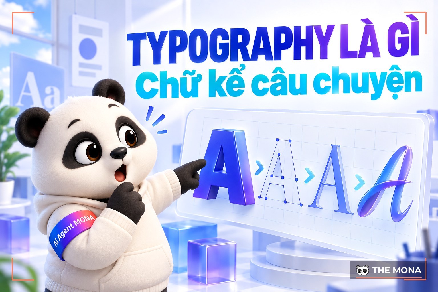
However perfect a design is, it becomes less effective, even meaningless, without suitable typography. Typography plays an important role in shaping the message for viewers in general and a brand's target audience in particular. This article explains Mona Media look at what typography is, and why it matters in design.
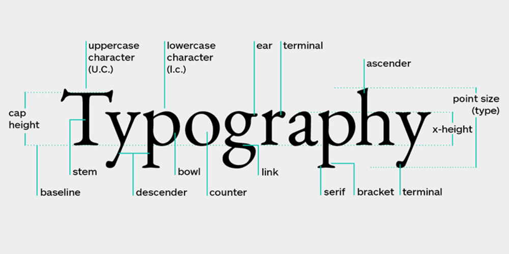
Typography is the art of arranging type, using basic elements such as typeface, size and spacing in many ways. It helps you use lettering skillfully to make an impact across a range of designs, including website design, brochure, print, books and computer graphics.
In today's increasingly competitive business environment, brands need to build a distinct identity. They have to know how to capture customers' attention and deliver the brand message as effectively as possible. Designers use typography as a powerful tool to turn text into a message that reaches viewers directly. It makes your content more meaningful and engaging. The more distinctive your typography, the better your brand connects with customers.
Typography also lets designers create a visual identity for their brand. However, a few important things need to be considered before deciding to use it: the choice of typeface, size, placement, text content, white space and other aspects of lettering that make a design stand out.
A typeface is a family of characters in different weights and sizes. Put another way, a typeface is a collection of different fonts. Arial and Helvetica are two of the most widely used typefaces in designs and documents today.
A font, on the other hand, refers to the style, weight and width of a typeface. Font is often understood as the height or width of a typeface, and of course it carries its own style. That is why every typeface comes in different font sizes.
See also:
Leading is the vertical space between lines; in other words, the distance between the baselines of two lines of text. Leading is usually set between 120% and 200% so text is easier to read. Following current typography trends, 140% is the ideal leading value designers should consider.
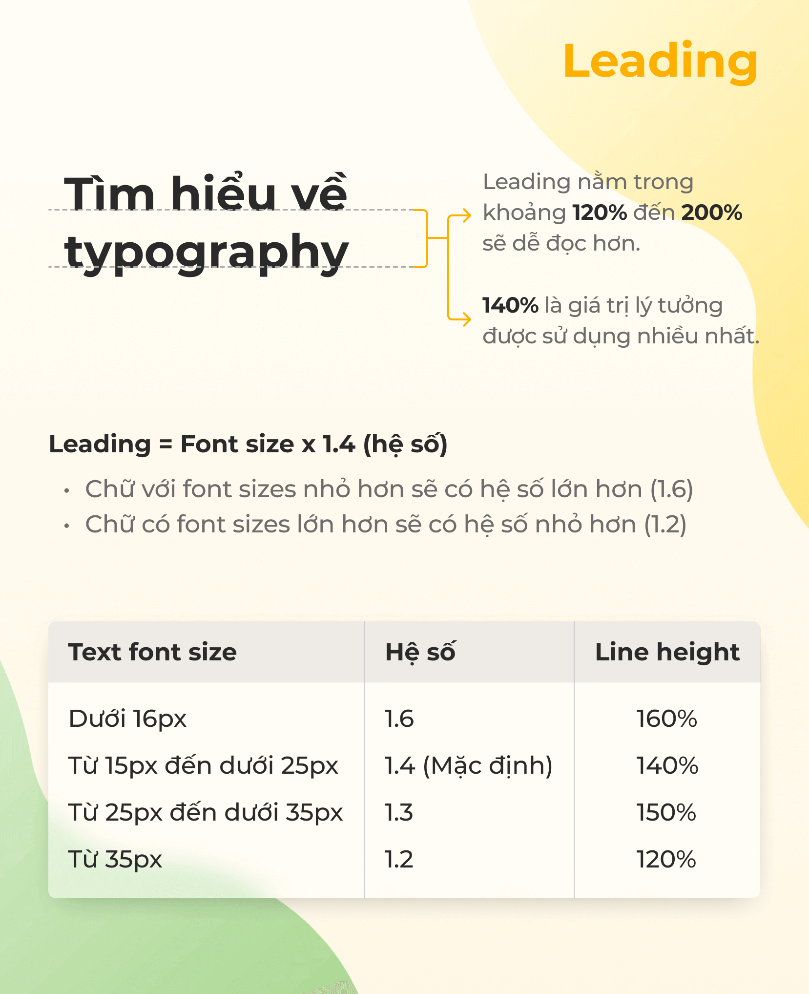
To make design easier, here is the formula for calculating leading:
Leading = font size x 1.4 (coefficient)
Where:
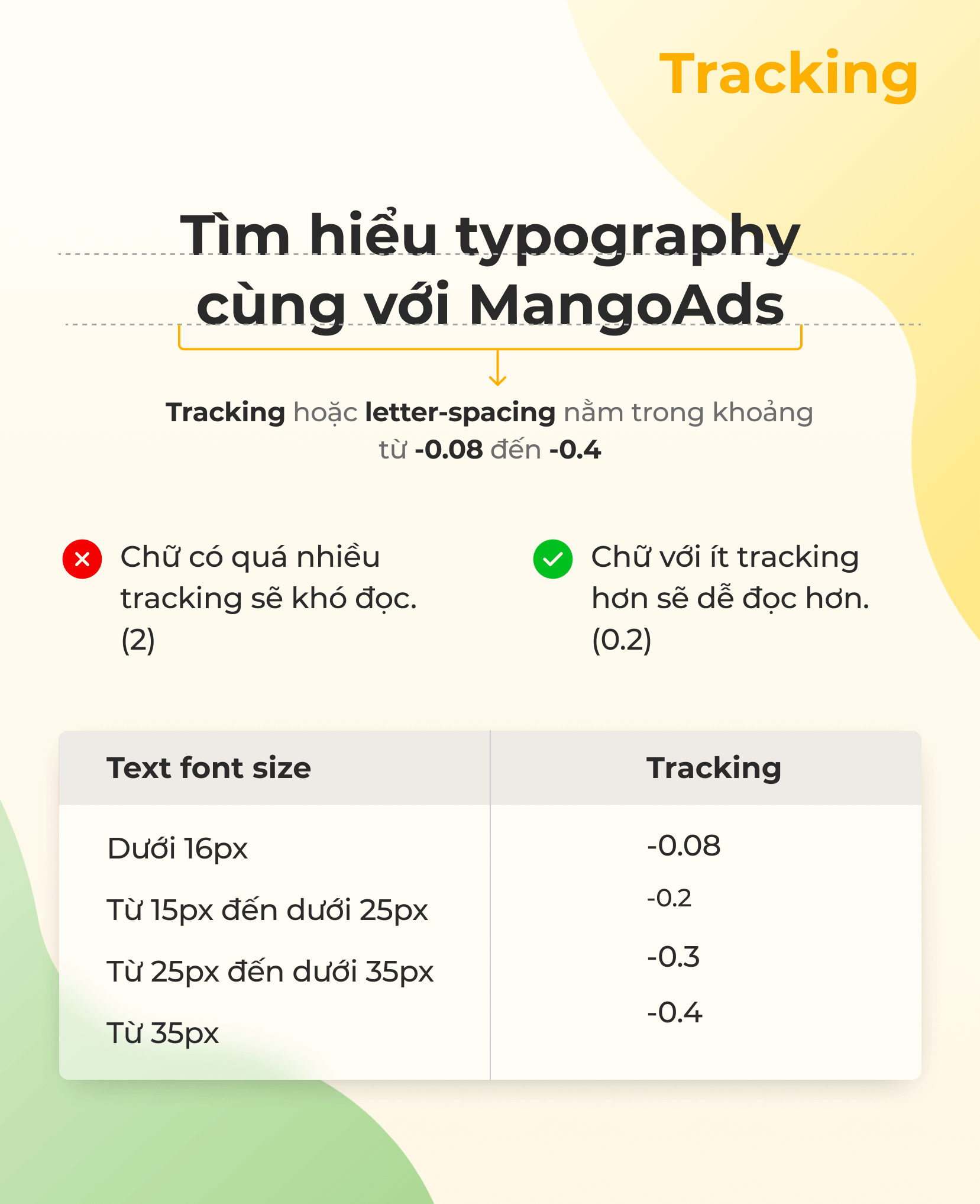
Tracking is the spacing between characters, in other words the overall length of a word or a block of text. For a clearer look, tracking or letter-spacing should be between -0.08 and -0.4. A few notes on tracking: text with too much tracking (2) is hard to read, while text with little tracking (0.2) is easier to read.
Kerning is the term for the spacing between adjacent characters in the same font. Without kerning, characters would sit side by side with no space between them. With kerning applied, characters do not stick together; two neighbors are clearly separated, do not overlap, and do not share the same vertical space.
Line length is the standard length of a line of text. Paragraphs usually run at least 40 words and at most 75 words per line. If the line length of your text box is too long, viewers get tired from having too much to read. So text should be concise and short.
An article's hierarchy consists of a title, subheadings and the other kinds of content in the text. The system is built on the size, weight and arrangement of the characters. The main title is usually the boldest and largest, followed by subheadings, and finally the longer body text in a smaller size.
Size helps designers establish the hierarchy in a text. This is done by using spacing, size and color sensibly. Size applies to 2 kinds of headings: the primary heading and subheadings.
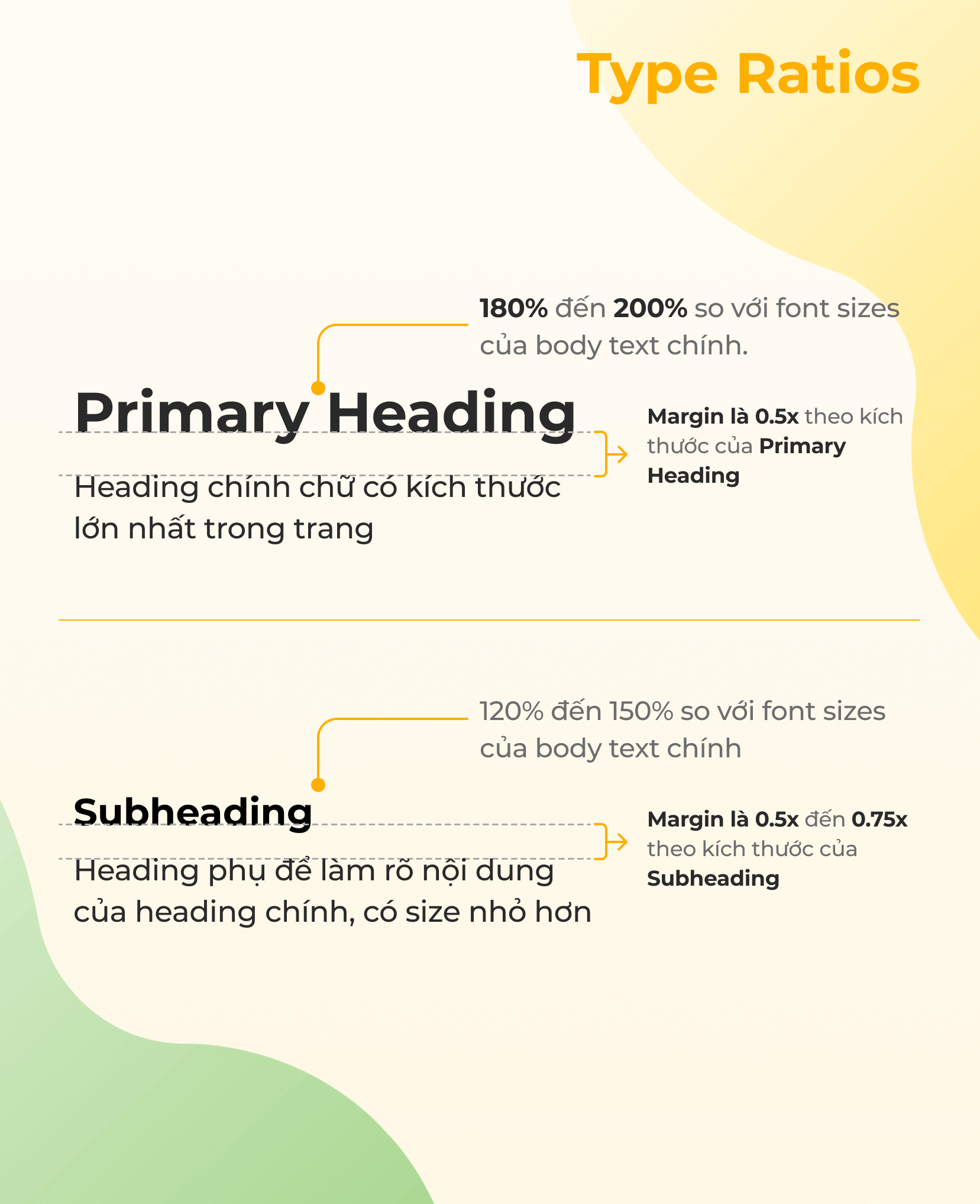
The primary heading is the largest on the page. Its size usually falls between 180% and 200% of the body font size, with a margin of 0.5x the size of the primary heading.
Subheadings clarify the primary heading and are smaller. Designers typically set subheadings at 120% to 150% of the body font size. The margin is then 0.5x to 0.7x of the subheading size.
Color makes text stand out. It conveys the brand's message quickly and effectively. Designers need to balance the three key components of color: value, hue and saturation.
Proper alignment keeps typography consistent across the whole text. Each character gets equal size and space, and it ensures suitable spacing between elements.
Contrast is another element of typography that helps designers bring out their ideas or message. Used well, contrast makes text not only more meaningful but also better at holding readers' attention.
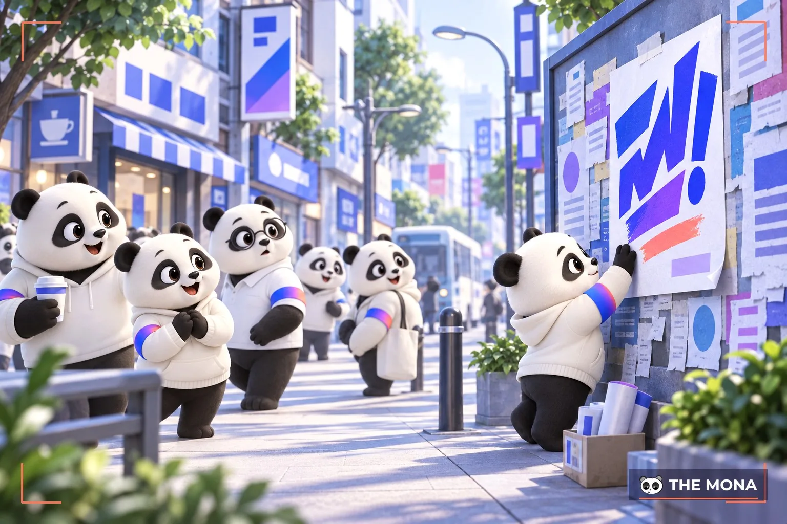
When customers land on a website, the first thing to do is catch their attention before they think about leaving. This is where designers show their skill and the power of typography.
Typography comes in many styles, shapes and sizes, which play an important role in creating distinctive designs. Many people now like to create designs with kinetic type to grab viewers' attention quickly.
When using typography, make sure visitors can read the text on your page easily. Choosing the wrong font makes the content cluttered and confusing. A common example is small fonts with serifs, which strain the eyes.
How readable content is depends on how the designer arranges and aligns the text. Designers usually align text to the right, left, center or justified.
They can also align text however they like with help from CSS and Photoshop. The main aim is still to guide viewers to the most important, essential information.
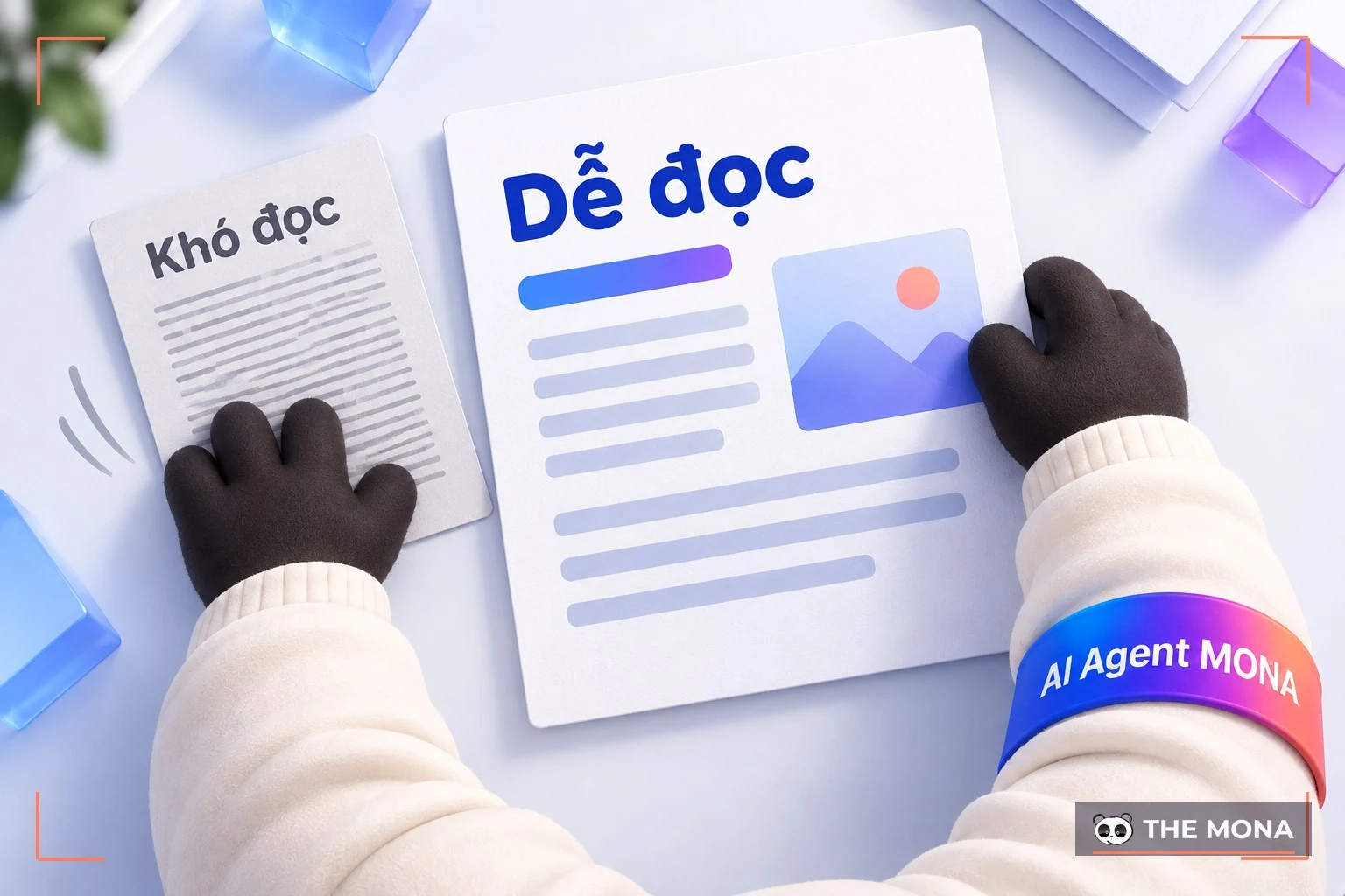
With experience, a designer knows how to combine size and font so the reader's eye goes to the most important information first. Viewers can locate information by skimming the text. To do this, designers use different font sizes for the primary heading, subheadings and body text.
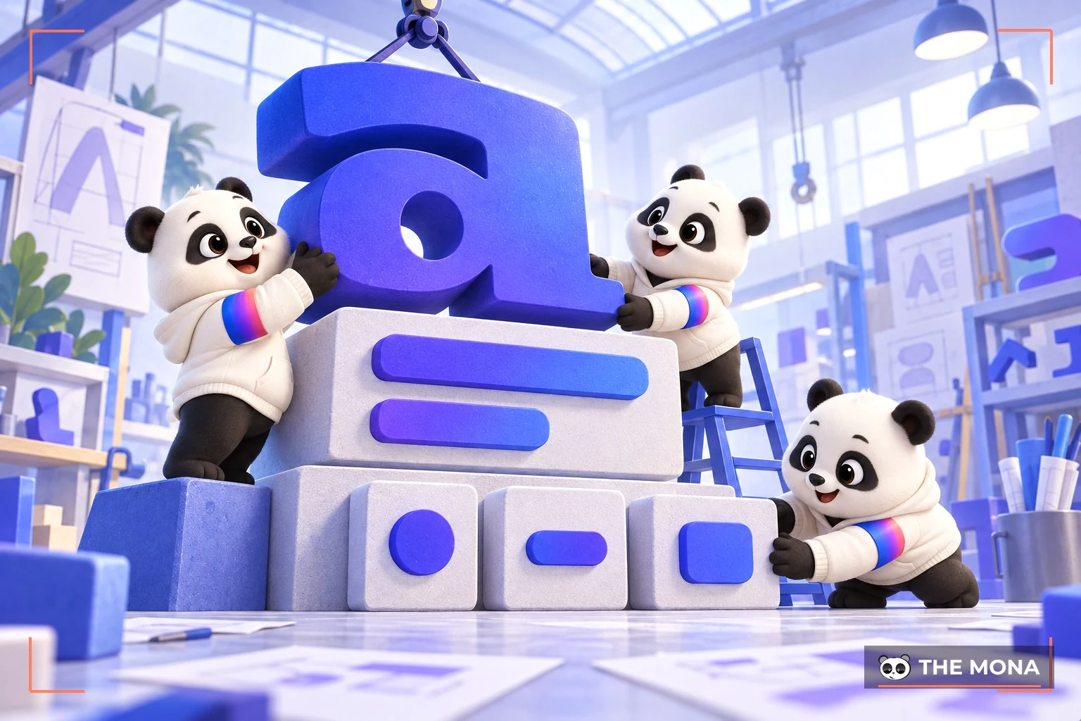
This is especially important for every business. Getting brand recognition right helps the business compete more strongly against rivals in the market. In each design, the font is what lets visitors and target customers remember it easily. Many large companies have gained recognition from most customers thanks to these very visuals.
Many logos today rely on typography to help people recognize the business's brand, so careful use of typography is essential. It makes sure customers quickly recognize what sets the business apart. The Coca-Cola, Disney and Netflix logos, for example, are easy to recognize and remember thanks to effective use of lettering.
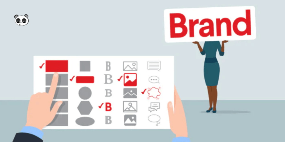
Typography is an extremely useful tool for establishing brand value in many ways, because it can represent the business. That is why there are so many typefaces to choose from: each one has a different effect and expresses emotion in its own way.
Take sans-serif typefaces. They are often preferred for text pages and designs because they are easy to remember and easy to read. Serifs, on the other hand, are sometimes seen as too ordinary and a bit “outdated”. Still, they remain quite readable, which is why most long-form text such as books and blogs is usually set by designers in this kind of typeface.
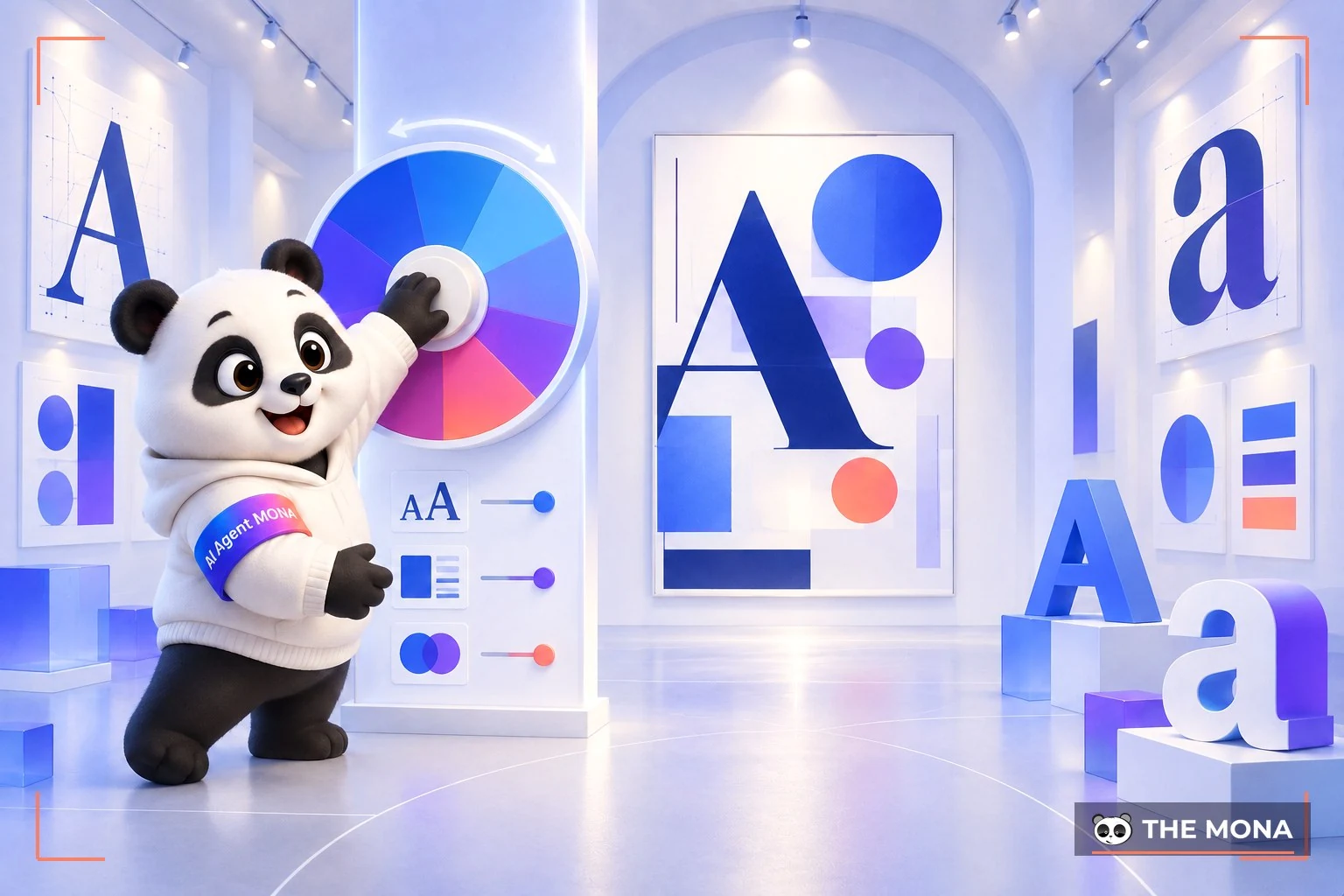
Designers also use typography to set the harmony of a design or web page layout. The more harmonious a design, the more artistic value it gives viewers. When designers use the same font for similar content, viewers recognize it immediately.
Typography is a key element that lifts designs and websites. For designers, it is also a handy way to convey a brand's message without words. MONA Media hopes you use typography wisely and effectively to quickly strengthen your business's brand identity and help deliver core message to your viewers.

CEO & Founder · The MONA
Founder of The MONA, who built a services company of 200+ staff with 14,000+ projects delivered. Khánh Hùng shares how he thinks about building systems that run themselves, automating a business, and the real lessons from delivering projects at MONA.
 1,5K


Professional website
design services
Own a website with a beautiful, 100% exclusive design and a lifetime warranty, with the ability
to expand features flexibly as your business grows, starting today!





 MONA will never sell your information or send you spam


 MONA will never sell your information or send you spam
