
 MONA OS 2.0
 Hợp tác với MONA


 Tự động hoá doanh nghiệp
 Cẩm nang SEO
 Digital Marketing
 Kinh nghiệm thiết kế website
 Hạ Tầng Server
 Giáo dục


 VI
 EN





Message us on
Zalo Official


 ProductsNew

 ProductsProducts
 Mới ra mắtKHA AI 2027App tự edit video, tự đăng mọi mạng xã hội, 2 phút mỗi ngày









 Thiết kế websiteVừa đẹp vừa thuyết phục được khách.
Dịch vụ SEOKéo về khách đang tìm đúng thứ anh chị bán.
 Tư vấn digital marketingKéo khách từ nhiều kênh, đo bằng số thật.
Quay video doanh nghiệpVideo giới thiệu công ty, nhà xưởng, đội ngũ.
 MớiDựng video AIDựng phim câu chuyện công ty bằng AI.
 Custom software developmentCRM, ERP and HRM built for your business.
 Viết AI Agent theo yêu cầuĐặt riêng một trợ lý AI cho đúng việc của mình.
 Tư vấn chuyển đổi AIĐưa AI vào vận hành của cả công ty.
NewMONA LMSManagement for centers and schools.
MONA SkillHubInternal training for company staff.
 NHTQ systemEnd-to-end China–Vietnam shipping operations.
MONA JMSManagement for gold, diamond and pawn shops.
 MONA E-LearningA website with every feature you need to sell courses.
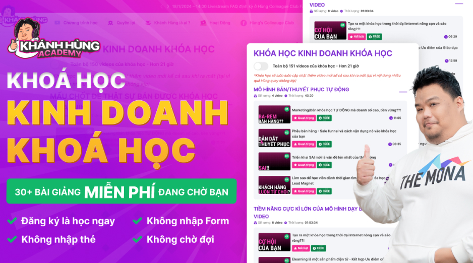 How to sell online courses (course)More than 30 free lessons on selling courses on autopilot.
 MONA Cloudmonacloud.vnServers to get your apps and websites running.
 MONA Basemonabase.vnPostgres database, sign-in and file storage.
 MONA Mailmonamail.vnSend OTP, order and invoice emails from your software.
 MONA Paymonapay.vnAccept bank transfers via VietQR and notify your software when the money arrives.
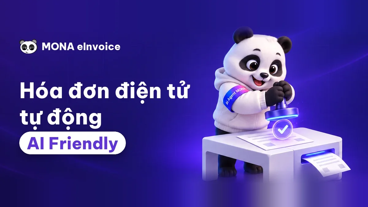 MONA eInvoiceComing soonIssue e-invoices that meet tax standards.
Gấu CườiTrả lời khách 24/7 trên web, Fanpage, Zalo và thu lead cho sale.
 Gấu TeleSalesGọi điện tư vấn, chăm khách như tổng đài viên thật.
Dê CườiTư vấn và chốt đơn cho shop ngay trong khung chat.
Gấu WebmasterNhắn nhóm Zalo là website được sửa xong.
 Gấu Pháp ChếSoạn hợp đồng, rà điều khoản trong vài phút.
 Gấu Báo GiáLên báo giá đúng mẫu và gửi khách ngay.
 AI chăm sóc khách hàngTheo dõi và giữ chân khách hàng cũ.
 Gấu Tuyển DụngLọc hồ sơ, hẹn lịch, phỏng vấn ứng viên.
 Mới ra mắt
KHA AI 2027
Xây kênh chuyên gia 2 phút mỗi ngày
Quay bằng điện thoại, AI tự edit video, tự đăng lên 16 nền tảng và tự trả lời bình luận, tin nhắn.
860.744lượt xem trên kênh CEO MONA sau 31 ngày
 Anh Khánh HùngCEO MONA đang dùng mỗi ngày
Xem app làm được gì
 AI
Gấu Cười MONA ĐANG TỰ XÀITrả lời khách 24/7 trên website, Zalo OA, Messenger và thu lead về cho sale.
Dê CườiChốt đơn bán lẻ và sàn: Shopee, TikTok Shop, web. Chăm cả khách sỉ, đại lý.
Gấu WebmasterCập nhật nội dung, tối ưu SEO website mỗi ngày.
Gấu TeleSalesGọi điện tư vấn, chăm khách như tổng đài viên thật.
Gấu Tuyển DụngLọc hồ sơ, hẹn lịch, phỏng vấn ứng viên tự động.
AI chăm sóc khách hàngGiữ khách cũ, cứu lead đã rớt cho phòng kinh doanh.
Gấu Pháp ChếSoạn hợp đồng, rà điều khoản trong vài phút.
Gấu Báo GiáLên báo giá đúng mẫu, gửi khách ngay khi có yêu cầu.
 Chuyển đổi AI toàn phầnGiải pháp tổng cho doanh nghiệp, 3 lớp triển khai.
 Viết AI Agent theo yêu cầuĐặt riêng một con AI gánh đúng nghiệp vụ của bạn.
 Custom softwareCRM, ERP and HRM with built-in AI automation.
 SEO & AEO thời đại AIĐược Google lẫn AI trích dẫn, không chỉ xếp hạng.
 Kiến thức AI cho doanh nghiệpBài phân tích, hướng dẫn ứng dụng AI vào vận hành.
 Free AI courses
 AI tools at work
App mới · KHA AI 2027
Xây kênh 2 phút mỗi ngày
AI tự edit video, tự đăng mọi mạng xã hội
Free consultation, 8am–10pm every day

18 March, 2023

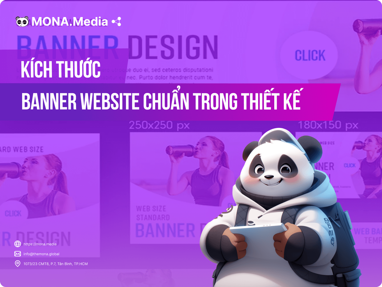
In website design you have surely heard terms like UX and UI. They are among the factors weighed most when building a website. So what are UX and UI, and why do they matter for web design? In today's article, MONA Media will give you an overview of standard website sizes UX for you to try.
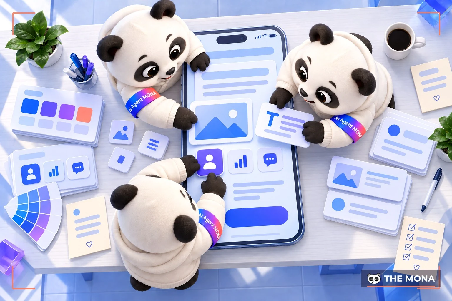
UI stands for User Interface, which is the user interface. On a website, UI is what users see on your site: images, content, layout and so on. UI is a way to reach customers. It does more than show an interface to users; it is also an effective tool for getting customers to act, if the business knows how to use it.
For a business, UI is a way to carry its message to users. The strength of UI therefore lies in presentation and content. Whether a user is convinced to buy is partly decided by UI.
But UI is not the only thing that decides user behavior. UX does too. UX – User Experience, refers to the customer's experience on the website. If UI is the surface, what users can see, then UX is what lies beneath the website.
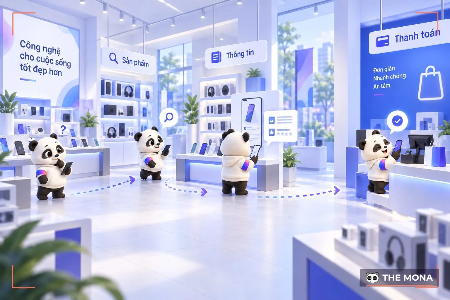
UX is designed from measuring customers' behavior, needs and wishes on the website. Like user flow, UX optimizes the customer's experience on the site. UX focuses more on technical factors such as code, hosting, domain and so on, or on optimizing the website's features and making media files display clearly. All of this lets users browse comfortably and smoothly.
That is why UX – UI design always go together and cannot be separated. To optimize both, a website design needs to meet certain size criteria. MONA covers the sizes to watch in the next section. These sizes are standard for UX and UI and help your website give users the best experience.
An effective website is not only good-looking but also sensible. That shows in the layout, colors, theme, content and user flow. These are also important in building SEO.
A sensible website layout keeps UX mistakes to a minimum and strengthens the brand image in customers' minds.
To build an effective website layout, build the site to the size criteria set by Google. Google rates websites that meet these parameters highly. Even before you consider whether the design looks good to users, getting a good rating from Google and moving up the rankings is already progress. So you need to understand the following website size types.
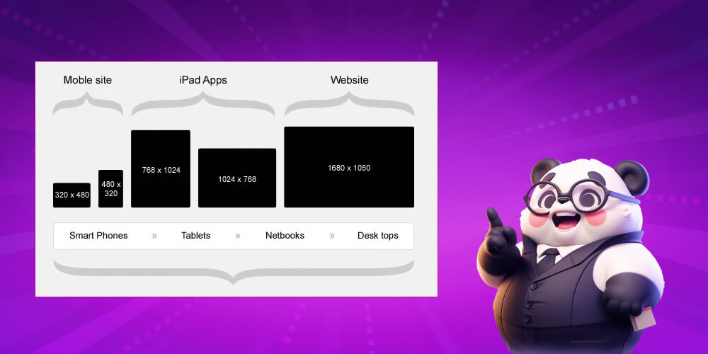
For the overall size of a website there are three types: fixed, fluid and flexible:
Besides the overall size of the website, other sizes also need attention, such as the size of homepage images and banners, article images and product images. Article length and content also matter because they affect UI (the user's interface experience).
>> See more: Standard website banner sizes for better design
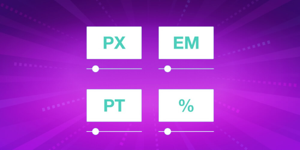
The standard units for measuring web size are pt, pc, cm hay mm, in. These units are fixed and do not change with the browser or device. If you set your site's font in 12pt then on a computer, a phone or any browser it will show the same font at that size 12pt.
Pixels are usually counted by resolution. Depending on the device, the page will display accordingly. Setting sizes in pixels makes a website more flexible. This unit is usually used for media files such as images and video.
There are also units measured in percent. Percent sizes are used for fluid sizes, as described above. Showing sizes in percent lets the website adapt to the device or browser. Most of the values and units above are fixed by design. But if you want to change the website size, which tools can help?
Most of the time, when you have to resize an element of a website, people change the images. Graphic files take up a lot of space and storage, so changing them is more efficient than changing the whole website layout. The following tools will help you handle these files.
Familiar offline tools you can use include Adobe Photoshop hay Paint. With Adobe Photoshop you need some knowledge of Photoshop and design. Paint is much easier for simple operations. Use these tools to reduce file size or image dimensions.
There are also full-featured online tools today that cover every need. Some popular ones you can look at: Canva, Pixlr, Photo Grid. These tools do not require deep expertise. With a good eye for images, they are easy to use.
Here are some tips for optimizing a website with good UX/UI. First, a clean, tidy and on-theme look. Some businesses forget the theme when designing a website. The website's theme has to be tied to the brand to work for the business.
Are you looking for a provider ofervice company website design that is professional, SEO-ready and trustworthy? Then MONA Media is the right choice!

Market leader SEO services and Website design in recent years. MONA's highly skilled developers have delivered thousands of successful projects, with websites that follow UI/UX and SEO standards, look good and are easy to use across many industries. Proof of this success is that more than 12,000 clients in Vietnam and abroad have chosen to become MONA's partners!
We are committed to giving you a complete, professional and SEO-ready website. If you need extra custom features for your own needs, our team can build those too! Please CONTACT US with MONA via Hotline 1900 636 648 for detailed advice.
That covers the basics of standard website sizes UX and UI, along with some tips for designing a good website. Still, every website is different, and setting the right website size depends on many factors. Look closely at your needs and goals when designing so you can optimize the size as effectively as possible. Good luck putting it into practice!

CEO & Founder · The MONA
The founder of The MONA built a service company of 60+ staff with 14,000+ projects delivered. Khánh Hùng shares his thinking on building self-running systems, automating a business, and the real lessons behind MONA's projects.
 1,6K



Professional website
design services
Own a website with a beautiful, 100% exclusive design and a lifetime warranty, with the ability
to expand features flexibly as your business grows, starting today!






 MONA will never sell your information or send you spam


 MONA will never sell your information or send you spam
