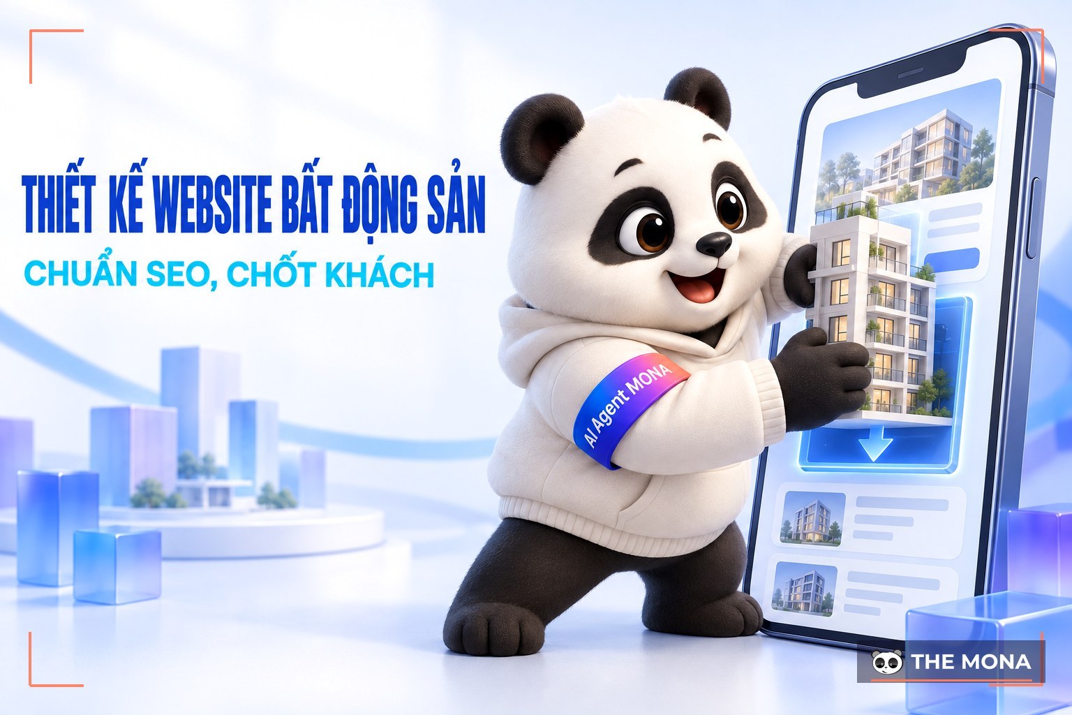
According to statistics from the first half of 2026, more than 70% of internet users go online by phone, and on average each person spends more than 6 hours a day online across several devices. This means visitors can reach your website from any device. If your site looks good, runs smoothly and is easy to use on every screen, you score a big point with them.
That is why responsive website design is no longer an option. It is a requirement for any business that wants to grow in the digital age. In this article, MONA Media walks you through the benefits and the professional process of responsive web design, so your brand stands out.
What is responsive website design?
Responsive website design (also called Responsive Web Design) is a way of designing websites so that the layout adjusts automatically to fit any screen size. Instead of building several separate versions of a website, responsive design uses flexible layouts, scalable images and flexible CSS, so the experience stays optimal whether visitors use a phone, tablet, laptop or desktop.
A responsive website does more than look good and professional. It also keeps content clear, readable and easy to use on every device and browser. This keeps the user experience stable and consistent, and improves the performance of your strategy. full-scope SEO.
Many businesses invest heavily in images and layout but neglect the real content and the user experience, so their website fades into the background for customers. Don't design just to have a website. Design to win customers over. The video below explains more.
What is the difference between a mobile website and a responsive website?
When people talk about optimizing the mobile experience, they often mention responsive website design and mobile websites. These are two different approaches. Responsive design uses a single version of the layout that adjusts itself to every screen size. A mobile website is a separate version built specifically for mobile phones.
What a mobile website and a responsive website have in common
Both mobile websites and responsive websites are built with the same goal: the best possible experience for users on mobile devices. They are implemented differently, but they share important points:
Better mobile user experience: Layout and content are optimized so users can easily reach and use the site on a small screen.
Good display on every screen: The website shows fully and clearly on every screen size, from desktop to phone.
Wider reach: The website reaches more users, especially people who are often online by phone.
What is the difference between a mobile website and a responsive website?
Both aim to optimize the user experience on mobile devices, but they are implemented very differently. Specifically:
Web Mobile: Builds a separate version of the website for mobile, with a layout and content that may differ from the desktop version.
A responsive website: Uses a single website. Responsive design techniques make the layout and content adjust to each screen size, with one codebase for every device.
Today a responsive website that looks good and runs smoothly on every device is not just an advantage but close to a requirement for businesses. Responsive design improves the user experience and brings several important benefits that help a business compete and grow sustainably.
Optimize your responsive website for every device
A responsive website displays correctly on every type of device, including desktop, laptop, tablet and mobile phone. This gives users a seamless, best-possible experience, whatever device they use.
This is why responsive design has become the gold standard in modern web development, helping businesses improve the user experience and connect better with customers.
Reach potential customers with responsive website design
With responsive design, your website looks good and reads easily on every device, with no need for visitors to zoom or drag the page. This smooth experience is more convenient for them, so you attract more visitors and keep them longer.
Responsive web design builds brand awareness
A responsive website with a good-looking layout, useful content and a smooth experience supports an effective SEO plan, helps more people get to know your brand and raises your customer conversion rate.
Higher conversion rate
A website that works on every device gives users a comfortable, convenient experience, so you can reach millions of potential customers. When your website looks good, runs smoothly and follows SEO standards on phones, tablets and desktops, visitors are ready to buy, sign up or contact you right away. A good experience on every device raises satisfaction and noticeably increases your conversion rate and revenue.
Responsive web design is a powerful marketing tool
Your website is an important digital asset. You fully own the content and how you interact with customers, without depending on platforms such as Facebook, Instagram, TikTok or YouTube. A responsive website gives a smooth experience on every device and also makes sharing content on social networks faster and more effective, which makes it a very useful marketing tool.
Case study: CINESTAR x MONA
Cinestar is one of Vietnam's leading modern cinema chains, serving more than 8 million visitors a year and still expanding.
For this project, MONA Media designed a new website for the large cinema chain, optimized to the Responsive standard so it works on every device. The mobile experience was a priority, making it easy for customers to book tickets and look up information quickly. The look is modern, on trend and friendly to younger customers aged 18 to 24. The website is built to UI/UX standards, follows SEO standards, is easy to manage and uses advanced programming technology.
See the Cinestar responsive web design case study to find out how MONA brought the cinema experience to the digital world.
Rules for building a responsive website with the best user experience
To build a responsive website that truly optimizes the user experience, a business needs clear and consistent design principles. They are the foundation for a website that looks good, runs smoothly and works well on every device, from phones and tablets to desktops.
Analyze and research search behavior
To design a responsive website that is both attractive and effective, start by understanding your customers. Analyze user behavior to see which devices they use, how they navigate, how purchase rates on mobile compare with desktop, and where they run into problems.
Before designing a responsive website, researching user behavior helps you:
Know which devices your customers use most to reach the web, so you can prioritize optimizing for them.
Understand how they interact with the website, such as zooming into product images, scrolling or searching for information.
See the conversion rate for each device, to find out which device brings the most orders.
Find the experience problems customers meet on mobile, tablet or desktop.
Make more accurate decisions about layout and content, so the website runs smoothly on every screen.
Use data from Google Analytics and Google Tag Manager to understand more about user journeys and needs.
Choose sizes that fit the screen
When designing a responsive website, choosing the right website size for each device is key to keeping the layout good-looking and easy to use.
Here are common screen sizes to refer to:
Mobile phone (portrait): max-width 320px
Mobile phone (landscape): max-width 480px
Tablet (portrait): max-width 600px
Tablet (landscape): max-width 800px
Large tablet (portrait): max-width 768px
Large tablet (landscape): max-width 1024px
Desktop and laptop: max-width 1025px and above
You should also optimize for common resolutions such as:
Desktop: 1920×1080, 1366×768, 1536×864
Mobile phone: from 360×640 to 414×896
Tablet: from 601×962 to 1280×800
These sizes are used as breakpoints in CSS media queries, so the website automatically adjusts its layout and content to the device the user has.
Optimize images on a responsive website
Beautiful, sharp images help a website make a good impression on visitors. But on different screen sizes, images can look blurry or distorted if they are not optimized properly.
To keep images sharp and correct on every device, you can:
Use the CSS Width and Max-width properties to keep the aspect ratio and avoid distortion when scaling.
Prefer the SVG format, so images can be scaled up or down without losing quality or breaking up.
Optimize typography on a responsive website
Images are not the only factor. The quality of the text (typography) directly affects the user experience and how credible the business looks. Hard-to-read or poorly rendered type on some devices can make visitors leave faster.
To optimize typography, you should:
Choose the right fonts: Prefer safe fonts that are easy to read and look good at many resolutions, such as Helvetica or Roboto.
Use flexible units for font size: Use em or rem in CSS so text size adjusts to the screen, for smooth reading on every device.
Design for mobile first
When designing a responsive website, apply the Mobile-first principle: build the layout for the mobile version first, then expand it for larger screens. This helps you prioritize the important content and avoid adding unnecessary detail.
Some tips for mobile-friendly websites:
Use a hamburger menu to save space.
Hide less important elements on mobile.
Design buttons and interactive elements for touch screens, so users can operate them easily with a finger.
If you do not have a website yet, do you know you are missing millions of chances to reach potential customers during digital transformation? If you already see the importance of a SEO-friendly website professional website but are unsure where to start, you are not alone.
The best solution now is to work with a professional responsive web design company. They will work with you to build a website that looks good, delivers a great user experience on every device, follows SEO standards and genuinely helps your business grow.
With more than 10 years of experience,MONA Media has worked with hundreds of businesses in many fields, from building online learning websites, education, retail and travel to e-commerce. We do more than custom website design, we also advise on complete solutions so your website works effectively and lasts, and becomes a useful business tool.
Exclusive, creative design: Every website is designed individually, with attention to visual quality, UI/UX and your brand identity.
SEO-ready from structure to source code: This helps Google index the website easily and improves your chances of ranking at the top of search results.
Works on every device: The website displays smoothly and consistently on phones, tablets and desktops.
Clear process, transparent contract: Scope of work, timeline and cost are all agreed clearly in the terms.
Customer support 24/7: Our technical team is always ready to answer questions and solve any problem quickly.
Reasonable, competitive prices: A good balance between quality and your business budget.
If you are looking for a reliable partner for responsive web design, contact MONA Media. Our team will advise you and give you a detailed quote for responsive web design , so you get a professional website, stronger brand recognition and a wider base of potential customers online.
MONA Media's mobile-friendly responsive website design process
MONA Media's mobile-friendly responsive website design process is built on more than 10 years of experience, so every product meets the client's requirements and business goals.
The steps of our design service for websites that work on every device are:
Receive requirements and quote based on the client's specific needs
Research the business and recommend solutions, free of charge
Design a responsive homepage
Collect feedback and adjust to finalize the design
Design inner pages with a consistent look and experience
Program the responsive homepage
Develop the key functions the client needs
Build an easy-to-use admin system
Train you to use the website and advise on SEO
Hand over the project on schedule
Every stage involves close coordination between sales, designers, developers, SEO staff and the client, so the website looks good, follows SEO standards and runs well on every device.
Frequently asked questions about responsive web design
1. What makes a website truly responsive?
Responsive web design builds websites that display on every device and screen format (phone, computer, tablet, MacBook and more) and in many browsers (Chrome, Cốc Cốc, Brave, Safari and more). The main goal is a better user experience.
2. What is special about responsive web design at MONA Media?
MONA offers a high-quality, professional service. Our design service brings you many benefits:
A professional website design process
A professional, dedicated team
SEO-ready and responsive on every device
A long-term, sustainable plan for growing your website
Competitive prices with several plans that fit each project
3. Will I get a contract for the website design?
Of course YES you will.
Everything we do at MONA is based on legal documents, so you can use our services with confidence. We are committed to giving you the best service experience.
4. What platforms can MONA build websites on?
MONA Media can build on WordPress (currently the easiest platform to use), and also in web programming languages including .Net, ASP.net, PHP, HTML, CSS and JavaScript.
You do not need to worry about which design service to choose. Our specialists will advise you and help you choose the right approach for your project.
That is the useful information about the responsive web design service at MONA Media. If you need this service, contact us. The experienced team at MONA Media will give you top-quality website services such as SEO services, custom web programming and website design.
MONA has a podcast: listen instead of readingEpisodes on AI, automation & SEO for Vietnamese businesses
Founder of The MONA, who built a services company of 200+ staff with 14,000+ projects delivered. Khánh Hùng shares how he thinks about building systems that run themselves, automating a business, and the real lessons from delivering projects at MONA.
Own a website with a beautiful, 100% exclusive design and a lifetime warranty, with the ability
to expand features flexibly as your business grows, starting today!



 MONA OS 2.0
 Partner with MONA


































 Free AI courses
 AI tools at work

 Tự động hoá doanh nghiệp
 Cẩm nang SEO
 Digital Marketing
 Kinh nghiệm thiết kế website
 Hạ Tầng Server
 Giáo dục


 VI
 EN