
 MONA OS 2.0
 Hợp tác với MONA


 Tự động hoá doanh nghiệp
 Cẩm nang SEO
 Digital Marketing
 Kinh nghiệm thiết kế website
 Hạ Tầng Server
 Giáo dục


 VI
 EN



Message us on
Zalo Official


 ProductsNew

 ProductsProducts
 Mới ra mắtKHA AI 2027App tự edit video, tự đăng mọi mạng xã hội, 2 phút mỗi ngày







 Thiết kế websiteVừa đẹp vừa thuyết phục được khách.
Dịch vụ SEOKéo về khách đang tìm đúng thứ anh chị bán.
 Tư vấn digital marketingKéo khách từ nhiều kênh, đo bằng số thật.
Quay video doanh nghiệpVideo giới thiệu công ty, nhà xưởng, đội ngũ.
 MớiDựng video AIDựng phim câu chuyện công ty bằng AI.
 Custom software developmentCRM, ERP and HRM built for your business.
 Viết AI Agent theo yêu cầuĐặt riêng một trợ lý AI cho đúng việc của mình.
 Tư vấn chuyển đổi AIĐưa AI vào vận hành của cả công ty.
NewMONA LMSManagement for centers and schools.
MONA SkillHubInternal training for company staff.
 NHTQ systemEnd-to-end China–Vietnam shipping operations.
MONA JMSManagement for gold, diamond and pawn shops.
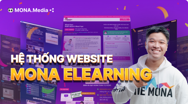 MONA E-LearningA website with every feature you need to sell courses.
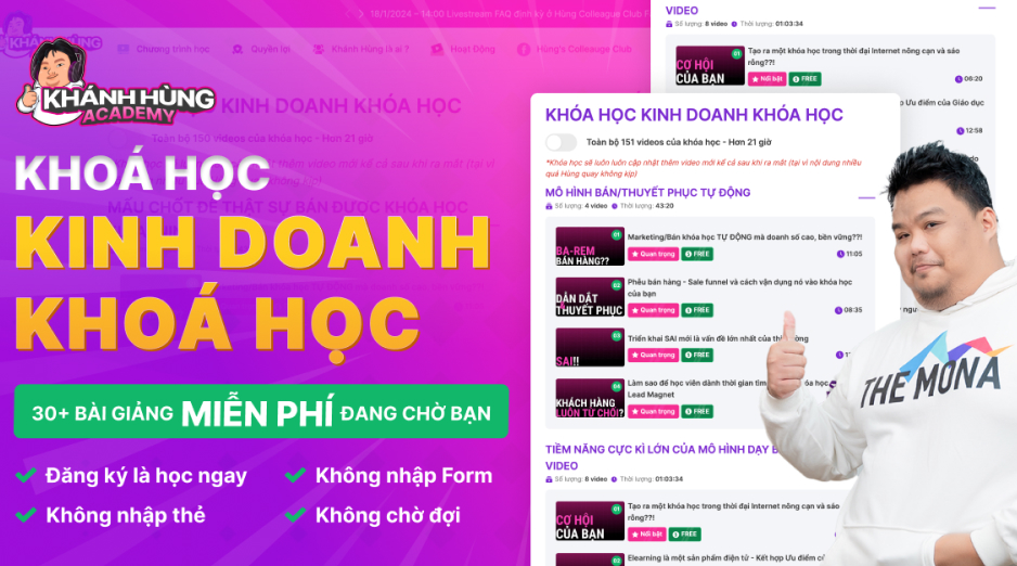 How to sell online courses (course)More than 30 free lessons on selling courses on autopilot.
 MONA Cloudmonacloud.vnServers to get your apps and websites running.
 MONA Basemonabase.vnPostgres database, sign-in and file storage.
 MONA Mailmonamail.vnSend OTP, order and invoice emails from your software.
 MONA Paymonapay.vnAccept bank transfers via VietQR and notify your software when the money arrives.
 MONA eInvoiceComing soonIssue e-invoices that meet tax standards.
Gấu CườiTrả lời khách 24/7 trên web, Fanpage, Zalo và thu lead cho sale.
 Gấu TeleSalesGọi điện tư vấn, chăm khách như tổng đài viên thật.
Dê CườiTư vấn và chốt đơn cho shop ngay trong khung chat.
Gấu WebmasterNhắn nhóm Zalo là website được sửa xong.
 Gấu Pháp ChếSoạn hợp đồng, rà điều khoản trong vài phút.
 Gấu Báo GiáLên báo giá đúng mẫu và gửi khách ngay.
 AI chăm sóc khách hàngTheo dõi và giữ chân khách hàng cũ.
 Gấu Tuyển DụngLọc hồ sơ, hẹn lịch, phỏng vấn ứng viên.
 Mới ra mắt
KHA AI 2027
Xây kênh chuyên gia 2 phút mỗi ngày
Quay bằng điện thoại, AI tự edit video, tự đăng lên 16 nền tảng và tự trả lời bình luận, tin nhắn.
869.054lượt xem trên kênh CEO MONA sau 34 ngày
 Anh Khánh HùngCEO MONA đang dùng mỗi ngày
Xem app làm được gì
 AI
Gấu Cười MONA ĐANG TỰ XÀITrả lời khách 24/7 trên website, Zalo OA, Messenger và thu lead về cho sale.
Dê CườiChốt đơn bán lẻ và sàn: Shopee, TikTok Shop, web. Chăm cả khách sỉ, đại lý.
Gấu WebmasterCập nhật nội dung, tối ưu SEO website mỗi ngày.
Gấu TeleSalesGọi điện tư vấn, chăm khách như tổng đài viên thật.
Gấu Tuyển DụngLọc hồ sơ, hẹn lịch, phỏng vấn ứng viên tự động.
AI chăm sóc khách hàngGiữ khách cũ, cứu lead đã rớt cho phòng kinh doanh.
Gấu Pháp ChếSoạn hợp đồng, rà điều khoản trong vài phút.
Gấu Báo GiáLên báo giá đúng mẫu, gửi khách ngay khi có yêu cầu.
 Chuyển đổi AI toàn phầnGiải pháp tổng cho doanh nghiệp, 3 lớp triển khai.
 Viết AI Agent theo yêu cầuĐặt riêng một con AI gánh đúng nghiệp vụ của bạn.
 Custom softwareCRM, ERP and HRM with built-in AI automation.
 SEO & AEO thời đại AIĐược Google lẫn AI trích dẫn, không chỉ xếp hạng.
 Kiến thức AI cho doanh nghiệpBài phân tích, hướng dẫn ứng dụng AI vào vận hành.
 Free AI courses
 AI tools at work
App mới · KHA AI 2027
Xây kênh 2 phút mỗi ngày
AI tự edit video, tự đăng mọi mạng xã hội
Free consultation, 8am–10pm every day

15 June, 2026

Creating images with Canva AI is more than typing a one-line description. You need to pick the right tool inside Canva, write a prompt with enough context, lock the visual style, adjust the ratio and check everything before putting it on your website, SEO article or sales content. In this article, MONA goes straight into the real steps in Canva AI, with prompt formulas that marketers, business owners and internal staff can apply easily. We also point out what Canva AI does fast and what still needs a custom system if a business wants serious automation.
You can create images with Canva AI straight from a text description. Do it right away. This part goes directly into the steps to get images you can use for posts, websites, ads and sales documents.
The easy mistake is to generate the image first, and only then think about where it will be used. That leaves images with the wrong ratio, hard-to-place text and layouts that need many fixes.
At MONA, we usually start from how the image will be displayed. Only then do we write the image description, pick the ratio and bring it into the design.
Open Canva, sign in, then go to Apps. Look for Magic Media or Text to Image, depending on how your Canva interface looks.
Being in the right place matters a lot. If you use a ready-made template by mistake, Canva only edits the layout and does not generate a new image from your description.
Do not rush to enter the description. Pick the frame first, because each place an image is used has a different ratio.
This gets the generated image close to your goal from the start. Fewer edits. The marketing team also keeps layouts consistent across many designs.
The first description does not need to be long. You just need to state the subject, setting, style, color and where the image will be used.
Example for a social post: “Realistic photo, a shop owner checking orders on a laptop, light background, blue color, with empty space on the right for text”.
Example for a website banner: “Horizontal image, a marketing staff member viewing a report on screen, modern office space, natural light, leave empty space on the left for the headline”.
We usually write the description around how the image will be used, not around inspiration. This makes it easier to bring Canva AI's images into a design.
After Canva AI creates the images, pick the one closest to the layout you need. Insert it into the design, then add text, logo and call-to-action button.
Keep them. The original lets you reuse the image for banners, posts and sales documents without generating it again from scratch.
Canva AI handles one-off images fast. But when a business needs a synced website, SEO, ads and sales data, MONA still separates the tool from the system.
Tools help you work fast. Systems help things run steadily. That is why we use AI internally and to train customers, but real automation still needs custom software when data has to flow end to end.

Canva AI cannot read vague intent. It needs a clear enough description to produce images close to your marketing need.
Easy to apply right away. You just combine 5 parts: subject, setting, style, layout and purpose.
We use this formula when guiding MONA's content team, design team and customers to create draft images for websites, SEO and sales campaigns.
A sample formula you can use right away:
The more generic the subject, the more the image drifts. Canva AI tends to make safe images when the prompt only says “product”, “model” or “office”.
Name the exact object. State the product type, material, color, angle and condition if needed.
A prompt that drifts: “Create a nice cosmetics image”. A clearer one: “Create an image of a white face cream jar with a silver lid, tilted slightly on a beige background”.
Well worth doing carefully. This part decides whether the image shows what you need or just looks like a generic stock illustration.
For the same subject, a different setting sells a different feeling. A pair of shoes in a studio looks nothing like a pair on the street.
Write the setting as if you were choosing the stage for the product. Do not let Canva AI guess this part.
A weak prompt usually has only the object. A usable prompt always has space, lighting and visual feeling.
A clearer example: “cafe in natural light, wooden table, soft sunlight, a close and friendly feel” is different from “dark studio, rim lighting, a premium feel”.
MONA usually advises customers to split the setting by channel. An image for business websites needs to feel more trustworthy than one posted quickly on social media.
Canva AI can create many kinds of images. The problem is that each kind pulls the brand toward a different tone.
A cartoonish image makes a finance brand look less serious. An image that is too cold makes a spa lose its caring feel.
Lock the style early. State clearly whether you want commercial photography, flat illustration, clean 3D, a minimalist poster or lifestyle photography.
Do not list too many styles. One prompt should favor one main style so the image does not become a hybrid.
When MONA makes content for SEO services, we usually favor illustrations that make the point clearly. The image does not need to be elaborate, but it must fit the search context.
Many generated images look good but are hard to use. The familiar reason is that the image has no room left for a headline, button or main message.
This is a very practical mistake. Marketers lose extra time cropping, covering, blurring or swapping the image.
State the layout right in the prompt. Canva AI needs to know whether the subject is on the left, on the right, in the center, or how much of the frame it takes up.
This line works well: “Leave clean empty space on the right for text” makes the image fit a banner better.
Think like a layout designer. The image is not only for looking at, but for placing into a real design.
For the same coffee image, the purpose changes the whole approach. An image for a menu is different from an image for an SEO article about running a coffee shop.
Canva AI needs to know what the image is for. The purpose helps the tool pick the right level of seriousness, emptiness and detail.
This part is very short. But the effect is big.
Complete prompt examples:
We usually save good prompts as internal templates. This helps the content team make more consistent images, especially when several people work on one campaign.
Canva AI is handy for one-off images and quick drafts. When a business needs images tied to the website, SEO, CRM, product data and an internal approval process, a standalone tool hits a ceiling.
At that point, MONA usually advises building custom software or an automation system that fits real operations. AI is just one part of a controlled chain of work.

Images made with Canva AI often look good on their own, but easily break once placed into a banner, thumbnail, poster or landing page.
The headline sticks to the character's face. The button lands in a very busy area. White text sits on a light background and loses its selling power.
MONA handles this right from the prompt, not at the step of dragging text in Canva. We always state the empty area, the gaze direction and the subject position before generating the image.
Treat empty space as part of the design, not as leftover room after the image is made.
When you enter the prompt, state which area is for text, buttons or the logo. Canva AI will more easily produce a clean layout.
Example prompt: “Create an image of a person using a laptop in a modern office, subject on the left, clean empty space on the right for a headline and button”.
Sales images do not always need the subject in the center. A centered layout often leaves text no room to breathe.
Choose the text side first, then push the subject to the other side. This makes a banner look more deliberate.
In landing page templates, MONA often asks for the subject to look toward the headline area. The viewer's eyes will follow that direction.
A small tip, but worth it.
A busy background makes an image feel lively, but it usually weakens the sales message. This is a very common mistake when creating images with Canva AI.
Describe a simple background, clear lighting and colors that do not compete with the text. The image should support the message, not fight for attention.
Example prompt: “Minimalist background, few details, soft lighting, a clean area on the right with enough contrast for white text”.
The clearer the prompt, the lighter the hand editing.
Do not pick the first image right away if it is for an ad, landing page or sales post. A good-looking image does not necessarily fit a text layout.
We usually generate 3 variations before choosing the final image. Each variation changes only the subject position and the empty area.
Then place each image at the exact banner or thumbnail size in Canva. Pick the one that keeps the text clearest.
Canva AI gets images out fast, but the deciding part is still layout thinking. For websites, SEO and marketing, MONA still uses AI as an internal support tool and trains customers to use it properly.
When a business needs seamless data, an image approval process, a brand asset library and performance reports, a standalone tool hits a ceiling. That is when custom software built by MONA runs more steadily.

A campaign easily turns chaotic when each image has a different kind of lighting, layout and color. It looks very disjointed.
If you do marketing, you will see this problem clearly when you have to produce many posts for the same sales push. We usually handle it by locking the style first, then letting Canva AI generate images.
A reference image is how you tell Canva AI the visual taste you want to keep. It should be close to the running campaign, though it does not need to match it exactly.
You can use product photos, old post images, approved ad visuals, or an internal moodboard. Pick few, but make them clear.
MONA usually advises marketing teams to prepare a separate sample image folder for each campaign. That way new staff also stay on the same visual direction.
Color is what makes an image recognizable as your brand faster than any description. If the color drifts, the whole set of posts looks like it came from different sources.
You should save your brand colors in Canva Brand Kit or a template design page. When you create a new image, only change the content and keep the background, text, and accent colors fixed.
Colors drift very easily.
We usually build a color palette by role: primary, secondary, warning, and background colors. This keeps images made with Canva AI inside the identity system of your website, SEO, and ads.
A beautiful AI image with a mismatched layout still throws a campaign off rhythm. Every post needs the same visual logic, especially when they run as a series.
You should reopen a design that has worked well, duplicate that page in Canva, then swap the image for the new result from Canva AI. Keep the text, spacing, logo, and button in the same positions.
This approach is very practical.
At MONA, when we train clients to use AI tools for marketing, we always separate image generation from layout. AI creates the raw material, and the layout helps that material sell more clearly.
Once you have a template that looks good, save it as the standard version. Don't let each staff member rely on personal memory.
A standard template should include a reference image, color palette, logo position, font style, and a sample prompt. Next time, the marketing team just duplicates it and swaps in content for the new campaign.
Don't start over from scratch.
MONA uses this approach internally when producing many content groups for websites, SEO, and ads. Since 2016, we've seen that standardizing templates helps the team work faster while keeping quality under control.

Editing by hand too early turns Canva AI into a tiring loop. You drag colors, change text, crop the image, then realize the background still misses the point.
Going slow at the start is faster in the end. We usually generate 10 variants first, pick the image with a good background and solid layout, and only then fine-tune.
This works well for images used in SEO posts, website banners, Facebook posts, ad visuals, and video thumbnails. MONA applies the same rhythm when guiding marketing teams to use Canva AI in their daily work.
You should keep one clear base description, then duplicate it into several small versions. Don't rewrite from scratch every time.
Rewriting from scratch easily shifts the meaning. The model reads each sentence in a different direction.
The short formula is:
A base description could be: “A shop owner checking orders on a laptop, modern style, natural light, with empty space on the left for a headline.”
Then you duplicate it into variants such as a small office, a tidy warehouse, a retail counter, or a home workspace. The core idea stays the same.
Change only one variable at a time. This is the step many people skip.
If you change the setting, colors, camera angle, and style all at once, a bad result won't tell you where it went wrong. Further edits then rely on guesswork.
We usually split variables into 4 groups:
Changing one group at a time shows you which direction Canva AI responds to best. It's very easy to control.
For example, for a website image that needs empty space for text, change only the camera angle first, and hold off on color and style.
Once you have 10 images, don't choose by what looks pretty. A marketing image has to serve a clear goal.
MONA usually scores quickly on 3 criteria:
A beautiful image that's hard to put text on still slows the design down. An image with too much detail also buries the headline.
You can score each criterion as pass or fail. No need to overcomplicate it.
The goal is to cut weak images fast. Choose few, but choose solid.
Once you've picked the winning image, that's when you edit by hand. This is where Canva really shines.
You should work in this order:
This order keeps you from wandering through edits. Once the image has the right background, the rest is much lighter.
For websites, images need a clear topic and fast loading. For social posts, images need to be readable in the first few seconds.
Canva AI helps you get options fast, but it still has a ceiling. A standalone tool doesn't connect to your website data, SEO, CRM, or content approval process on its own.
That's why MONA uses Canva AI as one part of an internal workflow and in client training. When a business needs real automation, seamless data, and security control, we still prioritize custom software, websites, SEO, and marketing systems built around how the business actually runs.

One good image in Canva AI isn't enough to run marketing. That image has to become many versions in the right size, for the right channel, and for the right purpose.
Do this step right and you won't have to regenerate from scratch. Your marketing team will also keep visuals consistent more easily.
In Canva, open the design you made with Canva AI. Then choose Resize or Magic Switch, depending on your account plan.
First create the 5 formats you use most: a square image for Facebook, a landscape image for the website, a vertical image for stories, a cover image, and an image for sales slides.
A small tip, but worth doing. Don't let Canva crop automatically without checking the subject afterward.
We usually split the size set from the start when making content for websites, SEO, and ads. That lets one visual idea serve more touchpoints.
AI images often look good overall but get messy once you add text. You should turn on the margin guides, then keep text and the logo in the middle zone of the image.
For Facebook images, the logo shouldn't sit close to the edge. For website images, keep text away from areas covered by buttons, menus, or color overlays.
This is a very common mistake. The image looks great in Canva, but on the website the layout breaks or the sales message gets hidden.
MONA usually checks images in the context where they'll actually appear. Websites, SEO posts, and sales pages all need images that serve reading behavior, not just decoration.
You should duplicate the design into several pages within the same Canva file. Give each page one job so edits don't pile on top of each other.
It's a very tidy approach. Page 1 is a clean background image, page 2 is an image with a headline, page 3 is a thumbnail with short text.
Don't cram everything into one image. An image with too much text is hard to reuse for SEO, ads, and sales.
We often keep a separate background version when designing content for clients. When the headline needs to change, the marketing team only edits the text layer and doesn't have to recreate the whole image.
When exporting, don't download everything in one format. Each channel needs a different file type to keep quality and loading speed.
An image that's too heavy slows the page down. A slow page makes visitors leave sooner and makes SEO results harder to keep steady.
If the image is for an SEO post, you should give the file a meaningful name. For example, cach-tôi-anh-bang-canva-ai-thumbnail.webp is easier to manage than the default download file name.
MONA usually handles images following the website and SEO workflow, not just by what looks nice. You can also look at our website design and SEO services service if you want images to fit a conversion structure.
Canva AI is very handy for creating and reusing images. But a standalone tool still has a ceiling when data, approval workflow, brand library, and website are not connected.
For businesses that need steady operations, MONA usually combines internal AI, team training, and custom software to manage the workflow. That way, good-looking images also move along the marketing and sales flow.

Canva AI is very handy when you need to make images quickly for articles, ads, email, landing pages, or social content.
It helps the marketing team cut sketching time, test many layouts, and turn words into visuals that are easier on the eye.
Its strength is speed.
For personal or small-team needs, Canva AI is fast enough to produce usable visual assets within the day.
The problem starts when each staff member creates images their own way, saves files separately, and names them by personal habit.
You easily end up with many versions with wrong colors, wrong messages, wrong sizes, and no way to know which one is live on the website.
This is a clear ceiling.
Canva AI handles image creation well, but it doesn't connect on its own to sales data, CRM, ERP, your website, and the internal approval process.
You still need someone to collect the files, check them, post them, measure results, and report back by hand.
That is very easy to get wrong.
MONA still uses Canva AI and many internal AI tools for ideation, rough drafts, content, and checking production speed.
We don't treat AI as a magic wand. We treat it as a support layer inside web, SEO, and marketing workflows.
How you use it needs context.
When training clients, we usually start from the business's real work rather than teaching scattered tricks.
Canva AI only delivers when prompts, input data, content structure, and brand standards are aligned.
MONA has operated since 2016, with , serving 14,000+ projects and recording an 85% retention rate.
These numbers help us see that a tool is only valuable when it comes with a clear enough process.
When a business wants to run seriously, an image is no longer a standalone file.
Images have to go together with products, articles, campaigns, leads, posting schedules, and performance data.
At this point you need your own system.
For this need, MONA usually advises custom software built around the business's real workflow.
You can start with website design, then add SEO services, CRM, ERP, and automation chains.
Canva AI is still useful for fast image creation, but only your own system gives you seamless data, security, and clearer performance tracking.
We use tools to move faster. Businesses use custom software to run on a firmer footing.


CEO & Founder · The MONA
Founder of The MONA, who built a services company of 200+ staff with 14,000+ projects delivered. Khánh Hùng shares how he thinks about building systems that run themselves, automating a business, and the real lessons from delivering projects at MONA.
 489


Professional website
design services
Own a website with a beautiful, 100% exclusive design and a lifetime warranty, with the ability
to expand features flexibly as your business grows, starting today!






 MONA will never sell your information or send you spam


 MONA will never sell your information or send you spam
