
 MONA OS 2.0
 Partner with MONA


 Tự động hoá doanh nghiệp
 Cẩm nang SEO
 Digital Marketing
 Kinh nghiệm thiết kế website
 Hạ Tầng Server
 Giáo dục


 VI
 EN












Message us on
Zalo Official


 ProductsNew

 ProductsProducts
 Mới ra mắtKHA AI 2027App tự edit video, tự đăng mọi mạng xã hội, 2 phút mỗi ngày









 Website designLooks good and wins customers over.
SEO servicesBrings in customers searching for exactly what you sell.
 Tư vấn digital marketingKéo khách từ nhiều kênh, đo bằng số thật.
Corporate video productionVideos introducing your company, factory and team.
 NewAI video productionCompany story films made with AI.
 Custom software developmentCRM, ERP and HRM built for your business.
 Viết AI Agent theo yêu cầuĐặt riêng một trợ lý AI cho đúng việc của mình.
 Tư vấn chuyển đổi AIĐưa AI vào vận hành của cả công ty.
NewMONA LMSManagement for centers and schools.
MONA SkillHubInternal training for company staff.
 NHTQ systemEnd-to-end China–Vietnam shipping operations.
MONA JMSManagement for gold, diamond and pawn shops.
 MONA E-LearningA website with every feature you need to sell courses.
 How to sell online courses (course)More than 30 free lessons on selling courses on autopilot.
 MONA Cloudmonacloud.vnServers to get your apps and websites running.
 MONA Basemonabase.vnPostgres database, sign-in and file storage.
 MONA Mailmonamail.vnSend OTP, order and invoice emails from your software.
 MONA Paymonapay.vnAccept bank transfers via VietQR and notify your software when the money arrives.
 MONA eInvoiceComing soonIssue e-invoices that meet tax standards.
Gấu CườiTrả lời khách 24/7 trên web, Fanpage, Zalo và thu lead cho sale.
 Gấu TeleSalesGọi điện tư vấn, chăm khách như tổng đài viên thật.
Dê CườiTư vấn và chốt đơn cho shop ngay trong khung chat.
Gấu WebmasterNhắn nhóm Zalo là website được sửa xong.
 Gấu Pháp ChếSoạn hợp đồng, rà điều khoản trong vài phút.
 Gấu Báo GiáLên báo giá đúng mẫu và gửi khách ngay.
 AI chăm sóc khách hàngTheo dõi và giữ chân khách hàng cũ.
 Gấu Tuyển DụngLọc hồ sơ, hẹn lịch, phỏng vấn ứng viên.
 Mới ra mắt
KHA AI 2027
Xây kênh chuyên gia 2 phút mỗi ngày
Quay bằng điện thoại, AI tự edit video, tự đăng lên 16 nền tảng và tự trả lời bình luận, tin nhắn.
938.878lượt xem trên kênh CEO MONA sau 43 ngày
 Anh Khánh HùngCEO MONA đang dùng mỗi ngày
Xem app làm được gì
 AI
Gấu Cười MONA ĐANG TỰ XÀITrả lời khách 24/7 trên website, Zalo OA, Messenger và thu lead về cho sale.
Dê CườiChốt đơn bán lẻ và sàn: Shopee, TikTok Shop, web. Chăm cả khách sỉ, đại lý.
Gấu WebmasterCập nhật nội dung, tối ưu SEO website mỗi ngày.
Gấu TeleSalesGọi điện tư vấn, chăm khách như tổng đài viên thật.
Gấu Tuyển DụngLọc hồ sơ, hẹn lịch, phỏng vấn ứng viên tự động.
AI chăm sóc khách hàngGiữ khách cũ, cứu lead đã rớt cho phòng kinh doanh.
Gấu Pháp ChếSoạn hợp đồng, rà điều khoản trong vài phút.
Gấu Báo GiáLên báo giá đúng mẫu, gửi khách ngay khi có yêu cầu.
 Chuyển đổi AI toàn phầnGiải pháp tổng cho doanh nghiệp, 3 lớp triển khai.
 Viết AI Agent theo yêu cầuĐặt riêng một con AI gánh đúng nghiệp vụ của bạn.
 Custom softwareCRM, ERP and HRM with built-in AI automation.
 SEO & AEO thời đại AIĐược Google lẫn AI trích dẫn, không chỉ xếp hạng.
 Kiến thức AI cho doanh nghiệpBài phân tích, hướng dẫn ứng dụng AI vào vận hành.
 Free AI courses
 AI tools at work
App mới · KHA AI 2027
Xây kênh 2 phút mỗi ngày
AI tự edit video, tự đăng mọi mạng xã hội
Free consultation, 8am–10pm every day

24 August, 2026

Customers come to MONA with a beautiful landing page but still no orders from their ads, the kind of page the whole office praised for the first 2 weeks and then went quiet because the monthly report moved by only a few forms. Beautiful in the real sense guides the customer's eye along one clear path, makes the button stand out and removes hesitation before they fill in the form. Judge the page by action.
We know the feeling of spending 50 or 70 million on ads each month with no new appointments for the sales team. Aesthetics still matter. They make a brand look polished and trustworthy. The trouble starts when decoration takes the place of selling information.

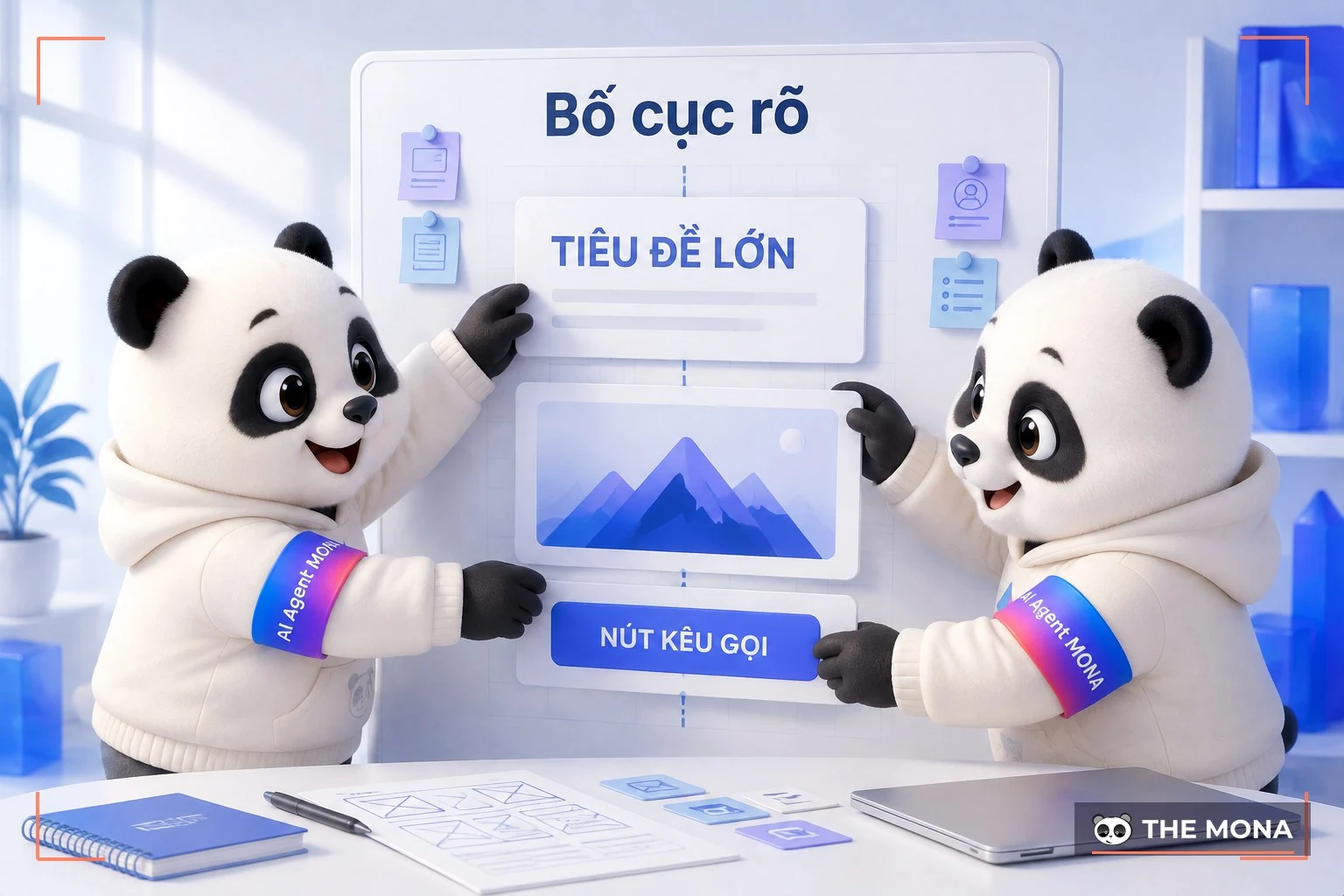
A truly beautiful landing page has a layout that leads the eye along 1 path, enough contrast and breathing room that serve 1 action. MONA judges beauty by whether it helps customers understand, trust and then click.
The button must pop.
On the very first screen, customers need to see what the page sells, who the benefit is for and where the next step is; if those three pieces of information compete through color, text and motion, the eye gets tired. Customers have to piece the idea together themselves. A beautiful landing page still loses orders that way.
We usually open the page on a phone, look at it for 3 seconds then ask ourselves what we remember. If the answer is only “looks classy”, the design has not finished its job.
White space separates the promise from the proof and lets the eye rest before the button. Contrast guides attention to the right point. Effects should stay only when they help readers understand the product faster. Motion without purpose makes the page heavy and buries the main information.
If you are new, read the explanation of landing pages and the role of each block. MONA uses that structure as a map, then picks colors, images and typography to match the brand identity. This keeps the landing page beautiful and shows the sales team what customers read before leaving their details.
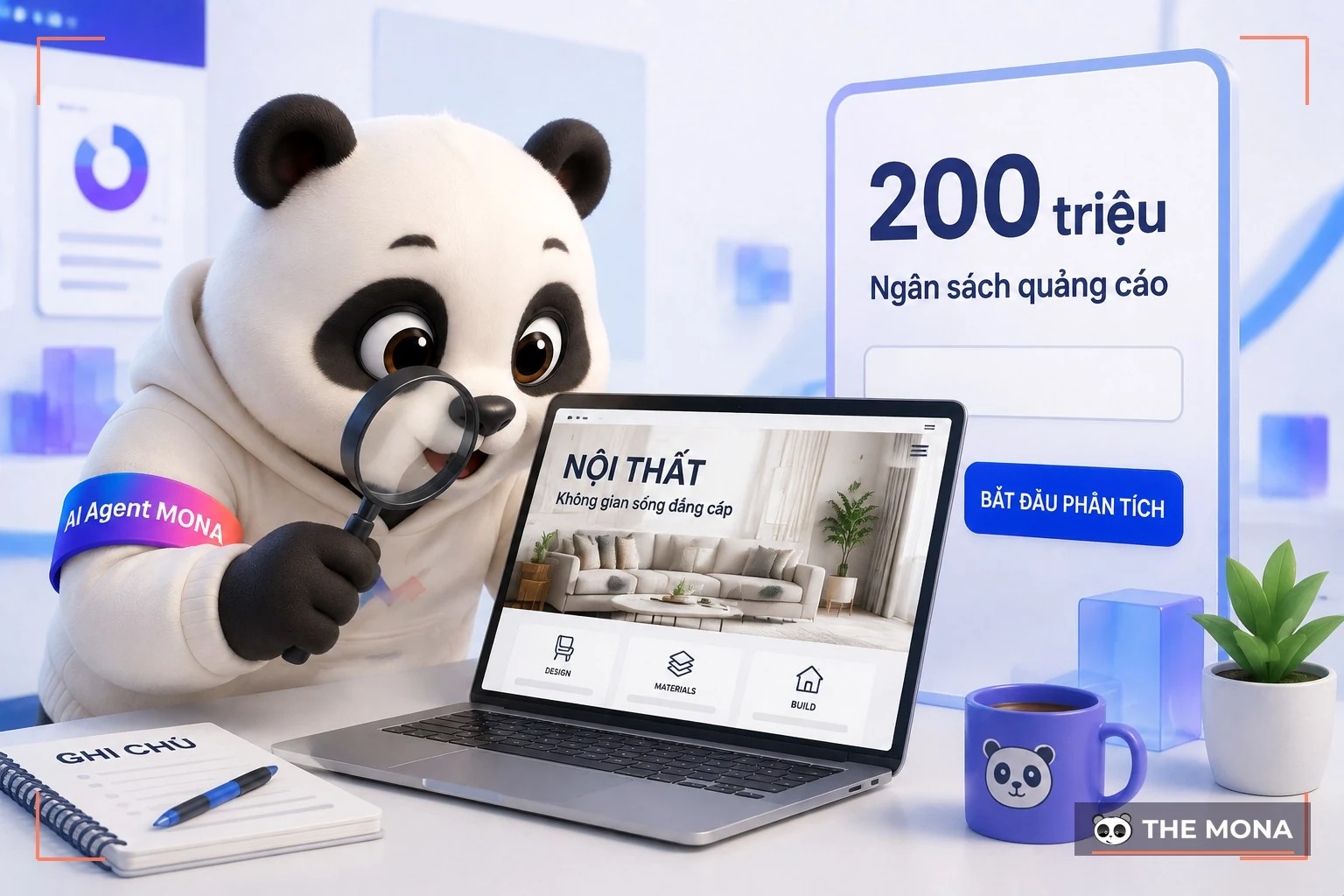
A beautiful landing page still fails if the booking button is buried and the form sits too deep. MONA once received a case like this after months of ad spend had already gone out.
No orders came in.
A brand running ads constantly 3 months, with a budget of nearly 200 million VND, but each month it got barely 10 form; the person in charge brought MONA a large printout, with the name of a beige sofa model still written on the margin. The page was praised a lot in a design group. So the owner never considered a layout problem.
We opened the page on a phone first. The booking button used a color close to the background, and the text describing the appointment was smaller than the collection intro.
The form sat after 8 screens of scrolling. Customers had to pass the full-room photo, the material story, the workshop intro and plenty of effects. Each part was beautiful. The whole page made someone who wanted to ask for a price do too much work.
MONA moved the promise to the top, placed real projects right after it and pulled the form close to the proof. The booking button appeared just when customers had enough reason to click. With the same budget, forms came in 3 times as often after the layout change. This figure is an illustration from a typical case, not a promise for every industry.
Only now did the beautiful landing page create forms.
Praise for aesthetics and buying behavior are two different measurements. You can keep the brand's classy look, but a beautiful landing page needs to place that look around one clear action path. Customers shouldn't have to walk through the entire collection before they can ask for an appointment.

For a beautiful landing page, the five factors to review are visual order, button contrast, breathing room, real photos and readable text on mobile; MONA checks all 5 factors on 1 trang before talking about effects.
The eye needs a path.
Visual order decides whether customers see the promise, the proof or the price list first. A big headline needs to carry a clear benefit. Images support that promise. The button should stand out naturally so customers see the contact spot immediately.
When doing UX/UI design, we check the feeling of enjoying the look and how easy it is to use, separately. The two layers need to support each other. A beautiful landing page keeps the brand's personality while every detail helps customers move one step forward.
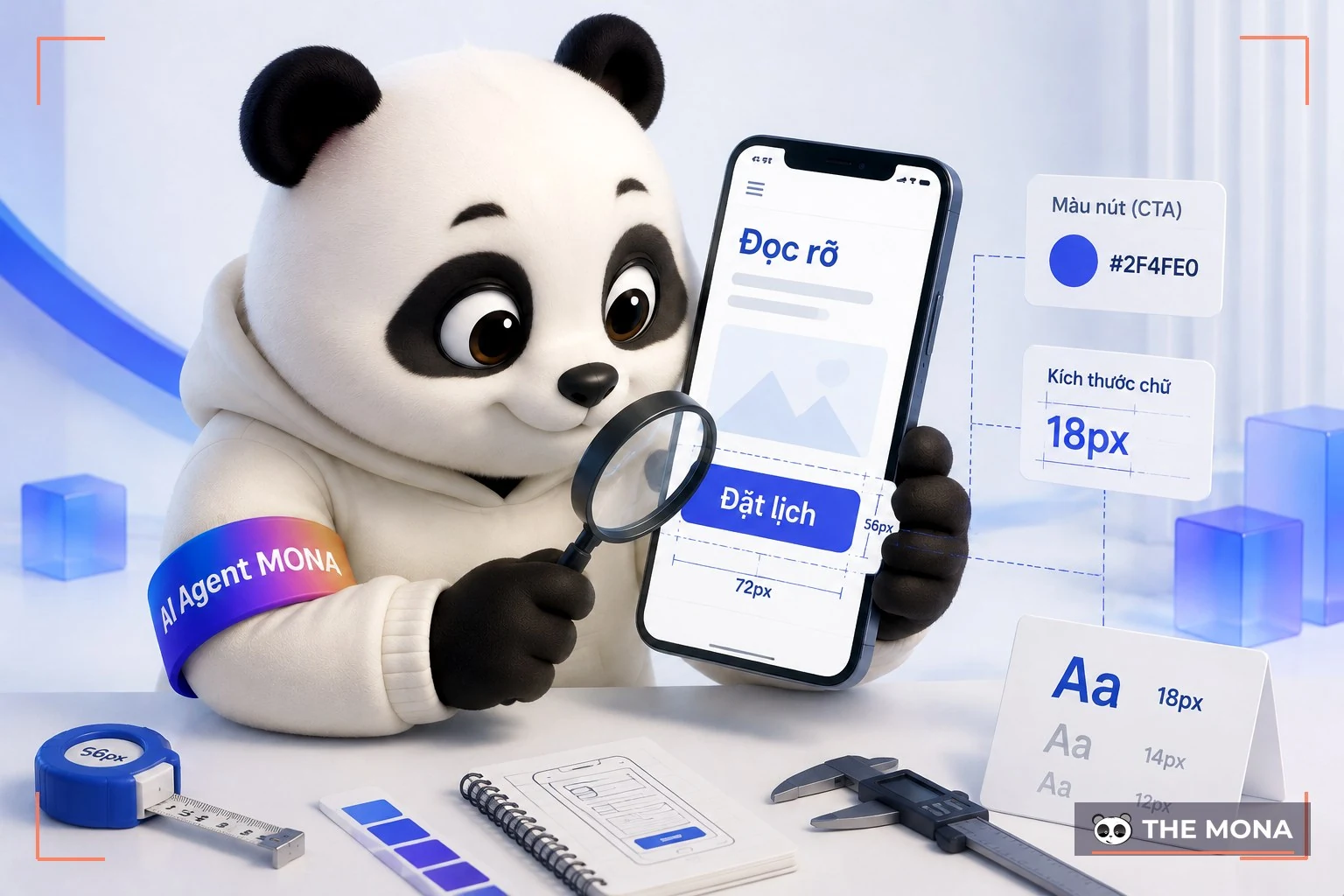
On mobile, the spacing between text, buttons and photos needs to be tested with real touches instead of just admiring a desktop mockup. We hold the phone at a normal viewing distance. After 3 seconds, the tester should be able to point out the headline and the main button. If they only remember the photo, the layout needs fixing.
Stock photos suit a draft. For real campaigns, MONA prefers photos of projects or products with usage context and clear material detail. A small scratch on a real wooden table is sometimes more believable than a room so perfect it feels foreign.
Speed is part of aesthetics too. Check it with PageSpeed, then look separately at large images, effect code and how fonts load.
If the server responds slowly, even a lean design opens sluggishly. We look at the hosting at MONA Host to determine whether the bottleneck is images, page code or infrastructure. The data tells you what to adjust. Cutting effects by gut feeling can easily make a beautiful landing page lose its character without making it much faster.
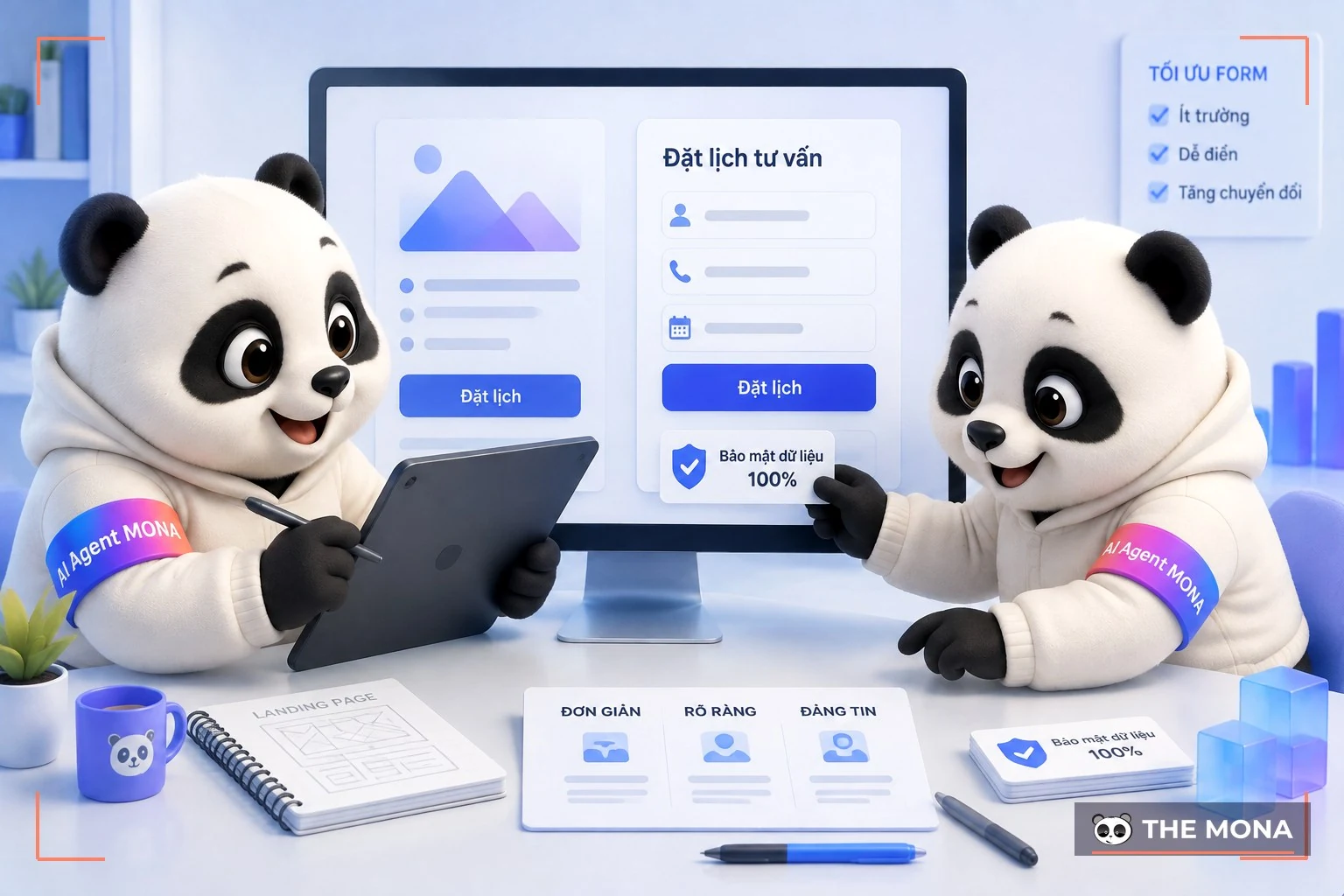
A beautiful landing page with a high close rate needs real proof, a clear offer, a short form and behavior tracking. MONA treats an average of about 2,35% along with the benchmark of 5,31% for top performers as a reference point.
Measure, then fix.
The figures from WordStream on conversion rates are a reference baseline, while the page's own data still needs close tracking. We compare before and after on the same traffic source. Industry, ads and price create differences. That way the marketing team knows which change made forms go up.
Proof should answer the worry on the spot. If customers fear the product looks different from the photo, they need real photos. If they fear a long process, show the steps, the person in charge and the result after the call.
An offer needs clear boundaries. We write the scope, the audience and the action required plainly. The clearer a beautiful landing page is, the less time the sales team spends explaining again.
That is the foundation of a high-converting landing page.

Each A/B test should change only one main variable and keep the rest stable, because changing the headline, photo, button and form at once hides what caused the form count to move. We test the headline first, then the proof or the button wording. Harvard's explainer helps internal teams understand how to set a hypothesis. Results should be recorded round by round.
Don't just measure clicks.
The point where people stop and the fields they abandon in the form show where they get stuck. MONA combines those signals with form counts when doing conversion rate optimization; while bringing more organic visitors to the page is the job of SEO services SEO. The landing page statistics from Backlinko add more context.
Content has to go with the layout. See how to write content for a landing page to place claims next to proof, and the article on DIY drag-and-drop landing pages helps the team picture the structure. A version running ads still needs its tracking code, mobile and form checked.
When the form connects to a sales system, the flow behind it must run reliably. MONA builds the data receiving and handoff separately at MONA Software. A beautiful landing page still loses its edge if staff respond slowly. We check what happens after the button too.
A landing page's conversion rate grows durably when every edit has a reason and a baseline to compare against. Marketing and sales look at the same data. You argue less over personal taste. The business takes back control.
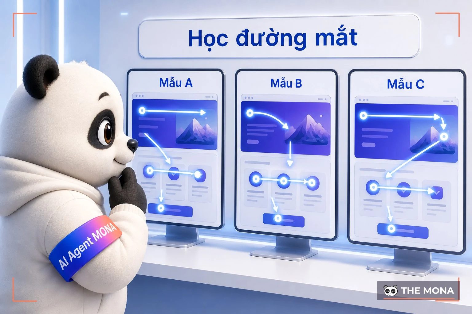
Good templates help you learn the order of information, the rhythm of proof and where the button goes. MONA recommends looking at 3 groups of templates to draw principles for 1 beautiful landing page for your business.
Look to learn.
Kho landing page website templates show many ways to divide the screen. Spend 15 minutes watching where your eye stops and write down why you trusted it. Then remove the template's colors, typography and wording from your notes.
Another brand's template comes with its own level of recognition, price and ad audience. Copying the layout wholesale brings those assumptions onto your page. We only take the logic that can be verified; the rest goes back to your data and how your sales team closes.
Well-known brands often put a big collection name at the top because customers already know what they sell, while a new business, especially in the first 6 months of running ads, needs to state the product and benefit clearly before showing off any collection. For a beautiful landing page design, the order changes with brand recognition. If you have your own workshop, show customers real people and finishing details. A mass-produced showroom doesn't add trust.
A template is only a reference.
MONA asks the project team to explain every block: which worry it removes, what trust it builds or what action it leads to. If it can't be answered, shrink it. This way of asking keeps the landing page beautiful with less filler.
After choosing a layout, replace everything with real photos, figures you are allowed to publish, verified customer quotes and your selling terms. The beautiful landing page then speaks in the business's own voice. Customers are also less likely to feel they have seen this interface somewhere else.
Is your page praised as beautiful while forms stay thin? Send us the link, and MONA will review it against the 5 factors above: eye path, button contrast, breathing room, photos and mobile text, then point out which block order is hiding the button. This review is free, call 1900 636 648 to book a time.

A beautiful landing page must use the trust signals that suit the industry. MONA keeps 5 industries on the same 1 formula: understand fast, trust enough, then act.
One rhythm per industry.
For cosmetics, a beautiful landing page needs close-ups of texture, true color and how to use, while real estate needs location, floor plans, legal status and a consultation booking the viewer can find immediately without scrolling back and forth. A spa leans on atmosphere and discretion. Fashion needs real fit, and education needs the curriculum, teachers and outcomes.
We have seen a business carry a real estate style over to a cosmetics page and make the product colors and usage instructions so small that customers had to zoom in just to read the lipstick shade they meant to buy. The page was still classy, but customers lacked the facts to choose. A beautiful landing page by industry starts from how customers decide.
The reading rhythm differs too. Home buyers compare many layers of information, while fashion shoppers want to see the fit fast. A spa form needs privacy. An education form must say what the consultation solves.
Beautiful must fit the job.
MONA keeps the brand's own identity and then prioritizes proof and actions that fit the industry. This avoids the situation where the team loves the page while customers don't know where to click. We want everyone looking at the same action path.
Industries should borrow the right principle: spas learn from fashion about real-person photos, education learns from real estate about consultation booking, cosmetics learns from spas about discretion. The look changes. The persuasion logic stays. A beautiful landing page still keeps its own character.

The section below answers 5 questions that customers coming to MONA usually ask before fixing or rebuilding a beautiful landing page. Each answer helps you settle one decision.
We answer directly.
Cost goes up when the page needs custom photos, special interactions or system integrations; good-looking colors alone don't set the budget. MONA prioritizes real photos, content, speed and measurement. Expensive effects that don't help customers understand or click get cut.
The right length answers everything the customer needs to know before acting. In one furniture case, a form placed after 8 screens of scrolling failed because the order was wrong. We look at scroll data and where people leave to cut or move blocks. A beautiful landing page for a high-value product usually needs more proof.
Stock photos work for a draft or background areas. When running ads, MONA advises replacing the selling spots with real photos of the product, project, team or process. A beautiful landing page needs to show customers what they are about to get.
Animation should explain an action, show the product or draw the eye to the information to read; we remove effects that make text hard to follow, cover buttons or slow the page. Every effect must pass a phone check.
Choose a provider that takes responsibility from layout and content to conversion measurement; MONA has 3 packages of about 7-40 million VND, from a compact page to a custom design with deep integration. The scope is on the MONA landing page designservice. We ask about your goal, traffic source and how sales handles the form before proposing anything.
A beautiful landing page creates value when customers understand the promise, see the proof and meet the button at the right moment. Open the page on a phone, try the form, then check the behavior data. After that, fix each point against a baseline. MONA works the same way so that beauty serves revenue and keeps the brand's taste.
Ready to take another look at the page that is running?
Look back at the furniture case at the start: nearly 200 million VND of ad spend over 3 months brought in fewer than 10 forms a month, and the page wasn't ugly at all, it just made customers scroll through 8 screens before they could ask for a price. After the order was fixed, with the same budget, forms came in 3 times as often. The cost of a wrong layout never shows up on the design invoice; it drains away with the ad money you burn every day.
MONA takes both kinds of work: reordering the layout of an existing page, or building a new one from scratch with packages from 7 million VND, with a commitment that every block on the page can answer which worry it removes for the customer. Call 1900 636 648, send the link to your running page, and within the week we will reply with block-by-block feedback.
MONA Media founded in 2016 (over 10 years), has delivered 14.000+ projects and has 85% of clients coming back. Hotline: 1900 636 648. Website: https://mona.media.
This article answers how to judge a beautiful landing page and reorder its layout to raise the chance of getting forms.

CEO & Founder · The MONA
Founder of The MONA, who built a services company of 60+ staff with 14,000+ projects delivered. Khánh Hùng shares how he thinks about building systems that run themselves, automating a business, and the real lessons from delivering projects at MONA.
 301




Professional website
design services
Own a website with a beautiful, 100% exclusive design and a lifetime warranty, with the ability
to expand features flexibly as your business grows, starting today!





 MONA will never sell your information or send you spam


 MONA will never sell your information or send you spam
