
 MONA OS 2.0


 Tự động hoá doanh nghiệp
 Cẩm nang SEO
 Digital Marketing
 Kinh nghiệm thiết kế website
 Hạ Tầng Server
 Giáo dục



 VI
 EN








Message us on
Zalo Official


 Products

 ProductsProducts




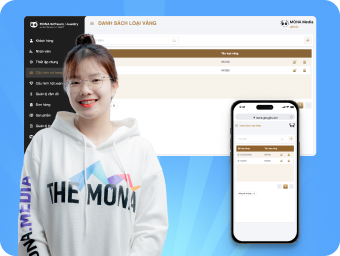




 Website designLooks good and convinces your customers.
SEO servicesBrings in customers searching for exactly what you sell.
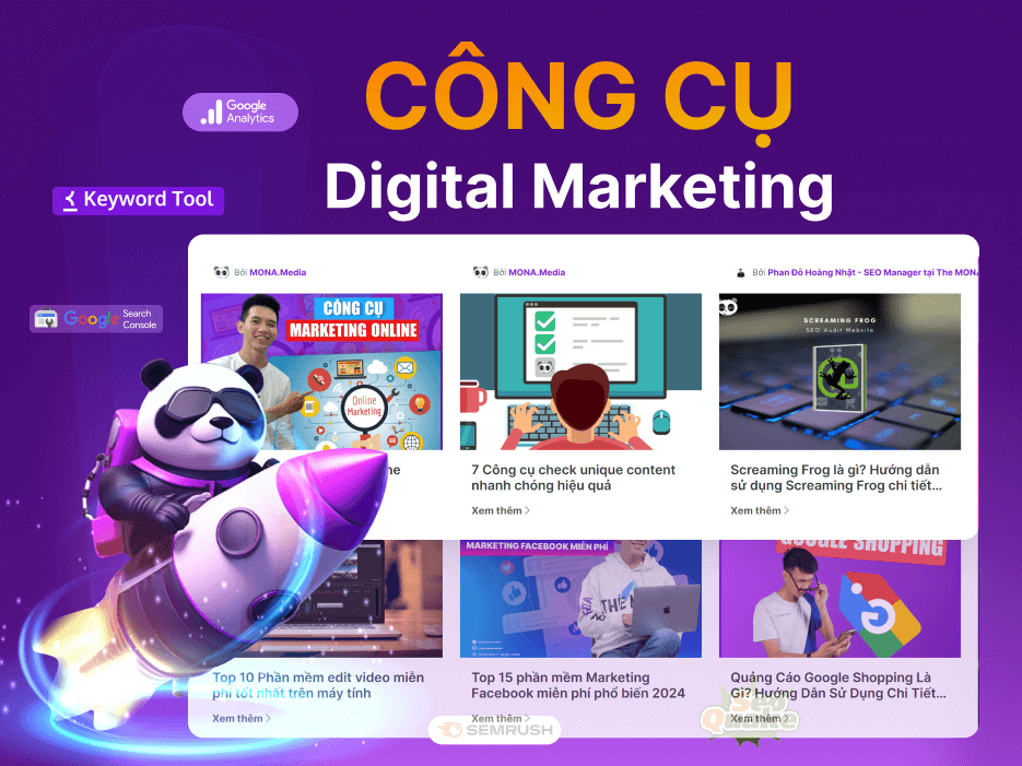 Tư vấn digital marketingKéo khách từ nhiều kênh, đo bằng số thật.
Corporate video productionVideos introducing your company, factory and team.
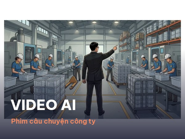 NewAI video productionCompany story films made with AI.
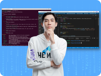 Custom software developmentCRM, ERP and HRM built for your business.
 Viết AI Agent theo yêu cầuĐặt riêng một trợ lý AI cho đúng việc của mình.
 Tư vấn chuyển đổi AIĐưa AI vào vận hành của cả công ty.
NewMONA LMSManagement for centers and schools.
MONA SkillHubInternal training for company staff.
 NHTQ systemEnd-to-end China–Vietnam shipping operations.
MONA JMSManagement for gold, diamond and pawn shops.
 MONA E-LearningA website with every feature you need to sell courses.
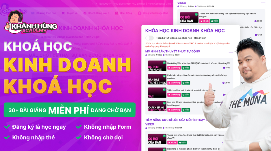 Course on selling online coursesMore than 30 free lessons on selling courses automatically.
 MONA Cloudmonacloud.vnServers to get your apps and websites running.
 MONA Basemonabase.vnPostgres database, sign-in and file storage.
 MONA Mailmonamail.vnSend OTP, order and invoice emails from your software.
 MONA Paymonapay.vnReceive bank transfers via VietQR, with payment alerts sent to your software.
 MONA eInvoiceComing soonIssue e-invoices that meet tax standards.
Gấu CườiTrả lời khách 24/7 trên web, Fanpage, Zalo và thu lead cho sale.
 Gấu TeleSalesGọi điện tư vấn, chăm khách như tổng đài viên thật.
Dê CườiTư vấn và chốt đơn cho shop ngay trong khung chat.
Gấu WebmasterNhắn nhóm Zalo là website được sửa xong.
 Gấu Pháp ChếSoạn hợp đồng, rà điều khoản trong vài phút.
 Gấu Báo GiáLên báo giá đúng mẫu và gửi khách ngay.
 AI chăm sóc khách hàngTheo dõi và giữ chân khách hàng cũ.
 Gấu Tuyển DụngLọc hồ sơ, hẹn lịch, phỏng vấn ứng viên.
 AI
Gấu Cười MONA ĐANG TỰ XÀITrả lời khách 24/7 trên website, Zalo OA, Messenger và thu lead về cho sale.
Dê CườiChốt đơn bán lẻ và sàn: Shopee, TikTok Shop, web. Chăm cả khách sỉ, đại lý.
Gấu WebmasterCập nhật nội dung, tối ưu SEO website mỗi ngày.
Gấu TeleSalesGọi điện tư vấn, chăm khách như tổng đài viên thật.
Gấu Tuyển DụngLọc hồ sơ, hẹn lịch, phỏng vấn ứng viên tự động.
AI chăm sóc khách hàngGiữ khách cũ, cứu lead đã rớt cho phòng kinh doanh.
Gấu Pháp ChếSoạn hợp đồng, rà điều khoản trong vài phút.
Gấu Báo GiáLên báo giá đúng mẫu, gửi khách ngay khi có yêu cầu.
 Chuyển đổi AI toàn phầnGiải pháp tổng cho doanh nghiệp, 3 lớp triển khai.
 Viết AI Agent theo yêu cầuĐặt riêng một con AI gánh đúng nghiệp vụ của bạn.
 Custom softwareCRM, ERP and HRM with built-in AI automation.
 SEO & AEO thời đại AIĐược Google lẫn AI trích dẫn, không chỉ xếp hạng.
 Kiến thức AI cho doanh nghiệpBài phân tích, hướng dẫn ứng dụng AI vào vận hành.
 Free AI courses
 AI tools at work

N-TEK Distribution
Building a global security
and technology network
Founded in 2013, N-Tek provides technology solutions, M&E infrastructure, telecommunications and security surveillance for 30+ EU partners and 600+ domestic clients such as the Ministry of National Defence, VinGroup, Vietinbank,...
1 of 12,000+ clients
of 

Asserting the brand's stature with a professional website
MONA understood N-Tek's motto “Building the future together”, so we created a website in constant motion that shows the life and second-by-second pace of today's technology.

Creating a “pulse” in every screen with flawless responsive technology
Like technology itself, it never stops. We also make sure the website stays compatible and “alive” in every effect and every layout, whatever the device or screen size.


A structured website design process
produces the best possible product
How do you assert your stature and promote your brand in the best way?
N-Tek's clients are businesses in the European (EU) market and mostly government agencies and large companies such as VinGroup, Delta, Unicon, Vinaphone, VNPT,…
N-Tek's goal was to show off its standing and business capability and promote its brand professionally.
A corporate website design solution with a strong tech feel


Understanding the business and its customers is how you build a quality website

Continuous full-screen video
To make a strong impression and show the company's scale right from the start, we used a continuously playing full-screen video banner. This makes it easier for the business to introduce its services.

A message carried in every design and effect
MONA found a way to help N-Tek's clients clearly understand its industry, products, services and scale through large, sweeping designs and continuous motion effects.

Multilingual website (English – Vietnamese)
A multilingual website is a must for a global business like N-TEK.
Building a sitemap
that follows the customer journey
After discussing the project, MONA and the client agreed on the following site map:

“Showing off” experience
in a standout way
Minimal, modern and easy to understand is what you usually see in technology. MONA picked up on that character and focused on large designs. That is the best way to show what is good about the client.


Design direction
MONA Media chose the Inter font so readers can easily take in and understand the content. To strengthen brand recognition, MONA also combined 3 tones (the base colour white, plus the brand colours green and yellow).

UI Design
Every layout, font, logo, icon and effect was chosen with care and follows UI/UX standards to give users the best experience.

Project evaluation based on MONA's own measurements and client feedback

8+ years of working across many industries gave us the business sense and understanding to grasp N-Tek's industry and clients more easily. That is also what helped us build a product this brand is very happy with


 MONA Ecommerce multichannel sales management software
Nhahang.AI restaurant management software
China import management software
MONA JMS software for gold, jewellery and gemstone shops
MONA Skillhub internal training software
Custom software development





 MONA promises never to use your information for sale or SPAM


 MONA promises never to use your information for sale or SPAM


 MONA promises never to use your information for sale or SPAM


